Given All Hallow’s Eve is upon us, I thought I’d take the opportunity to share some of the website faux-pas that really horrify me.
I’ve tried to focus on the mistakes that websites make that cost them: whether actual hard money, or just the goodwill of their users, but admit that the odd personal grudge may have crept in.
1. Tiny buttons for page navigation
Pagination controls are so often squeezed into the bottom of a page in a tiny font – making pages difficult to browse through because the links are so small.
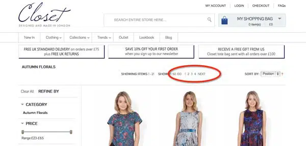
How tricky is it to create a big ‘next’ button that you can click without mistakenly slipping onto the ‘last’ link? These tiny click targets become even more frustrating when you’re using a smartphone or tablets (especially for us users afflicted with fatter than average fingers).
Browsing sites like Closet is something of a lottery – something that could easily be fixed with a bit of thought.
2. Stupid redirects
One of the big pains of mobile browsing is clicking on a link from a search engines and, rather than the page you’re interested in, being dumped on the home page of the mobile version of the site.
If you don’t have a responsive or mobile friendly version of the page I’m looking for, then show me the desktop version of the site. Dump me on the home page and I’m lost (and you’ve lost me!).
Equally annoying are sites that don’t remember what you were doing before they forced you to log in – again dumping you back on the home page.
3. Badly-designed forms
Forms that haven’t been thought through properly are one of the most annoying aspects of modern web-life. They’re probably worth a blog post all of their own, but in the meantime, can we all just try and follow some basic principles?
- Be clear about what you’re looking for: If you need an eight-character password with letters and numbers and punctuation then please tell me in advance, rather than leaving it to me to work out why my first attempt wasn’t acceptable?
- Validate form inputs inline. Inline validation improves the user experience and, more importantly, reduces form abandonment rates. Take a look at Confused.com to see an example of inline validation done well.
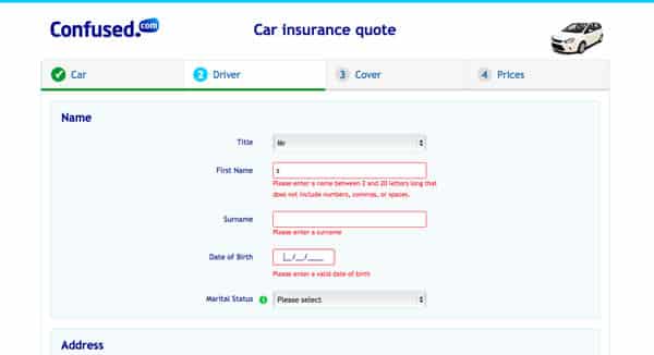
- Help users get the formatting right: Too many forms freak out when you don’t match the format they’re expecting. How difficult is it to work out that a postcode is missing a space and account for it, or that a 9.00 means the same as 9-00. If you’re struggling look at using drop downs to make sure the user enters data in a way that you can understand.
4. Postcode pain
Around 5000 postcodes change are made to postcodes each day – which equates to 1.3m a year. If you’ve got a database that isn’t up to date, that’s a lot of customers that you’ve just blocked from dealing with you. If you validate addresses, make sure your Postal Address File is always diligently updated.
(On a related topic, more often than not the full postcode isn’t necessary for what I’m trying to do – so why do the likes of Autotrader force me to put the whole thing in?).
5. Am I really logged in?
Many sites pretend to know who I am, but then get all cagey at the last minute. For example, eBay welcomes me by name when I visit, yet as soon as I actually try to do anything, it prompts me to log in. What’s the point?
6. Overly-eager Newsletter Pop-Ups
When you walk into a store, there’s nothing more irritating than being immediately asked by an over-eager shop assistant “can I help you?”, before you’ve even had a chance to look around. Well, the web alternative – the immediate pop-up asking you to subscribe to a newsletter – is equally frustrating.
If I’ve had no time to read the content, how do I know whether it’s worth signing up to get more? Couldn’t you wait a little while to let me work out if there’s anything’s worth reading first?
7. Cookie acceptance pop-ups
The newsletter pop-up’s more officious cousin. There are so many better ways of handling wonderful EU requirement than blocking the screen with a pop-up as soon as I arrive on the site. Just try Cookie Control for starters
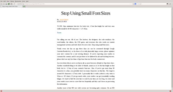
8. Ridiculous font sizes
Assuming you actually want me to read that text, you really should avoid putting it in a font so small that I have to reach for the zoom to be able to read it.
9. Forcing Facebook logins
Reducing ‘friction’ (making it easier for users to do what you want them to) is fantastic, but forcing people to join Facebook or Twitter in order to sign up to your service just isn’t helpful.
By all means offer social sign up it as an option, but not at the expense of being able to being able to sign up with old-fashioned email.
10. Terrible photos
Whether stock images or just really low quality photos, poor images give the instant impression that your company is cheap, dodgy, insecure, or just all three.

Real photography can reinforce your brand, build trust and add to your reputation. Avoid stock imagery and instead invest in some proper photography, or if that’s not viable, try crowdsourcing pictures from your audience.
11. Download our app!
Another frustration when browsing on mobiles is constant invitations to download a website’s app to receive an “optimal browsing experience”.
I really don’t want to download a website’s app when I’m simply interested in browsing a few webpages. This is clearly a sentiment that most of the Internet shares, as Google has now started penalising sites that overtly promote app downloads to their visitors.
12. Autoplay
When you’re sitting at a desk in a quiet, productive office, and some webpage you’ve opened starts blaring out the soundtrack to a video, or some ‘mood-setting’ music, your natural instinct is to quit that window in your browser as quickly as possible and resolve never to go back to that annoying site.
Don’t take control away from your visitors. Let them decide when to watch a video or listen to your preferred soundtrack. It will make a big difference to your drop off rate.
Have I missed any nightmares out? What website practices terrify you?