We’re now just one week away from the date their algorithm change takes effect and it’s clear that a significant number of companies are struggling to get ready for the change – to the extent that the web has dubbed the change ‘Mobilegeddon‘.
We thought we’d find out just how ready companies in the UK are for the change, and so analysed the websites of the FTSE 100 to see whether or not they were prepared.
City of London – Home to the FTSE
Whilst we were expecting to find a few issues, we were shocked that nearly half didn’t meet Google’s mobile-friendly standard.
What we did
We ran each FTSE 100 company’s website through Google’s Mobile Friendly Test to find out whether Google considers each website ‘mobile friendly’ or not and recorded the results shown. All the testing was carried out on the 14th April 2015.
We found that 50 companies passed Google’s test and 47 failed.
Surprisingly, those failing the test included household names such as HSBC, Standard Life and Next.
A further three companies (M&S, Persimmon and Reckitt Benckiser) have separate mobile-specific websites which, whilst not following Google’s preferred approach to mobile-friendliness, would be expected to meet mobile-friendly standards.
The ‘Mobile Friendly Test’ Results
The full results of the test are below:
The most common issues we identified with the sites were:
Links spaced too closely together – making it hard for users to select the right link
Mobile viewports not being set – making the site appear bunched up
Text too small to read
Content wider than the mobile’s screen
The graph below shows which problems occurred most frequently:
Now, it’s possible that the companies that are not currently showing as mobile friendly are planning an update to their websites – but with just seven days to go until Google makes its algorithm change, they’re leaving it a little late.
What this means
It’s important to remember that just because Google doesn’t believe your site is ‘mobile friendly’ it doesn’t mean that users on mobiles can’t access your website.
What it does indicate is that there are likely to be problems for uses on mobile devices when trying to use the site, and Google has strongly indicated that if a website doesn’t pass this test it will have a “significant impact” on their search results.
With searches on mobile devices now accounting for over 50% of web searches, if your site doesn’t meet Google’s standards, 50% of your natural search traffic could be at risk.
What you should do
If you’ve got a website and aren’t sure about whether you’re going to suffer from ‘Mobilegeddon’, we’ve put together an review of the shifting patterns in mobile search, detail about Google’s change and what you can do about understanding the impact on your website.
If there’s more you’d like to know, or you need some advice, we’re happy to have a chat.
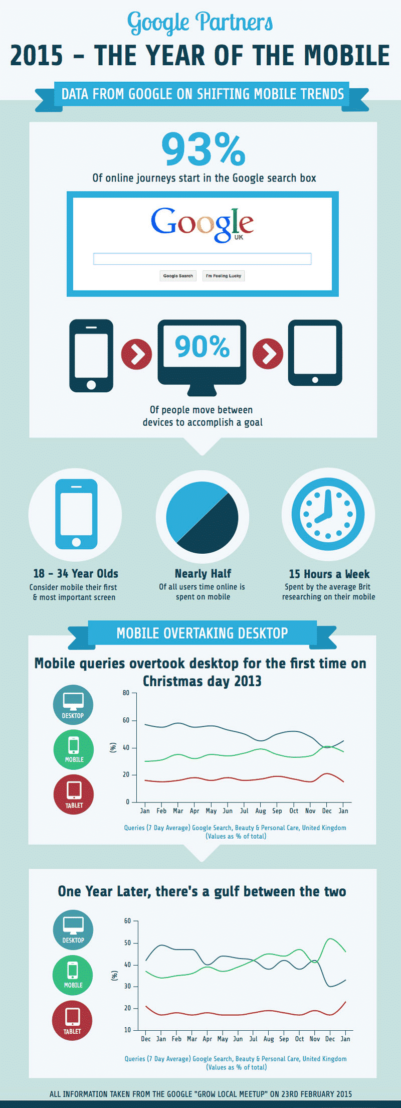
We recently ran a Google Hangout where some of Google’s senior team shared the latest trends and insights on mobile search behaviour – and some of the headlines were truly startling – the speed of change surprising even us.
To help share this data, we’ve put together an infographic which captures some of the key headlines. We think it’s well worth a look!
We’ve seen two pretty clear signals in the last week that, if you’ve not already done it, now is the time to embrace mobile as a fundamental part of your online strategy.
Firstly, Google provided us with some powerful data on mobile search behaviour (that we thought would be great to share) and secondly, on Thursday, Google Webmasters announced that they were expanding mobile-friendliness as a ranking signal in their mobile searches.
If you’ve not considered making your website mobile-friendly yet, or it’s just on your list of things you really need to get around to one day, don’t panic.
We’ve set out some straightforward advice below to help you understand the impact of shifting trends on your business and how to minimise the impact.
Mobile is swiftly becoming the primary device
Everyone knows that more and more people are using mobile to browse the Internet, and that increasing numbers of people are using their devices for shopping.
What you might not realise though, is the speed of that growth and the degree to which reliance on the traditional desktop is dissipating.
We took part of in a Google Meetup with some of Google’s senior UK managers. They shared some great data that really helped put the changes we’re currently going through in context.
Their data showed that nearly half of users time online is spent on mobile – and this trend is only heading in one direction (so given the time taken for the data to be extracted and presented, it’s not too unreasonable to assume that ‘nearly half’ is now at least ‘half’).
Mobile focus is even greater for young people, with 18-34 years olds considering their mobile the first and most important screen.
Behaviour is changing – faster than most people realise
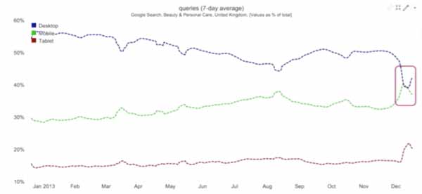
To put this into context here’s a graph for showing Google searches by device within the beauty and personal care sector in 2013.
You can see that the trend is for convergence of mobile and desktop searches – with a brief period over Christmas where searches on mobiles and desktops were equal – a breakthrough moment.
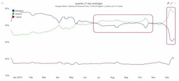
Roll on 12 months though and the picture has transformed. Mobile and desktop use regularly crossover and mobile is becoming the predominant method through which people search in this sector.
The shift is even more obvious at Christmas time, when yet again there is a lurch toward mobile – but this time pushing mobile usage toward twice that of traditional screens.
This is such a vivid illustration of the shift in device usage we’re seeing – and shows really clearly that, in some sectors in particular, if you’re not making sure that your website is mobile-friendly, you’re adversely impacting the majority of your customers.
Desktop search volume is shrinking
If you’re looking to grow your business, then ignoring mobile makes it an uphill battle.
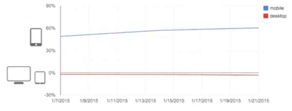
The chart below shows the rate of growth in Google searches over time (broken down into mobiles vs desktops & tablets). As you can see, mobile is showing strong and steady growth and desktop+tablets consistent gradual decline in volume.
If you’re reliant on traffic from desktops, then the percentage of internet traffic that you’re targeting is slowly but surely diminishing – all the growth in internet searches is coming from increasing mobile activity.
Google algorithm changes acknowledge the importance of mobile
If this data wasn’t compelling enough, Google Webmasters made an announcement on Thursday that , from April 21st, Google will be expand the significance of mobile-friendliness as a ranking signal in its mobile search results.
Google has been factoring whether a website is mobile-friendly into its search algorithm since last year and have taken a number of steps to encourage sites to adopt a mobile-friendly approach – including creating a completely separate algorithm for searches taking place on a mobile phone, and labelling sites that meet it’s criteria as ‘mobile-friendly’.
Google’s new announcement suggests that they plan to take much more notice of this moving forward, saying that mobile-friendliness will soon “have a significant impact on our search results’.
This obviously raises issues for companies that don’t reach this standard – as they may see search traffic that they’ve previously taken for granted disappear overnight.
To encourage businesses to get ready for this April change, and to show how serious they are, Google Webmasters have even created a campaign to encourage businesses to make their sites mobile-friendly using the hashtag #mobilemadness
As part of this they’ll be providing advice and guidance on best practice through blogs, live presentations, Q&As etc. so follow them on Google+ to stay up to date if you’re interested!
What actually is mobile friendly?
Google’s full set of guidelines on what a mobile-friendly needs to do is pretty detailed but, in brief, Google doesn’t consider a site to be mobile-friendly if it:
Uses Adobe Flash for content (as Flash does not work on many mobile devices, particularly iPhones and iPads)
Requires users to scroll horizontally on a mobile devices to see the whole page
Has font sizes too small to read
Has buttons or links that are too small or close together to use
One of the best ways of making your website mobile-friendly is using a responsive design. This means that the layout of the web pages automatically adjusts itself to the size of the screen of the user – no matter what device they’re using.
Many content management systems and website platforms (for instance WordPress) are designed to produce responsive websites, so it’s worth checking to see if your site is already responsive – if its been built within the last two years it probably should be.
How do I find out if my website is mobile-friendly?
Google’s provided a handly tool to help you check if your website is mobile friendly, Just visit their Mobile-Friendly Test page, type in your URL and, in just a few seconds, Google will let you know whether your site meets their criteria or not.
If your site doesn’t pass, the tool also provides clear feedback on the issues and gives advice on what you can do to fix things.
What if my site’s not mobile friendly?
There’s going to be a lot of scaremongering from web design companies telling you to go responsive RIGHT NOW!
Don’t freak out.
Promoting mobile friendly sites in search results is another step in the direction that Google’s been travelling for a little while – and this is just a further push.
Don’t rush in and feel that you have to act before the 21st April.
Six weeks isn’t long enough for most businesses to set out what they need, find a good web designer and develop an effective website. More than likely you’ll end up rushing the job and end up with a half-thought through website that puts you in a worse position that you’re in now.
Think before you act
Instead, develop a strategy. Work out what you can afford to do (both in terms of cost and time) and when. From there prioritise actions and set out a clear timeline to get where you want to be.
To help in this, check out your site and get an idea of whether the upcoming change is likely to affect you.
Branded vs non-branded search: Many businesses find that most of their search traffic comes to their site through searches on their brand name. This traffic is unlikely to be significantly impacted by Googles change, as the relevance of your brand to the search will be so strong
Repeat vs new visitors: If most of your visitors are repeat, personalisation of searches and results will again limit the impact of this change
Current % of traffic from mobiles via search: Obviously, if most of your traffic is currently coming from desktops, then your exposure to this algorithm change is smaller
Check out your position vs the competition
Identify the key terms driving search traffic to your website (Google Webmasters Tool is generally the best source for this information if you don’t know it).
Search the key terms from a mobile and see where you lie in the results – and which competitors above and below you are marked ‘mobile friendly’. If most aren’t, then again, its an indicator that the change isn’t going to impact you so significantly.
If, after doing this research, you’re still concerned about the potential impact of the change then it’s you can incorporate actions into your plan to reduce the disruption in the short term. This could be focussing on alternative marketing channels to continue driving traffic, or looking at ensuring your presence in search results via paid search advertising in the mean time.
This should ensure you’ve got time to implement a mobile-friendly strategy that you can be confident delivers what you need for the medium to long term.
If you’re worried about the effects of this change on your business, or feel you need help developing a strong strategy, we’d be happy to talk to you about how we can lend a hand.