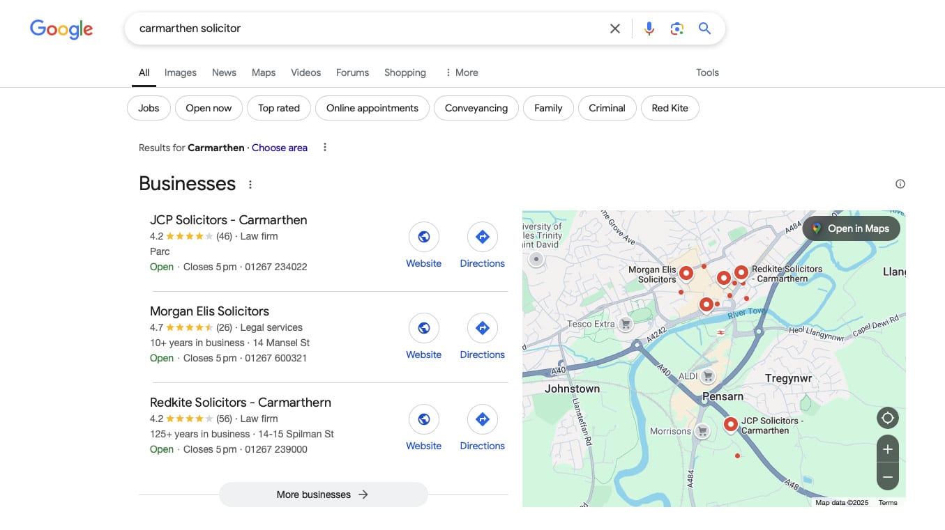
Error Encountered!

My long-suffering partner finally gave up on her old mobile phone last week (or rather the screen gave up on her, after a couple of years of fairly heavy abuse) and she got a shiny new iPhone.  

Since then, she’s spent several days berating the mobile banking app she was trying to set back up, as it resolutely refused to accept her passcode.

Over four days she has at least 20 attempts at putting the right passcode into the app, only to be told each time that the code “needed to be between 5 & 8 characters and a mixture of letters and numbers”.

This infuriated her.

She knows what her passcode is – it’s a 6 digit number, and yet, despite this seeming to fit the error description, it wasn’t being accepted. 

She tried old passcodes, other banking PINs and passwords, all to no avail: the app wouldn’t let her proceed. 

Last night, we were sitting in front of the telly (for the first time in about two weeks I might add) and, after another rant about how poor her bank is and several interesting suggestions about where they might put their app, I suggested she give setting it up another crack.

She put in all sorts of PINs and passwords and personal information as prompted and then got to a screen where she had to enter her debit card details and the dreaded passcode. 

Again, the same error message appeared. At this point I, as a (slightly smug) independent observer, was able to quietly point out that the app was actually asking for her POSTcode. 

The point of this post isn’t to make fun of my better half, to make her sound dumb (she’s far from it!), or even to demonstrate my problem solving skills, but to show that people aren’t very good at paying attention. 

Despite knowing there was a problem, reading the error message several times, and desperately trying to work out what was wrong, my partner decided that it must be the app that was at fault, blamed the company and abandoned the process. 

Look at your analytics and see how many users drop off at key steps and do the maths on that lost value.

What else could you do in the next day that would earn you as much money as spending some time making your process steps easier to follow and your error messages clearer?

Curious during Covid-19

With the current outbreak of COVID-19 and the impact the virus is already having on our countries, customers, our team and their families, we wanted to share information about how Curious is preparing for any further disruption.

Despite the uncertainties that COVID-19 brings, we fully expect to maintain the same level of service excellence to our customers. Our team is set up to connect with our network, colleagues and our customers from wherever they may be, and we’re confident we can continue to help your businesses wherever we’re required to work from.

Our technical platform is fully automated and we’re able to resolve any hardware or software issues without requiring engineers on site. Our technology partners, who provide our hardware are chosen for their resiliency and sophistication whose practices are designed to handle this sort of issue as smoothly as possible.

Thank you so much for trusting us with your business-critical websites. We take this responsibility very seriously and will continue to work hard to ensuring we deliver on our promise to you.

As ecommerce specialists, if your business needs any help or advice as to how you can continue to serve your customers over the coming months, please don’t hestitate to get in touch. We’ll do everything we can to help.

Many thanks

The Curious Team

What colour should my buttons be?

I’ve made passing reference in a couple of previous blog posts about the colour of call to action buttons on pages.

These buttons are a topic that many in the world of websites seem to obsess over. What size should they be, what shape should they be and, most importantly, what colour should they be?

The best colour for a call to action button is a topic has been obsessed over by conversion optimisation specialists across the world in what probably amount to thousands of blog posts.

Red is a bold colour, it stands out on the page and is associated with value (think of all those “Sale” signs in shop windows). Green on the other hand is calmer, less scary and encourages us to “go” (think traffic lights). Unbounce (undoubtedly a company with some expertise in conversion rates) came out and declared the future was a Big Orange Button (BOB).

As you might expect, there’s been a whole host of user testing experiments carried out and published as case studies to support a particular view point. For example, CareLogger tested green vs red buttons on their site:

The result? 34% more people clicked on the red button than when it was green. A clear winner, right?

Well, maybe not. The trouble is that (like anything) it isn’t all that simple…Buttons on a website don’t exist in isolation, they are part of the wider page and need to therefore be sensitive to their context.

Sure red is a strong standout colour but, if the predominant colour scheme of the site is red, then it doesn’t stand out at all.

What’s more important is visual hierarchy: what elements stands out the most on the page?

If your button blends in with the rest of the site, then (whatever colour it is) it isn’t going to perform as well as a button that is more impactful.

Just to revisit that case study from earlier, take a look at the CareLogger page where those buttons were placed: The predominant colour scheme is green. In that instance, of course a red button performed more strongly – it differentiated the call to action from the rest of the page. It could be argued that another colour (perhaps orange, but even purple!) could perform even stronger.

So how to make sure your buttons perform best?

An effective button needs to be bold, stand out, catch your eye and encourage you to click. To that end you should:

  1. Make sure your buttons contrast with the rest of the page
  2. Use text that encourages users to click: communicate the value of what will happen. Not ‘Click Here’ but ‘Get your free report now’
  3. Ignore what works for other people: test the impact of different colours and text and see what works for you

Have you tested different button colours? Let us know what you found below.

Why you need to test your website

Sometimes the websites we create don’t work in the way we hoped.

Sure they might look great, but that’s only one job of a website. The other is to perform – to drive the people that visit your site to find out more about your company and buy from you.

And if they don’t do that, we’ve all got a problem: You’ve invested money in a website and want to see a return on your investment – and equally we want you, as our customer, to be happy.

That’s why we believe that testing your website is so important.

Humans aren’t good at spotting problems

Ever written a document or letter, proof-read it carefully and then sent it, only for someone to immediately point out a spelling mistake?

We’re not all that great at critically evaluating our results – and we often interpret feedback we get to reinforce our perspectives. Our Cognitive Bias leads us to think we know how user feels and acts, and what they want to see – which can hide big problems with the way a website actually performs.

Parts of your website that you see as obvious and straightforward, might actually stump a ‘real’ user.

We try really hard to get it right

When we create website for we use lots of techniques to maximise their chances of working effectively:

  • Design Patterns – This is the technical term for ‘the established way of doing a specific thing’. A great example is the three lines on a mobile website that signify where the main menu can be found.
  • Best Practice – This doesn’t necessarily mean what everyone else is doing, but rather what’s been demonstrated to work effectively at engaging visitors and driving them to action.
  • Experience – The team have been working in the Internet industry for close to 20 years. In that time, we’ve built LOTS of websites and seen how visitors use them. That helps us make better decisions
  • Data – We’re massive fans of data and use it wherever possible to understand how customers are currently using a website, and where there might be problems.

Despite all of this though, we know websites we produce won’t be perfect.

We’re not clairvoyant. We can’t predict exactly how users will use a website – the only real way of telling is to wait and see.

And that’s why, when your website goes Iive, you need to test.

It’s all about the conversion

Your conversion rate is the percentage of visitors that go on to complete your website’s intended objective – whether that’s sign up for a newsletter, buy a t-shirt, or fill in a contact form.

If your website’s not converting then, despite anything else, it’s not working.

Measuring your conversion rate – and improving it – is key to increasing your profitability – in particular as small changes in your conversion rate can have a massive effect on your profits.

But improving your conversion rate is often quite simple – you just need time and to follow a clear process.

What you need

Data, data, data

Most important is to understand what’s going on with your website – and why.

The first step toward this is to install Google Analytics. We’re big fans of GA (though there are plenty of other capable analytics packages out there you can use if you’d rather), mainly because it’s very capable, integrates with a whole range of other software and, most importantly, is free!

Once installed, make sure it’s configured correctly to accurately measure visitors and set up goals to measure the rate at which they covert to conversions.

The downside of analytics though is that it only tells you how many users do what you want them to do – and you need to find out why.

We suggest using click tracking and user tracking tools to show you how users are actually using your site and give you some clues as to why. Hotjar, Crazy Egg and Mouseflow all work well.

You can then supplement these with user surveys and one-on-one testing to find out what’s causing your customers to do what they do.

A flexible website

If you’re going to be able to make your website work, you need to be able to change it.

You could just change the website code to make the site look the way you want but, unless you’re a developer, this can be expensive. The best solution is a content management system that allows you to quickly make changes without needing any coding skills.

We’re big fans of WordPress because it allows you to easily make changes and is massively flexible, but there are plenty of other content management systems out there you can use.

There are also a whole range of website builders out there, like ShopifyWix or Squarespace, that allow you to create and change a website without having to know code* .

Whatever you choose, make sure your website theme is flexible. Many ‘off the shelf’ themes have a really tight structure that constrain the layouts and styles you can use.

Even better, use a theme that’s custom built for you and has the future flexibility you need built in.

Just enough traffic

The only way that you can truly test a website’s performance is by seeing how people use it, and for that you need visitors.

Not loads, but enough. Reliable patterns of behaviour can only be seen once sufficient numbers of visitors have used the site – until then, the one or two user who behave abnormally can effect the results. There’s a measure called statistical significance that tells you that your results are reliable. The exact number of visitors you need for statistical significance to be achieved depends on the circumstances, but it typically requires you need several hundred users before a clear pattern emerges.

It normally takes a bit of time before search engines properly spider your site and start sending traffic, but you can easily use social media or even paid advertising to send small amounts of traffic that mean you can start to spot problems

How to fix it.

1. Watch where users struggle

Use analytics to see where people drop out of your website – in particular look out for key points where you want them to act, like checkouts and contact forms.

2. Ask them why

Use click tracking and survey tools to engage with users and see what’s making them leave. Are they encountering system problems? Do they need more information? Perhaps they just can’t see what to do next.

3. Make changes

Use the insights from customers to adjust the site to fix whatever the problems are.

4. Rinse and repeat

Keep watching your analytics, and see if your changes have made a (hopefully positive) difference. Most importantly, keep experimenting!

Crank up the volume

Once you know your website’s really working, then you can put all your efforts into pushing traffic toward it, confident that for every visitor you get, you’ll know how many customers you’ll get out of the other end!

*That said, the learning curve can be pretty steep for some of the website builders and is likely to take a few days of time working out how to make it do exactly what you need it to.

Google To Start Using Page Speed for Mobile Rankings

Is your website on the slow side? From July 2018, load speed will start affecting a page’s ranking on Google’s mobile search results.

Only the slowest loading pages will be initially targeted, but Google says there is no way to determine whether a page is affected by this change.

Their webmasters’ blog did say: ‘We encourage developers to think broadly about how performance affects a user’s experience of their page and to consider a variety of user experience metrics’.

If you think your website could be affected, we can benchmark your site and, if there are problems, suggest different ways it can be sped up. Give us a call if you’d like our help

To start off, you can get an idea of how fast your website performs using Google’s Page Speed Insight tool.

Zokit Business Award for Customer Focus – We won!

We had a great day at the Zokit SpringConf on Thursday, meeting businesses from across South Wales.

The day was topped off by Curious winning Zokit’s Customer Focus Award,  recognising businesses that have exceptional customer service throughout the whole customer journey.

We’re massive advocates of focussing on your customers’ experience, and so couldn’t be more proud to take the trophy home.

Simon looking rather pleased after getting through his acceptance speech!

Delighted to be nominated for Customer Focus award

We’re really proud to be shortlisted for the 2017 Zokit Customer Focus business award.

The award recognises businesses that have exceptional customer service throughout the whole customer journey – something that we’re really focused on for both our clients and their customers, so being shortlisted is really important to us.

The winner’s announced on the 18th May, and we’ll let you know how we do!

Google confirms site quality matters

So on a Google Webmaster hangout that took place yesterday, John Mueller (a Webmaster Trends Analyst at Google) talked about site quality and architecture, specifically whether the Panda algorithm took these into account when evaluating pages.

When asked if Google takes site architecture into account and if improving the site categories would make a difference to search engine performance, John said:

“We see (Panda) as something that is more like a general quality evaluation of the website that takes into account everything around the site…That is something where, if we find issues across the site where we think this essentially affects the quality of the web site overall, then that is something that might be taken into account there”

You can watch the hangout here:

Whilst, as far as statements go, this is a little woolly, it does go some way to confirming that Google’s looking at a far broader set of factors than most companies typically focus on – and that investing time getting your site architecture and categorisation right upfront will pay dividends in the long term.

Google moves to mobile-first: What it means to you

Toward the end of 2014, Google caused chaos by announcing that, from 21st April 2015, it would introduce a change to its search algorithm that would penalise website that weren’t mobile friendly when showing mobile search results.

The change was swiftly named ‘Mobilegeddon’ and led to many companies rushing to change their websites to meet Googles new rules.

Well, a couple of weeks ago, Google let slip another announcement.

This time, they’ve said that Google will soon prioritise mobile websites as the primary source of information for their search index.

What does that mean?

Google works out who to show in search results by ‘spidering’ the Internet – following each link within a website and seeing where it leads and, as a result, building up a picture of the whole web.

Until now, Google has always done this by browsing around at the full version of websites. What Google is now saying is it will now also browse using a smartphone – and treat those results completely separately – using them as its primary source of information for decision making for the Google search index.

This is significant because some mobile versions of websites don’t include some of the pages on the main site, or they hide some sections of the page to make them easier to read on a phone.

Why ANOTHER algorithm change?

There’s a really good reason for this change. The percentage of people browsing the Internet on their mobiles has exploded over the last few years – to the point where most people now are browsing the Internet on their phones.

% of people using mobiles to use the Internet

As it stands at the moment, it’s possible that users might see a snippet of content on a Google search results page, that might not be there when they actually click through to the mobile site.

By updating it’s index to look at and evaluate the quality of the mobile versions of websites, Google is basically looking to make sure that it’s search results reflect the needs of the majority of it’s users.

When is this going to happen?

Basically, this change has already started happening.

Google are testing the effects now and as they become more confident in things working as they want, they’ll start to roll it out more widely. They expect the whole process to take a few months.

What’s does this mean for me?

If you’ve got a responsive mobile friendly website where the markup is the same across the desktop and mobile versions (& if you’re a Curious client, this will be the case for you), you won’t need to change anything.

Google will likely see your site in exactly the same way, as it does now.

However, if you have a separate mobile site, that is different than your desktop site, then you should start to think about making changes to your website.

Very often, a separate mobile site will contain a subset of pages of the main site; it might hide certain bits of content – in particular sidebars that include additional links; or it could exclude some of the metadata – the technical information about the website that sits within the HTML.

An example of schema metadata within a website

In this case, you’re likely to find that over the next few months, the effectiveness of your website in attracting traffic from search engines, starts to reduce – particularly for those searching on mobiles.

If you do have a separate mobile site, the key things to focus on are making sure all content is available when browsing with a smartphone and that any structured markup is present on both the desktop and mobile versions.

If you find you need to make changes though, the most important thing is DON’T RUSH.

Google will continue to index desktop sites and it’s better to have a working desktop site than a broken or incomplete mobile version!

Is your website ready for a separate mobile index?

For advice on how to prepare your site for the change to Google’s index, or how we can help you better optimise your site for mobile, get in touch. Call us on 0330 010 9000, or just fill in this form.

Are you ready for Penguin 4?


UPDATE: Google announced that the Penguin update went live on Friday 23rd Sept, and that Penguin is now real time and has been incorporated into its main algorithm.


In October last year Gary Illyes, a trends analyst that works at Google, let slip that a new Penguin update would appear in 2015. It never arrived – but all the evidence points that it’s still on its way.

Photo of 4 Penguins

This is good news for Search Engine Optimisation (SEO) companies and marketeers that are optimising their websites for search engines the ‘right way’ (basically, following Google’s Webmaster Guidelines). For those that have been taking a more unethical approach to SEO though, the news might not be so welcome!

What Is Google Penguin 4?

Back in April 2012 Google made an update to it’s algorithm that it named ‘Penguin’. It was designed to identify websites that were spamming it’s search results by buying links (or getting links through link networks created to boost search engine rankings). 

It had an immediate and significant effect. Sites that weren’t playing by the rules suddenly disappeared from search results, and many websites were notified of manual penalties that had been applied to their search engine rankings –  either demoting them many pages down, or removing them entirely.

Inter flora Search Performance
Interflora were one of the larger names hit by the first Penguin update: their search traffic fell to pretty much nothing overnight.

Since then, there have been a number of further ‘Penguin’ updates made. Each time the there are significant changes to the  search results – with generally, the sites that are approaching their marketing fairly seeing positive results and those trying to game the system being negatively impacted.

Penguin 4 is the name that’s been given to the next big update that’s will focus on combatting ‘spammy’ linking.

With Penguin 4 changes become real time

Each time a new Penguin Update  gets released, websites previously penalised that have worked to remove bad links (for instance through the Google disavow links tool) can regain rankings and, equally, sites that have not previously caught might get trapped.

The downside of this, is that it takes a fairly long time for the effect of changes to a website (whether positive or negative) to reflect in search results. Sites that have been penalised (whether fairly or unfairly) have to wait a long time before they can recover, and some companies are still finding quick wins by using spammy techniques in the gaps between updates.

Penguin 4  is rumoured to look to address these problems by introducing a real-time element to the algorithm – effectively meaning that the Penguin portion of the algorithm will always be “on” and updating, processing information about new links in real time and  making adjustments accordingly.

This should mean that Google will catch spam link profiles more quickly and allow companies that have identified and resolved issues to recover faster.

When’s Penguin 4 coming?

Well, we’re still waiting right now, but the signs are its imminent.

After the news broke last year that Penguin 4 was coming, the SEO community, have been watching carefully for the effect of it hitting. After being questioned when Penguin 4 didn’t appear in 2015,  Gary Illyes reported in January that we were “weeks away” from seeing the next iteration. 

However as of today, there’s still no sign and Google have confirmed it’s not live yet. Gary’s said he’s now not giving out any more dates for fear of being wrong should it be missed again because it’s not quite ready.

Why the delay? Well, we’re not sure, but the general consensus is it looks like Google’s taking it’s time to get it right – which, given the wide ranging effect these updates have, is a good thing!

What does this mean for me?

If you run a website, you might be wondering what a real-time Penguin algorithm means for you, or what you should be doing to prepare for the update.

Firstly, if you’re not already doing it, rather than trying to game search engines, focus on creating quality content. Earn links and don’t buy them. Focus on providing the best user experience you can and, rather than fixating on your rankings, allow them to improve naturally.

Secondly, it’s worth making sure that there aren’t any problems with the links that you’ve already got pointed towards your website (and if you’ve ever purchased links on Fiverr or have engaged the services of someone who emailed offering cheap SEO services – this is ‘must do’).

Checking and cleaning backlinks

Making sure that the links to your website from other sites across the Internet aren’t going to cause you a problem is fairly straightforward:

1. Create a comprehensive list of backlinks

There are lots of tools available on the web to help with this, but it’s worth using as many sources as possible to get a comprehensive list and then de-duping. Google Search Console is a great place to start, but Majestic.com, Open Site Explorer and Ahrefs.com are pretty good too.

2. Look for patterns

Once you’ve got your list of links look for indicators that unnatural practices have been used.  This could be the same Anchor Text repeatedly used, similar dates that backlinks were created, or the same IP address being used.

3. Remove or Disavow suspect links

If there are websites that  are suspect, its time to remove them. It might sound painful, but it’s better to remove low quality links before anything happens, rather than after you’re penalised.

Start off by asking site owners to remove or ‘nofollow’ the links, sending messages via the sites’ contact forms or their registered owner (you can find this out through Whois).

After you’ve done this, you can use Google Search Console to disavow those that remain.


If you’re concerned about your site being impacted and want some expert help, get in touch. We’ve got tons of experience with helping companies that have run into trouble and can give you clear advice and assistance to get things fixed quickly.

“If a door handle needs a sign, it’s probably faulty,”

Donald Norman, director of The Design Lab, and author of “The Design of Everyday Things” of a door that displayed a ‘Push’ sign on a pull handle the quote above.

Kind of really sums up usability in my opinion (both on the web and in the real world): at it’s best you don’t need instructions, you naturally know what to do.

New website for Cosy Under Canvas

We’ve recently put live a new website for Cosy Under Canvas: a fabulous glamping site near Hay-on-Wye, offering fantastic domes that come with comfy beds and private hot tubs – all in a beautiful woodland setting!

The new website is fully responsive and uses full-screen video to capture the essence of the Cosy Under Canvas experience.

Responsive website for Cosy Under Canvas

After a little time to bed-in, the on-site analytics data shows that the new website has reduced number of users that leave straight away (the bounce rate) by more than 25% year on year – as well as driving an increase in reservations.

Emma Price, the site’s owner, told us:

“I came across Curious quite by accident and as I was in a difficult situation with my existing web developer I thought I would give them a call. I am delighted that I did so. Working with Simon and his team is a pleasure. They are keen, quick and confident and communication with them is faultless. They are cheerful, creative and insightful as well as being very efficient. High quality design and build work is produced quickly and thoughtfully with excellent attention to detail. I would not hesitate in recommending I Am Curious for any web design, optimisation or online marketing project commissions”

Emma Price – Cosy Under Canvas

Want to find out if we can transform your website?

Request a free website review to see how you can make more money from your website.

The Biggest Mistake Most Companies Make During a Website Redesign (And How to Fix It)

Put aside the look & feel and first focus on the content

When most companies redesign their websites, they normally start with, well, the design.

The process typically starts with a design brief, and the first output will usually be a beautifully rendered design concept filled with placeholder text – generally Lorem Ipsum. It might look something like this…

Website with Lorem Impsum

Lorem Impsum is pseudo-latin text that’s used by designers to fill spaces that are intended to have text in. The idea is that it gives a visual sense of the what the page will look like but, as it’s effectively nonsense, doesn’t inadvertently colour the viewer’s meaning of the page.

There’s an inherent problem with that though: the meaning a web page communicates is fundamental to how well it works.

In evaluating a design that’s filled with placeholder text, you have to make assumptions about the final content that will sit on the page – the information the page is going to communicate. With that in mind, you’ve no real idea if it is going to be effective in getting your message across to users or not.

Copy is important

When designing a website, copy is generally seen as the design’s poor cousin – the last thing that gets slotted in – and when you think about it, that’s crazy. You can have the slickest design imaginable but, when it comes down to it, the words are the most important thing on your website.

People might glance admiringly at your glossy design but, without compelling words, it’s unlikely that they will buy anything.

It’s frustrating then, that finding the right text to sit on the pages is so often a last minute affair – the final task before the site can go live.

‘Design first’ hobbles websites

There is a second problem that Loren Impsum creates: when you eventually come to replace it with copy, you’re left with the challenge of writing the right amount of copy to fit the space.

Now, chances are that the perfect message for a particular space isn’t going to match the pre-defined amount of space left by the placeholder text. This leaves you with three pretty unpalatable choices:

  • Use the perfect copy for the circumstances, but break your design
  • Make compromises with the copy to fit the available space
  • Redesign the site to fit the final copy

Depending on which you pick, you’re either stuck with a sub-par website or a bill for additional work.

Take a look at this (rough) example:

Image showing problems fitting content into a design

What might look like a sensible design goes to pot when you add in finalised copy.  Adding in real words, rather than convenient dummy text, overflows spaces, pushes alignments out, and breaks the intended design layout.

There must be a better approach.

Content first

Instead of immediately focussing on the design, try flipping the process on it’s head.

Start instead with setting out the content that should appear on each page:

  • Define the objectives of each page: who should it be appealing to, what action(s) do you want them to do?
  • What are the key brand messages you want to communicate to them
  • What information do your users need to know before they’ll the action.

Once you’ve got the guidelines for the content, you can start writing – set out the headlines and titles and then flesh out the words underneath.

When you know exactly needs to appear on the page, you can then create a layout, including headlines, body copy and images, that communicates your messages effectively

Finally, you can apply a look and feel that’s relevant for the layout and creates a webpage that’s coherent and relevant to the audience.

Image showing design being applied to defined content

Better all round

It’s not just a question of creating a more coherent site. We’ve found that this approach allows for a much smoother process all round.

Focussing on the objectives and audience creates a far more tightly focussed website – not something that’s driven by a graphic design concept.

It’s much easier to catch and correct issues. The process creates some really clear stages where the client gets to review and correct thinking:  defining objectives; producing content; setting layouts; and final design.

And if something’s not right? Well, it only means redoing the last package of work – coming up with alternate designs is pretty simple if everyone’s agreed on the broad layout of content on the page. Equally experimenting with different layouts of what people agree to be the required content is pretty straightforward.

Paradigm Shift

We need make sure that content is the starting point, not an afterthought. After all, if a website doesn’t work, it doesn’t matter what it looks like:

“Design is not just what it looks like and feels like. Design is how it works”

Steve Jobs

Flipping the design process upside down creates a far better outcome: Web content that is focussed on guiding users down a path – meaning a website delivers on both the user’s and the business’ goals.


We’d love to know what design process works for you. Have you found issues with this approach? Has it come up trumps for you? Let us know.

Four ads on top? Google’s search result changes and what they mean

For a few months now, Google has been testing different ad layouts on it’s search results pages – principally moving the paid advertising from the right hand sidebar, into the main column of content.

Well, it now seems that they’ve finished testing and are rolling out the change more widely. This is likely to have a pretty significant impact on search behaviour.

Upsetting the status quo

For a while now, search results have always looked a bit like this:

Screenshot of Google Search Results

Two columns of results, the main column including up to three adverts at the top and then natural search results, with more ads, shopping results and other widgets in a right hand sidebar.

Google’s been testing alternative layouts for a while, and the version that’s been spotted in the wild most is a single column: 4 adverts followed by natural search results, Google Local results and, at the bottom, further adverts. Like this…

4-ads-Screenshot


Well, it seems that as of this week, Google’s rolling out this change more widely.  Moz have been tracking this and have seen this layout now appearing around 20% of the time. Graph showing jump in appearance of 4 advert search results

Why are Google changing?

Google plays their cards pretty close to their chests about what’s driving any particular test, but there are likely to be three factors:

1. Revenue

Google need to ensure their profits maintain a positive trajectory and, despite having fingers in lots of pies, advertising still makes up over 90% of their revenue.

Google need to ensure that people see, and click on, the ads in their search results and trying new format layouts allows them to find ways to increase this.

2. Mobile penetration

Mobile is becoming the primary way people view the web. It could be that, as the results sidebar doesn’t fit on a mobile screen format, Google are trying to al

3. Improved service (for advertisers!)

With Knowledge Graphs, Paid Shopping Blocks, and Google Local panels appearing the right hand column over the last few years, adverts are often pushed below the fold. There’s likely to be pressure from advertisers to ensure that ads are more consistently viewed on screen.


Whatever the driver it’s clear that things are still a little volatile, but it’s reasonable to predict that this screen layout become the status quo.

What does it mean to me?

If you’re a Google Adwords user, it’s simple. The first four ad spots become far more valuable. If your ad appears below position 4, the chances are the number of clicks you’re going to get will drop significantly – the ads are far less likely to get seen. With that in mind, you’ll need to adjust your bid strategies accordingly.

Beyond Google Adwords, the impacts are more wide ranging. Obviously, if an extra advert is being squeezed on to the top of the page, the natural search results get pushed down a bit.

That doesn’t sound like the end of the world, but a large number of people aren’t aware that any of the search results are advertising – the last research I saw put the figure at 36%. So the effect of the extra ad is likely to be that being top of natural search for a given term is likely to deliver less reward than it has.

There’s a problem though…what happens when Google decides to show other content as well as its Ads in the search results?

Well, here’s the results page for ‘cardiff hotel’. As you can see Google Local results are appearing immediately below the adverts, which means all natural search results are pushed well down the page, below the fold. In this circumstance you can expect the Adverts to get a far higher proportion of clicks from the page than they traditionally would.

Search results page for 'Cardiff Hotel' showing no natural search results

So, what should you do? Well, the first thing should be to keep an eye out. Use your analytics to track traffic from Natural Search and see if performance levels change.

If you want to try and recover any lost traffic, well, the obvious answer is start using Google Adwords to appear at the top of the page. By testing ads on your key terms to see if they’ll deliver you profitable traffic to your website, you may find that you can actually get more traffic than you had before!

We’d love to know your experiences of these changes. Have you seen a dip in traffic levels in the last few days? Let us know in the comments.


Update – 23/2/16

Google have now confirmed that this new layout “is designed for highly commercial queries where the layout is able to provide more relevant results for people searching and better performance for advertisers.”

Effectively this means on searches where customers express an intention to buy. Despite their comment, we are seeing it pretty broadly though!

How to clean up spam traffic from your website analytics

Have you noticed strange traffic patterns in your analytics reporting? Massive spikes in traffic that don’t relate to any of your marketing activity or are you sitting back wondering why what appear to be thousands of visitors aren’t translating to new business?

It could well be that all isn’t as it seems and that you’re suffering from ‘Referral Spam’.

Can of spam

Referral Spam is effectively ‘ghost traffic’: rather than real site visitors, it’s traffic generated by computers, and in some cases never even touches your website server.

Whilst it’s normally fairly harmless, it can prove a massive annoyance for people looking to get meaningful information from their website analytics, and mislead website owners into thinking they’re getting more traffic than they really are.

Referral Spam has become more and more prevalent over the last year or so to the point that most websites will be affected by it in some way.

Read on to find out what it is, how to spot it, and more importantly – how to correctly strip it out of your analytics reporting.

What is Referral Spam

Referral spam is the footprint left by web ‘bots’ (computer programs) that scan the web looking for targets to attack. These bots scan thousands of websites, sending out a fake request to the website’s server for a page. Each web server records the details of these requests in their access logs.

Alternatively, other bots just target your Google Analytics ID, leaving behind a fake set of data about traffic that’s visited your site.

If you look in Google Analytics for your website, you may well be able to see some of these requests (Look in the report at Acquisition > All Traffic > Referrals).
Referral Sources Report showing Referral Spam

In the column of referrals sources, you may see websites that you’d expect to send traffic to you, but you’re also likely to see names like:

    • semalt.semalt .com
    • buttons-for-website .com
    • anticrawler.org

These are referral spammers.

Why do they do it?

Referral Spam tends to be happen because either:

1. Spammers want to promote a website and are trying to get you to visit the site or use a search engine to search for it.

They’re hoping that you will notice these strange URLs in your analytics or weblogs and visit the pages to see what they are about. This could just be because they’re looking to drive traffic to pages selling something, or sometimes these pages contain malware or viruses, and their goal is to infect as many people as possible.

2. They want to boost their rank on Google search engine results pages.

Some websites’ access logs are publicly available via a webpage so, when spammers make their fake requests to websites, they are hoping that this will be publicly recorded along with their URL. When search engines later scan these pages, they’ll see these links to the spam site which will potentially improve the spammer’s SEO rankings.

Can I stop Referral Spam?

The short answer is not really.

It’s nigh on impossible to block all the ghost traffic to your website without being sure you’re not affecting real users, BUT  you can make sure that it doesn’t affect your reporting.

There’s lots of advice as to how you can exclude spam traffic from your analytics reporting, however some of it (such as filtering out individual sites) is like playing whack-a-mole, and some (such as using the referral exclusion setting*) is just wrong.

The most effective approach is to create a data view that filters out all traffic that doesn’t physically visit your website – and it’s fairly simple to set up.

Filtering Referral Spam from Analytics

We’ll show you the steps you need to follow in Google Analytics as that’s the most common system used out there, but similar approaches can be followed on most other analytics platforms

We’ll be creating a filter on your  analytics data.

You can apply a filter to your main view in Google Analytics, but if you do that you’re permanently excluding this information from your reports, which means you’ve no way of seeing what you’re filtering out.

When creating filters, we always suggest using a new ‘view’ of your data. That way, if something goes wrong,  you’ve still got a complete set of data that you can compare back to.

So, first of all, let’s create a new view…

Log into Google Analytics and click on Admin in the top navigation. This will take you to the Administration screen where information on your Account, Properties and Views is displayed.

Make sure the correct website property is selected and then click on the ‘view’ drop down:

You’ll then see an option to ‘Create new view’

Google Analytics Screenshot - Create New View

You’ll then be asked to enter a ‘Reporting View Name’ and set the ‘Time Zone’. We’re going to call this view “Spam Free” and set the Time Zone for “United Kingdom”, “London” time, and then click the ‘Create View’ button.

Google Analytics Screenshot - New View Settings

You’ll then be taken back to the Admin page with your new view selected.

Google Analytics Screenshot - Admin Menu

First off,  click on ‘View Settings’. That will take you to a screen where you can set your default currency and enable ‘Bot Filtering’. Whilst this  function (Excluding all hits from known bots and spiders) sounds great, the reality is that it’s not all that effective – however, every little helps!

Google Analytics Screenshot - View Settings

Next, click on the ‘Filters’ tab on the left navigation. Here you’ll see a red button with an option to ‘Add Filter’.

Google Analytics Screenshot - Add Filter

Clicking on the Add Filter button brings up a series of options

Google Analytics Screenshot - Filter Options

To set up the correct filter, you’ll need to enter a name – we’ve called this one Exclude Referral Spam.

Then, leaving the ‘Filter Type as ‘Predefined’ select the following from the three drop down boxes:

‘Include only’  ‘traffic to the hostname’  ‘that contains’

Finally in the text field, type the main part of your web domain. It’s very important you don’t include the http or the www.

This instruction tells Google Analytics to only record traffic to your website when it emanates from your server name.

Google Analytics Screenshot - Filter Settings for Hostname Filter

Finally click the blue ‘Save’ button and you’re done.

This filter should now exclude the majority of spam from your analytics view – you just need to remember to select the ‘Spam Free’ view when you log on.

If you’ve set up Goals or Ecommerce Tracking on any other view, you’ll need to copy those onto the ‘Spam Free’ view if you want to be able to use them in your reports.

Finally, also remember that Google Analytics settings only affect reports from the date they are set up onward, so they can’t and won’t clean up historical data.

Let us know how you get on, and also if you know of any other ways to improve handling of referral spam in analytics reporting.

*Although the name sounds appropriate, referral exclusions are designed to ensure traffic being passed between a company’s domains is reported correctly – using this to tackle referral spam will make any data problems worse.

Story Telling – The Art of Emotional Marketing

If you’ve been on social media today there’s probably one thing that’s dominating your feed – The John Lewis Christmas Advert.

In case you haven’t seen it, it goes a little something like this:


A little girl is looking through a telescope where she spots a man on the moon. He seems a bit lonely, but when she tries to contact him he doesn’t respond because he can’t see her. She decides to send him a present, on a balloon (very Up), which is a telescope so he can see her back.

As per every John Lewis Christmas advert it plays on your heart strings. You feel sorry for the lonely old man on the moon and you coo over the kind little girl trying to show him she’s there.

You feel happy and joyful when he can finally see her little face, smiling and waving to him from the Earth.

Not One Product in Sight

It’s an advert you instantly remember and one you’ll know is for John Lewis within the first 5 seconds of it starting.

It’s for this reason that the John Lewis Christmas campaigns are so special and so fascinating – because at no point in this advert does it feature any products for sale, nor a single bit of information on the company being advertised.

At no point in the advert does it try and sell you something.

The majority of Christmas adverts on TV will talk about price and what to buy this Christmas. Toy stores will talk about the latest action figure available, shops stocking a multitude of items may talk about delivery or prices, clothing brands may show you what the trends are for this years Christmas party.

But John Lewis mentions nothing of these.  We know nothing about what John Lewis has on sale this Christmas. We don’t know anything about opening times, delivery information or any deals they may have running over the festive season.

So why is it then that the John Lewis Christmas campaign is arguably one of the most successful advertising campaigns of the decade, and is responsible for them racking up some £734 million in the 5 weeks up to the 28th of December 2014?

Two words : Story Telling.

It’s an Emotional Rollercoaster

Humans love stories. They’re powerful and capture the imagination. Each part of a story allows you to feel an emotion. Be it happy, sad, anxious, excitement… the list is endless. And when it comes to consumer behaviour, emotion is key.

To get into the geekiness of things, here’s why emotional marketing works:

We may think of ourselves as logical beings, but actually we’re emotional and base the majority of our decisions on emotion. When thinking about a brand or a product, we’re most likely to evaluate it based on a feeling towards it rather than any information about it.

So for example, if I was to show you a picture of a logo of an animal and ask you to donate £2 a month, you’d probably decline because all you’ve remembered is that it’s a dog charity that wants £2 a month.

If I was to show you a picture of a dog, looking incredibly sad, lonely and showing obvious signs of abuse, you feel sad for the dog, anger towards how it got into that situation and a feeling of needing to help.

When you find out for a little sum of money you can help get dogs, like this one, out of these horrible situations you are likely to donate. Why? Because donating has made you feel better about the situation, it has made you feel pro active and that you’re playing a part in giving these animals a better life.

Therefore, creating an emotional response to an advert has a far bigger influence on consumer behaviour than that of an advert simply showing products.

So when John Lewis plays out a story (be it Monty the Penguin in his quest for love, the little boy excited to give his parents the Christmas gift he’s bought them or in 2015, the man on the moon lonely at Christmas), it’s the emotional rollercoaster we go through in those 2 minutes that has made John Lewis’ Christmas sales rocket year after year.

So when you’re watching the adverts on TV this year, have a think about the ones you remember.

Do you remember it for the information, or because of an emotion its made you feel?

Then look at your own marketing campaign: Does it connect emotionally with your customers? Or are you basing your advertising on boring business logic?

Nearly half of FTSE 100 face ‘Mobilegeddon’

Back in February, Google announced that, from April 21st, it would increase the importance of mobile-friendliness as a ranking signal in its mobile search algorithm. In short, they gave website owners an ultimatum: fix your mobile user experience.

We’re now just one week away from the date their algorithm change takes effect and it’s clear that a significant number of companies are struggling to get ready for the change – to the extent that the web has dubbed the change ‘Mobilegeddon‘.

We thought we’d find out just how ready companies in the UK are for the change, and so analysed the websites of the FTSE 100 to see whether or not they were prepared.

Photo of City of London Skyline - Home to the FTSE
City of London – Home to the FTSE


Whilst we were expecting to find a few issues, we were shocked that nearly half didn’t meet Google’s mobile-friendly standard.

What we did

We ran each FTSE 100 company’s website through Google’s Mobile Friendly Test to find out whether Google considers each website ‘mobile friendly’ or not and recorded the results shown. All the testing was carried out on the 14th April 2015.

We found that 50 companies passed Google’s test and 47 failed.

Surprisingly, those failing the test included household names such as HSBC, Standard Life and Next.

A further three companies (M&S, Persimmon and Reckitt Benckiser) have separate mobile-specific websites which, whilst not following Google’s preferred approach to mobile-friendliness, would be expected to meet mobile-friendly standards.

The ‘Mobile Friendly Test’ Results

The full results of the test are below:

Results of the test of FTSE 100 websites

The most common issues we identified with the sites were:

  • Links spaced too closely together – making it hard for users to select the right link
  • Mobile viewports not being set – making the site appear bunched up
  • Text too small to read
  • Content wider than the mobile’s screen

The graph below shows which problems occurred most frequently:

Graph showing mobile errors found on FTSE100 Websites

Now, it’s possible that the companies that are not currently showing as mobile friendly are planning an update to their websites – but with just seven days to go until Google makes its algorithm change, they’re leaving it a little late.

What this means

It’s important to remember that just because Google doesn’t believe your site is ‘mobile friendly’ it doesn’t mean that users on mobiles can’t access your website.

What it does indicate is that there are likely to be problems for uses on mobile devices when trying to use the site, and Google has strongly indicated that if a website doesn’t pass this test it will have a “significant impact” on their search results.

With searches on mobile devices now accounting for over 50% of web searches, if your site doesn’t meet Google’s standards, 50% of your natural search traffic could be at risk.

What you should do

If you’ve got a website and aren’t sure about whether you’re going to suffer from ‘Mobilegeddon’, we’ve put together an review of the shifting patterns in mobile search, detail about Google’s change and what you can do about understanding the impact on your website.

If there’s more you’d like to know, or you need some advice, we’re happy to have a chat.

Get help now by calling us on 0330 010 9000 or fill in this quick form.


2015 – Year of the Mobile: Infographic

We recently ran a Google Hangout where some of Google’s senior team shared the latest trends and insights on mobile search behaviour – and some of the headlines were truly startling – the speed of change surprising even us.

To help share this data, we’ve put together an infographic which captures some of the key headlines. We think it’s well worth a look!


If you want more information on Mobile, read our article on the latest mobile trends, how Google is changing it’s search algorithm to take account of them, and what you can do to keep up.

(Click infographic to enlarge)

Mobile-Madness


Share this Image On Your Site


#MobileMadness – Is your site mobile-friendly?

We’ve seen two pretty clear signals in the last week that, if you’ve not already done it, now is the time to embrace mobile as a fundamental part of your online strategy.

Firstly, Google provided us with some powerful data on mobile search behaviour (that we thought would be great to share) and secondly, on Thursday, Google Webmasters announced that they were expanding mobile-friendliness as a ranking signal in their mobile searches.

If you’ve not considered making your website mobile-friendly yet, or it’s just on your list of things you really need to get around to one day, don’t panic.

We’ve set out some straightforward advice below to help you understand the impact of shifting trends on your business and how to minimise the impact.

Mobile is swiftly becoming the primary device

Everyone knows that more and more people are using mobile to browse the Internet, and that increasing numbers of people are using their devices for shopping.

What you might not realise though, is the speed of that growth and the degree to which reliance on the traditional desktop is dissipating.

We took part of in a Google Meetup with some of Google’s senior UK managers. They shared some great data that really helped put the changes we’re currently going through in context.

Their data showed that nearly half of users time online is spent on mobile – and this trend is only heading in one direction (so given the time taken for the data to be extracted and presented, it’s not too unreasonable to assume that ‘nearly half’ is now at least ‘half’).

Mobile focus is even greater for young people, with 18-34 years olds considering their mobile the first and most important screen.

Behaviour is changing – faster than most people realise

To put this into context here’s a graph for showing Google searches by device within the beauty and personal care sector in 2013.

You can see that the trend is for convergence of mobile and desktop searches – with a brief period over Christmas where searches on mobiles and desktops were equal – a breakthrough moment.

graph1

Roll on 12 months though and the picture has transformed. Mobile and desktop use regularly crossover and mobile is becoming the predominant method through which people search in this sector.

The shift is even more obvious at Christmas time, when yet again there is a lurch toward mobile – but this time pushing mobile usage toward twice that of traditional screens.

graph2

This is such a vivid illustration of the shift in device usage we’re seeing – and shows really clearly that, in some sectors in particular, if you’re not making sure that your website is mobile-friendly, you’re adversely impacting the majority of your customers.

Desktop search volume is shrinking

If you’re looking to grow your business, then ignoring mobile makes it an uphill battle.

The chart below shows the rate of growth in Google searches over time (broken down into mobiles vs desktops & tablets). As you can see, mobile is showing strong and steady growth and desktop+tablets consistent gradual decline in volume.

graph3

If you’re reliant on traffic from desktops, then the percentage of internet traffic that you’re targeting is slowly but surely diminishing – all the growth in internet searches is coming from increasing mobile activity.

Google algorithm changes acknowledge the importance of mobile

If this data wasn’t compelling enough, Google Webmasters made an announcement on Thursday that , from April 21st,  Google will be expand the significance of mobile-friendliness as a ranking signal in its mobile search results.

Google has been factoring whether a website is mobile-friendly into its search algorithm since last year and have taken a number of steps to encourage sites to adopt a mobile-friendly approach – including creating a completely separate algorithm for searches taking place on a mobile phone, and labelling sites that meet it’s criteria as ‘mobile-friendly’.

Google’s new announcement suggests that they plan to take much more notice of this moving forward,  saying that mobile-friendliness will soon “have a significant impact on our search results’.

This obviously raises issues for companies that don’t reach this standard – as they may see search traffic that they’ve previously taken for granted disappear overnight.

To encourage businesses to get ready for this April change, and to show how serious they are, Google Webmasters have even created a campaign to encourage businesses to make their sites mobile-friendly using the hashtag #mobilemadness

mobile-madness

As part of this they’ll be providing advice and guidance on best practice through blogs, live presentations, Q&As etc. so follow them on Google+ to stay up to date if you’re interested!

What actually is mobile friendly?

Google’s full set of guidelines on what a mobile-friendly needs to do is pretty detailed but, in brief, Google doesn’t consider a site to be mobile-friendly if it:

  • Uses Adobe Flash for content (as Flash does not work on many mobile devices, particularly iPhones and iPads)
  • Requires users to scroll horizontally on a mobile devices to see the whole page
  • Has font sizes too small to read
  • Has buttons or links that are too small or close together to use

One of the best ways of making your website mobile-friendly is using a responsive design. This means that the layout of the web pages automatically adjusts itself to the size of the screen of the user – no matter what device they’re using.

Many content management systems and website platforms (for instance WordPress) are designed to produce responsive websites, so it’s worth checking to see if your site is already responsive – if its been built within the last two years it probably should be.

How do I find out if my website is mobile-friendly?

Google’s provided a handly tool to help you check if your website is mobile friendly, Just visit their Mobile-Friendly Test page, type in your URL and, in just a few seconds, Google will let you know whether your site meets their criteria or not.

If your site doesn’t pass, the tool also provides clear feedback on the issues and gives advice on what you can do to fix things.

What if my site’s not mobile friendly?

There’s going to be a lot of scaremongering from web design companies telling you to go responsive RIGHT NOW!

Don’t freak out.

Promoting mobile friendly sites in search results is another step in the direction that Google’s been travelling for a little while – and this is just a further push.

Don’t rush in and feel that you have to act before the 21st April.

Six weeks isn’t long enough for most businesses to set out what they need, find a good web designer and develop an effective website. More than likely you’ll end up rushing the job and end up with a half-thought through website that puts you in a worse position that you’re in now.

Think before you act

Instead, develop a strategy. Work out what you can afford to do (both in terms of cost and time) and when. From there prioritise actions and set out a clear timeline to get where you want to be.

To help in this, check out your site and get an idea of whether the upcoming change is likely to affect you.

Use Google’s tools to predict the impact

Use Google Analytics and Google Webmasters tools to understand the traffic coming to your website. Look at:

  • Branded vs non-branded search: Many businesses find that most of their search traffic comes to their site through searches on their brand name. This traffic is unlikely to be significantly impacted by Googles change, as the relevance of your brand to the search will be so strong
  • Repeat vs new visitors: If most of your visitors are repeat, personalisation of searches and results will again limit the impact of this change
  • Current % of traffic from mobiles via search: Obviously, if most of your traffic is currently coming from desktops, then your exposure to this algorithm change is smaller

Check out your position vs the competition

Identify the key terms driving search traffic to your website (Google Webmasters Tool is generally the best source for this information if you don’t know it).

Search the key terms from a mobile and see where you lie in the results – and which competitors above and below you are marked ‘mobile friendly’. If most aren’t, then again, its an indicator that the change isn’t going to impact you so significantly.

If, after doing this research, you’re still concerned about the potential impact of the change then it’s you can incorporate actions into your plan to reduce the disruption in the short term. This could be focussing on alternative marketing channels to continue driving traffic, or looking at ensuring your presence in search results via paid search advertising in the mean time.

This should ensure you’ve got time to implement a mobile-friendly strategy that you can be confident delivers what you need for the medium to long term.


If you’re worried about the effects of this change on your business, or feel you need help developing a strong strategy, we’d be happy to talk to you about how we can lend a hand.

Just give us a call on 01267 239 910 or fill in this form, or email us on [email protected].

My favourite website in the world – and what we can learn from it

Back in 2012, Water Services Ltd put live their new website. I think anybody working in the web industry would agree that it really is a thing of beauty – a gift that keeps on giving.

Just when you think you’ve taken in all there is to see, you uncover some other little detail that brings another shiver of joy…

My favourite website in the world

Obviously, it’s awful.

But, it’s so awful that it transcends awfulness and becomes something fantastic!

From the wonderful 80’s video game music that welcomes you at massive volume as soon as the site loads, the crazy number of different animations on the page to the random Roman Centurion, I love it.

It’s a beautiful lesson in how not to design an effective website. To help you avoid the same mistakes, here are some of their techniques you should probably look to avoid:

Animation

Movement is distracting. That’s not to say avoid it completely, but make sure it’s working for you, not against you.

There’s so much happening on the Water Services Ltd site that your attention is being pulled around the screen making it really hard to focus on anything in particular.

Autoplay

One word: don’t. The last thing you want people to do when the arrive on your site is have them panicking for the volume button or some other way of shutting off the noise you’re making (often closing the browser).

A key rule of usability is don’t take control away from users: let them decide whether they want to play that video or listen to music whilst they browse.

Creating Confusion

People aren’t great with choice. Choices confuse us. If you want proof, take a read of this famous study of jam sales.  Give a users too many options as to what do and we freeze – we suffer choice paralysis and are very likely to make the easiest decision possible – to leave.

Keep things straightforward and direct users down a clear path to your ultimate goal – rather than bewildering them with options.

‘Mystery Meat’ Navigation

‘Mystery Meat’ was a term applied to Website Navigation by Vincent Flanders to describe a navigation where the link isn’t visible until someone hovers over it (the name comes from the bland unidentifiable meat served in dodgy cafeterias that could be anything).

Mystery Meat Navigation (or MMN) is basically a bad idea: if your users have to guess where they need to click to do something – chances are they won’t do it.

See the rotating circle of images in the middle of the page? You knew that was how to navigate to the different section pages didn’t you?

Distract from the message

The majority of websites’ main objective is to communicate a message. Images and design should aim to support that process – adding context to the message, making a load of plain text more visually appealing, or perhaps illustrating a point to make it easier to understand.

If your design isn’t supporting your message, but is in fact obfuscating it – either by drawing your attention away or, in this case, often by just covering it up – then it’s failing. Far better to strip it away and get your message across!


All that said, I’m not completely oblivious to the possibility that Water Services Ltd have built such an unusual website on purpose.

It’s so bad, it’s hard to believe that anyone would sign off the design for any other reason. Perhaps this was the only way they could think of to get people talking about the site? If so, it might be working beautifully.

What do you think? Do you know a WORSE website? Tell us in the comments below!

DNS: what is it and why you really should care

Here’s a couple of quick questions for you: Do you have control of your web domain? And do you know the password for it?

If you can definitively answer yes to both of these then great – go and make yourself a nice cup of tea and relax.

If the answer’s no, or you’re not sure, or quite possibly you don’t have a clue what I’m talking about, well I’d really suggest reading on. Even if you find this techie stuff tedious or confusing and something best left to your web designer, IT administrator or whatever, this is one of those times (maybe the only one) when you need to spend a little time making sure you know what’s going on – and I’ll try and explain why.

What’s DNS?

Your web domain (for instance, www.iamcurious.co.uk) is one of your business’ most important assets – it’s your online address, the thing that people use to find you online.

However, for that to happen, websites are dependent on something called DNS. DNS (or Domain Name System) is the rather clever set up that directs traffic around the Internet. It’s what ensures that people around the world who type your web domain into their browser get pointed to the specific location where your web pages sit.

Each website on the Internet chooses somewhere that manages their DNS listing and, through clever jiggery-pokery, this is then copied across the whole of the Internet (If this has sparked your interest, “How Stuff Works” has a fuller and better description of DNS).

Why is DNS important?

If your DNS records are missing, wrong or broken, nothing works: people can’t see your website and you won’t be able to receive email.

If you don’t have access to your DNS and need to make a change to your DNS or if something gets corrupted, fixing the problem can be extraordinarily difficult – a job that should take hours can take days, weeks or even months to fix – and all the time your site just won’t work.

How long can you cope for without a website or without receiving email? How much money would it cost you?

The potential impact doesn’t just end there – If your domain isn’t registered to your email address, it’s possible that your domain name could be sold to someone else without you being able to do anything about it – if there’s no one to respond to renewal emails from the company you rent your domain from, then your ownership of the domain will at some point expire.

What this means to me

Now you might be reading this convinced that this still isn’t important, and that your web designer, IT admin or whatever keeps an eye on all this. But, what happens if your web designer absconds with your copywriter, or your IT administrator has a paddy and just walks out one day, would you be left in the lurch?

It doesn’t even require anything that dramatic – we’ve been working with several new clients over the last few months who have, for a wide variety of reasons, not spent a significant amount of time on their websites for quite a while and, over time, have just lost contact with the person who set everything up in the first place.

With that in mind, back to the questions at the top of this post: Do you have control of your web domain?

If you’re not sure, it’s easy to find out.

Simply go to WhoIs, type in your domain name and click the look-up button. Now find the name of the Registrar listed and think carefully – do you have an account there? If so, do you know the password for it?

whois

If you can say “yes” confidently to both of those questions – you too can go and have yourself that nice cup of tea.

If the answer to either of those questions is no, then take some time, as soon as you can, to get access to it. It really could save an awful lot of tears in the future.

Why you need to put yourself in your customers shoes

“My mother says she’s cold and then makes me put on a coat”

Chris came across this quote above the other day and posted it on our blog as it made her chuckle.

Reading it I thought that, despite it being attributed to ‘Colin, aged 7’, it could have equally been applied to myself around that age too. I was forever being told that if I went out with wet hair I’d catch a cold, to take my coat off inside so “I felt the benefit”, or indeed, forced to wear a coat when I went out on what seemed a perfectly warm day.

Looking back, I’m can see that this was just because my mum cared about me and was trying to look after me, but when you’re 7 and desperate to get outside and play, these demands were usually followed by a whine of “oh, Muuuuum” and much stamping of feet – why couldn’t she understand that I was about to spend the next hour or so running around like a lunatic and that a coat would therefore just be too warm?

Anyway, the more I thought about it, the more the quote seemed relevant to this blog (bear with me here).

So many businesses, instead of asking their customers whether they’re hot or cold, just assume that, because they believe in their product, their customers must be hot for it too.

Businesses create the website they would want to see and then wonder why they’re not getting the results that they’d like.

Most businesses believe passionately in their product (that’s generally why they’re in business in the first place) but allowing yourself to become blind to the likely concerns of customers as a result – ignoring the need to handle objections, provide supplementary information or truly engage with your visitors – is incredibly naive.

It’s very difficult to effectively put yourself into the mindset of a potential customer, particularly if you haven’t made the effort to get to know about them.

A recent Econsultancy survey of businesses found that the majority of respondents didn’t undertake any form of user testing, focus groups or customer interviews.

Without the sort of insight that come from these types of customer research, how can businesses expect to be able to create a proposition that responds to their customers’ needs?