Back in 2012, Water Services Ltd put live their new website. I think anybody working in the web industry would agree that it really is a thing of beauty – a gift that keeps on giving.
Just when you think you’ve taken in all there is to see, you uncover some other little detail that brings another shiver of joy…
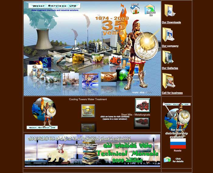
Obviously, it’s awful.
But, it’s so awful that it transcends awfulness and becomes something fantastic!
From the wonderful 80’s video game music that welcomes you at massive volume as soon as the site loads, the crazy number of different animations on the page to the random Roman Centurion, I love it.
It’s a beautiful lesson in how not to design an effective website. To help you avoid the same mistakes, here are some of their techniques you should probably look to avoid:
Animation
Movement is distracting. That’s not to say avoid it completely, but make sure it’s working for you, not against you.
There’s so much happening on the Water Services Ltd site that your attention is being pulled around the screen making it really hard to focus on anything in particular.
Autoplay
One word: don’t. The last thing you want people to do when the arrive on your site is have them panicking for the volume button or some other way of shutting off the noise you’re making (often closing the browser).
A key rule of usability is don’t take control away from users: let them decide whether they want to play that video or listen to music whilst they browse.
Creating Confusion
People aren’t great with choice. Choices confuse us. If you want proof, take a read of this famous study of jam sales. Give a users too many options as to what do and we freeze – we suffer choice paralysis and are very likely to make the easiest decision possible – to leave.
Keep things straightforward and direct users down a clear path to your ultimate goal – rather than bewildering them with options.
‘Mystery Meat’ Navigation
‘Mystery Meat’ was a term applied to Website Navigation by Vincent Flanders to describe a navigation where the link isn’t visible until someone hovers over it (the name comes from the bland unidentifiable meat served in dodgy cafeterias that could be anything).
Mystery Meat Navigation (or MMN) is basically a bad idea: if your users have to guess where they need to click to do something – chances are they won’t do it.
See the rotating circle of images in the middle of the page? You knew that was how to navigate to the different section pages didn’t you?
Distract from the message
The majority of websites’ main objective is to communicate a message. Images and design should aim to support that process – adding context to the message, making a load of plain text more visually appealing, or perhaps illustrating a point to make it easier to understand.
If your design isn’t supporting your message, but is in fact obfuscating it – either by drawing your attention away or, in this case, often by just covering it up – then it’s failing. Far better to strip it away and get your message across!
All that said, I’m not completely oblivious to the possibility that Water Services Ltd have built such an unusual website on purpose.
It’s so bad, it’s hard to believe that anyone would sign off the design for any other reason. Perhaps this was the only way they could think of to get people talking about the site? If so, it might be working beautifully.
What do you think? Do you know a WORSE website? Tell us in the comments below!