Many years ago, I was an 18 year old learning to fly a glider. It was a fabulous experience and an interesting challenge: learning to fly without an engine, relying on air currents and awareness of your surroundings to keep you safe and and in the air.
As part of learning to fly solo, one of the scenarios pilots train for is tow failure.
When a glider launches, it’s pulled into the sky by a winch on the ground. If that tow cable fails mid-ascent, it leaves the glider without power needing to be landed pretty quickly! Practising simulated tow failures is therefore a necessity.
After a few dummy runs, I had it pretty much nailed – failure less than two thirds down the runway, dip the nose quickly and make as short landing at the end of the field. If it was closer to the end of the runway when you’ve got a bit more height, you do a very small loop around the airfield to bring the glider in to land at the start of the runway.
All boxes ticked, I then progressed to some final check flights before they let me up completely by myself. These had the instructor sat in the back, just keeping an eye to make sure I didn’t do anything dumb and was sufficiently competent to fly solo., On the second check flight, just as we were taking off, I felt the cable release. The instructor behind me had pulled the cord that disconnected the winch, simulating a tow failure…at pretty much two-thirds down the runway.
I was pretty high, and there wasn’t much runway left to give me space to get down and land on… but did I have enough height to do a loop of the airfield and make it back to the runway without crashing into the air traffic control tower? I wasn’t sure either option would end well.
I panicked and froze. Probably only for a few seconds, but it was enough.
“I have control” came a voice from behind and the instructor took over, angled the glider into a steep descent, and bought us in to land on the grass right at the edge of the airfield.
We opened the cockpit canopy, climbed out, and the Fight Lieutenant gave me the biggest bollocking of my life!
In amongst the shouting and expletives, he made it clear that he was somewhat unhappy that I hadn’t taken action quicker. “But, I wasn’t sure what to do” I said, I tried to explain – either of the approaches I could have taken might have ended in disaster, and just didn’t know which was right.
Yep, he agreed, neither option was ideal in the circumstance, but that’s sometime the case. What was important was doing SOMETHING.
The one course of action that certainly meant crashing was not doing anything.
The Cost of Indecision
It’s a lesson I have always been very aware of since:
It’s one thing to be cautious, to weigh options – but sometimes you don’t get the luxury of certainty. Sometimes, every option looks risky, and you have to move anyway.
We see this in business, in relationships, in leadership, in life. Waiting for the perfect answer, the perfect timing, or absolute clarity can paralyse us. But life rarely gives us that clarity upfront. What we do get is the ability to act.
So that’s been my takeaway: make a decision. Even if it’s not perfect. Because often, doing nothing is the one thing that guarantees failure.
Not all that long ago, I used to tell sole traders and micro-businesses — that if they couldn’t afford to spend more than £500 on a website, they were probably better off just creating a Facebook page.
The reasoning was simple.
Building a website that actually works for you takes effort – research, design, copywriting, search engine optimisation and more – and all of that costs money.
If you didn’t have the budget to create a website properly, rather than wasting a couple of hundred pounds getting something half-baked, setting up a solid Facebook page was a good choice.
For businesses of that size, most customers are going to be local, and Facebook gave you visibility, messaging, and a contact page — all for free. For many tradespeople, hairdressers, coaches, and community-led businesses, that was more than enough.
But fast-forward to 2025, and that advice? Totally changed.
Here’s why.
The Problem With Social Media
Over the past couple of years, the social media landscape has fundamentally shifted — and not in a good way for businesses
Changing social feeds
Social media algorithms have evolved consistently over the last few years. What you see when you look at your social feeds now has shifted. Content is suppressed or promoted based on opaque decisions that you have no control over. You might have 5,000 followers. But, unless you’re paying to push your content, that doesn’t mean they’ll see what you post.
You don’t own the audience. You don’t own the platform. You’re at the mercy of the feed.
Worse still, platforms like Meta (Facebook/Instagram) and X (formerly Twitter) have increasingly shown they’ll fall in line with government policy and political tides when pushed. Users that would have previously been banned from sites are now encouraged, and dissenting views have been downvoted or blocked. Your content (whether natural or paid) may well be popping up alongside some rather unpleasant narratives, or not shown at all as it doesn’t ‘fit’.
Social has fragmented
Whether or not it’s because of the above, we’ve seen a quiet but consistent exodus from traditional social media.
Facebook is a ghost town for younger audiences and older users are abandoning it. Twitter/X has become a chaotic mess. Instagram engagement is down. TikTok is fun, but volatile. Threads… exists?
Where once social media offered a one-stop shop for customer visibility, that centralisation has fractured.
There are now too many platforms, too many formats, and not enough consistency.
If you want to use social media in place of a website – which platform do you choose?
Unless your audience is hyper-niche and already consolidated (like a wedding florist living on Pinterest, or a developer targeting GitHub), you’re going to struggle to show up in a meaningful, reliable way without spreading yourself thin.
Meanwhile, a website?
Is always on
Doesn’t change its algorithm
Gives you complete control
Is a permanent, on-brand space for your customers to land
It’s your shopfront. Your 24/7 business card, brochure, portfolio, and contact form — all in one.
It’s worth the stretch
If you can, find a little budget and invest in a simple but professionally designed website.
Choose a freelance designer or small studio who can give you a clean, brand-consistent, conversion-ready site that makes your business look credible and established. It’ll save you time, boost your confidence, and free you up to focus on what you do best.
Think of it like a shopfront. You could DIY a handwritten sign, or you could have something polished and professional above your door — something that tells people, “this is a serious business”.
You don’t need fancy animations or custom code. Just:
Clear content
A strong headline
Trust signals (like reviews or testimonials)
A solid call-to-action
A little spend goes a long way — especially when you’re building trust online.
If you can get together £750+, you’ll be able to find someone who can deliver within your budget.
But What If I Can’t Afford That?
Money’s that tight, or you’re in full bootstrap mode?
There’s still a way. Go for a lean, single-page site using tools that don’t need a load of technical knowledge. We’d suggest looking at Carrd (super lean and simple), Squarespace (beautiful templates) or Webflow (for more advanced users) as platforms that create sites that look appealing and are good for SEO.
The key things to remember are:
Make it fast
Make it mobile-friendly
Keep the copy clear and benefit-led
Even the most basic self-built site can:
Show up in Google search
Rank for local keywords
Act as a hub for email signups and customer reviews
Scale with your business over time
Start small. Get the essentials right. Then upgrade when the business does.
Because having something of your own — however simple — is better than relying on platforms that can ghost you overnight.
Build Where You Have Control
In 2018, it was reasonable to say “just use Facebook.” In 2025, that’s like saying “just list your shop in the Yellow Pages.”
Social is still useful — but it’s no longer dependable. A website is.
So yes — websites are worth it. They’re more essential than ever.
Don’t build your business on someone else’s platform. Build your own.
p.s. Well, you would say that wouldn’t you!
Just in case you’re thinking, well, you’re in the website building business, of course you want us to spend money on one!
We’re not in the market for building the sort of websites that we’re talking about here. Our customers are typically businesses that are scaling and want to invest a bit more on something that will help them grow.
We do though HATE to see people make bad choices when it comes to websites and would rather steer people to make good decisions than waste money.
Got a question you want us to answer? Let us know in the comments below…
You type a question into Google (lets say, for instance, “best type of pram for a newborn”) Instead of the usual list of links, you get a full, AI-generated response.
Not the usual AI snippet then links and summaries from other sites below. A complete answer, with pros and cons of different types, images and more.
Detailed, relevant, confident, helpful.
No need to click. You’ve got your answer immediately.
But hang fire a sec… where did that answer actually come from?
Welcome to the strange new world of Google AI Mode, where search engine optimisation is being turned upside down before your eyes.
What Is Google AI Mode — And Why Does It Matter?
In 2023, Google began rolling out a major change to how search works – something called “Search Generative Experience (SGE)”.
Instead of just showing a list of blue links, Google started using generative AI to summarise answers directly at the top of the search results. Ask a question, and you get a colourful, conversational response: a ChatGPT-lite experience built right into your browser.
It’s smart. It’s fast. And (although it’s not always correct) it’s incredibly helpful for users.
Google AI mode takes that a step further. Creating a new results page that’s AI created:
The page does includes links to websites (generally in the right hand side bar or, in some cases, citations for quoted text) – and it’s possible to use the links at the top to switch to a more standard set of search results for your query (in the same way you can switch to see Images or Shopping results related to your search).
It’s primary focus though, is much more about answering your question right there.
This isn’t live yet. It’s part of Google Labs – an experimental part of Google that them to trial the approach with limited group of users – but, based on Google’s announcements to date, it seems very likely this will get rolled out more widely.
Google Is Becoming the Destination
Let’s be clear: if/when this rolls out further, this won’t be a small tweak to the algorithm. It’s not a core update or a ‘Panda’. This is a fundamental shift in how search works.
Google’s AI Mode is designed to answer your questions — not point you to someone who can.
Google is synthesising content from across the web, mashing it together into a summary, and serving it right up in answer to your question. Sometimes with citations. Often…without.
You don’t visit the blog. You don’t see the brand. You don’t convert. You just get what you came for and move on.
For users? Brilliant.
For content creators, publishers, brands, SEOs? Not so much.
Welcome to Zero-Click 2.0
We’ve been inching toward this for years – with featured snippets, ‘People Also Ask’ boxes, and knowledge panels chipping away at clicks. But Google AI Mode takes it to another level.
This is Zero-Click 2.0:
✅ User gets a solid, summarised answer instantly.
❌ The source site gets no traffic.
❌ The brand gets no visibility.
❌ The content creator gets no value from their work.
It’s like throwing a dinner party and realising that Google showed up early with the guests, ate the food, and left you the crumbs – with barely a word of thanks to the chef.
The Big SEO Questions We Can’t Ignore
So what does this mean for the future of SEO?
1. Who’s Incentivised to Create?
If high-quality content is hoovered up by Google’s AI and never clicked on, where is the incentive to produce it?
Will content become gated? Paywalled? Heavily branded just to be noticed?
Could this see a rise in “walled garden” content — less open web, more controlled ecosystems.
2. What Happens to Attribution?
Right now, citations in AI Mode are, well, let’s be kind and say vague. You might get a carousel of links. You might not. You often won’t know where a specific line came from (and therefore the degree it can be trusted).
This opens the door to accuracy issues, ethical murkiness, content scraping, and even legal challenges.
If Google’s AI is built on your content but gives you no credit, is that fair use? Or theft?
3. Is SEO Still Worth It?
Yes, but it’s changing fast.
Ranking and position one might soon mean that you’re a source for AI summaries, but may not automatically mean you’re a destination for traffic.
This could create an SEO arms race not – not so much for your content being included in search content, but figuring out how to be actually cited in Google’s answers.
(And we don’t really know yet how to optimise for that.)
The Journey Toward Zero Click
2012
Knowledge Graph launches
Google begins pulling direct facts into search results.
Impact: Start of zero-click answers for basic queries.
2014
Featured Snippets arrive
Google introduces position zero — full answers above search results.
Impact: Rankings matter less. Click-through starts to dip.
2017
People Also Ask expands
Follow-up questions appear, keeping users inside the SERP.
Impact: More SERP space, fewer clicks to actual content.
2019
Zero-click passes 50%
More than half of Google searches now end without a click.
Impact: The content ecosystem starts to break.
2023
SGE (Search Generative Experience)
AI answers roll out as default for many queries in Google.
Impact: Search feels like ChatGPT — but with vague citations.
How Should We Respond?
So, rather than panic, how can we prepare for what’s ahead?
Focus on Content That AI Can’t Summarise Well
Deep research, opinion-led insights, original data, community-driven perspectives.
Things that can’t be neatly distilled into a two-sentence AI answer, without at least pointing towards the source.
Less “What is X?” More “Here’s what happened when we tried X ourselves.”
Build Brand, Not Just Traffic
If people know you, they’ll seek you out directly. To that end, newsletters, communities, and branded experiences become critical.
Its less about trying to rank, more about trying to ensure your voice matters.
Add a Human Voice That AI Can’t Fake
The Internet’s about to get flooded with AI-generated content (some would argue it already is!).
As a result, REAL human writing with personality, tone, humour and emotion becomes a differentiator again.
Create that emotional connection with your reader.
Get this right and there are opportunities.
With the link blocks that appear on the left hand side of Google AI Mode, sites that were previously buried on Page 2 of Google can claw their way back into the answers – if they can optimise their content to appear as relevant topics, images and citations.
The Value Loop Is Breaking — Can We Rebuild It?
There is though a deeper question…
For the past 20 years, there’s been an implicit contract:
We create content → Google sends us traffic → Users find value → The web grows.
Google AI Mode has the potential to break that loop – taking value without returning it.
That’s not sustainable.
Unless Google finds a way to compensate creators – or at least drive meaningful visibility back to sources – it puts at risk the very ecosystem it depends on.
So while AI search is obviously alluring from Googles point of view, it also demands that they rethink how value flows online.
Until then, content creators are in limbo – serving an algorithm that increasingly is not serving them back.
Want help navigating this AI-driven shift in SEO?
Get in touch and we can talk strategies, future-proofing – and how to make your content matter.
What do you think?
Will Google change direction and not roll this out further? Is this a storm to be weathered, or is this a key shift in search? Are you changing SEO strategy to reflect the impact AI is having?
If your business relies on local customers, optimising your website and business for Local Search is your golden ticket to success. Whether you run a brick-and-mortar store, provide local services, or operate a regional business, showing up in local search results can be the difference between thriving and struggling.
Why Local Search Is a Game-Changer
Think about how you search for businesses. When you need a plumber, a coffee shop, or a reliable electrician, what do you do? You Google it.
Generally these searches include some form of ‘local intent’: that’s search speak for using a place name in the search query, or using the phrase ‘near me’
When you do that, a different search algorithm comes into play. One that weighs up the search engine results quite differently to other kinds of searches.
In particular, right at the top of the results, what pops up first? A “Local Pack” that handy map with three business listings at the top of the search results:
Local search results for ‘Solicitor in Carmarthen’
These local search results drive massive visibility – especially when you realise that nearly 50% of all Google searches have a local intent.
Backlinko.com also recently found that 42% of searchers click on the Local Pack results when seeing local services.
If you business is focussed on doing business with customers near to you, and isn’t optimised for local search, you’re missing out on a huge chunk of potential customers who are actively looking for what you offer.
The Power of your Business Profile
Your business profile is one the biggest factors that make up your local search presence. There are three main platforms where you can create a business profile for search:
Google: Determines how your results are shown in Google search results
Bing: Determines how your results are shown in Bing search results
Apple: Shows your business in Apple Maps
Although it’s worth making sure all three are completed, with its domination of the search market, your Google Business Profile is by far the most important. Without it, you’re practically invisible in Google Maps and local searches.
Here’s why setting up and optimising your Google Business Profile (GBP) is so critical:
1. Appear in Google’s Local Pack
A properly set-up Google Business Profile increases your chances of appearing in that Local Pack, which dominates those local search results. If you’re not there, your competition is – and they’re getting the clicks and calls instead of you.
Appearing in that Google’s Local Pack (that prime map and business listing shown at the top of the search results) can dramatically increase your business’s exposure – especially as we’ve seen that 42% of users click on these results. Securing a spot in there is invaluable.
2. Boost Visibility in Google Maps
When customers search for businesses “near me,” Google Maps is their go-to tool. Your GBP ensures your business appears accurately on the map, making it easy for customers to find you and get directions.
3. Accurate and Accessible Information
Not being able to find out the right information about a business is frustrating – and users rely on accurate information to make purchasing decisions. According to the Local Business Discovery and Trust Report, 2023, a huge 62% of consumers said they would avoid using a business if they found incorrect information online, so it’s worth getting those details right.
By regularly updating your GBP with current contact information, operating hours, and services, you ensure potential customers receive reliable data, buidling trust and encouraging engagement.
4. Drive More Traffic & Sales
A complete and active GBP includes essential information like your website, phone number, address, and services. The easier you make it for potential customers to reach you, the more conversions you’ll see.
5. Increase Trust with Reviews
Customer reviews are massive for credibility. Your Google Business Profile allows happy customers to leave you great reviews, which you can respond to – showing that you value the feedback.
Businesses with high ratings are more likely to get chosen over competitors with few or poor reviews and the Local Consumer Review Survey, 2025 found that 83% of consumers use Google to find local business reviews.
Even better, reviews (and responses to them) are one of the factors that search engines take into account when they’re calculating local search results – so you get a double whammy: credibility and a boost in search ranking. Google even gives you a link to send to your favourite customers so you can ask them to leave some lovely feedback.
6. Gain Insights & Analytics
When your profile is all up and running, Google provides detailed insights into how people find your business, what they search for, and what actions they take. This data helps you refine your marketing strategies and understand what’s working (and what’s not).
7. Showcase Your Business with Photos & Updates
People trust visuals. Adding high-quality photos of your products, team, or location can increase engagement and make your business more appealing. Google also allows you to post regular updates, including news of your latest promotions, events and offers to keep your profile active and fresh.
How to Set Up & Optimise Your Google Business Profile
Getting started with GBP is simple, but optimising it for success takes effort. Here’s a quick overview but, if you want to know more, we’ve put together a full guide on how to set up your Google Business Profile:
Claim & Verify Your Business – Go to Google Business Profile and claim your listing. Google will verify it through a postcard, phone call, or email.
Complete Every Section – Fill in all details, including your business name, category, address, phone number, website, hours, and services – and take time to do it properly: the more information, the better.
Add High-Quality Photos – Upload professional photos of your storefront, products, team, and anything that showcases your business.
Encourage & Respond to Reviews – Ask happy customers to leave reviews and always respond to them (both positive and negative) to build trust.
Use Google Posts & Updates – Keep your profile active by posting updates, promotions, and events.
Monitor Insights & Adjust – Regularly check your analytics to see how customers are finding you and make adjustments accordingly.
Go to business.google.com and start by typing in your business name
The Bottom Line
Ignoring Google Local Search is like leaving money on the table. If you’re not showing up when potential customers are searching, your competitors are getting the business instead. A Google Business Profile is the most effective way to boost your local visibility, attract more customers, and grow your revenue.
If you haven’t set up your Google Business Profile yet, do it today and take control of your local search presence.
Managing digital advertising campaigns on your own can be a bit like trying to fix a leaky pipe without a wrench.
Doable? Maybe. Stressful? Absolutely.
Add in the other pressures of running a business, and it’s no wonder that when it comes to promoting your products or services online things can feel overwhelming.
A recent survey showed that whopping 65% of Chief Marketing Officers (CMOs) plan to invest in agency support for their online ads in 2025 – and these are the guys that know what they’re doing.
We thought we’d try and explain why even experience marketeers are saying goodbye to DIY ads and hello to expert help.
1. Better Bang for Your Buck
Digital advertising is all about ROI (Return on Investment), but getting it right takes more than just picking a few keywords and setting a budget. A good agency is expert at making your money work harder for you.
We know the ins and outs of ad targeting, bidding strategies, and optimisation tricks that can make your campaigns more efficient. Instead of burning through your budget with trial and error, an agency helps ensure you’re getting the maximum return on every pound spent.
We’re also experts at analytics and tracking – and by correctly setting up the reporting we can see how the money you spend leads to actual results.
2. Saving Time (and Sanity)
Let’s be honest: as a small business owner, you’ve already got a huge number of subjects that you’re required to master.
On top of that, learning how to REALLY use Google Ads or Meta isn’t just time-consuming; it’s downright exhausting.
Agencies take that workload off your plate so you can focus on what you do best – running your business. Plus, with experts monitoring and tweaking your campaigns, you can rest easy knowing your ads are always running smoothly.
3. Expertise You Can Count On
Google Ads isn’t a one-size-fits-all solution.
An agency brings a wealth of experience to the table, crafting strategies tailored specifically to your business and industry. They’ll know how to identify the right placements and keywords, create compelling ads and analyse performance data to refine your campaigns.
In short, we’ll do all the heavy lifting while you reap the rewards.
4. Avoiding Common Pitfalls
Running your own ads might seem straightforward at first, but there’s a lot that can go wrong.
Missed opportunities with ad extensions, poor-quality scores, or overpaying for clicks are just a few of the challenges DIY advertisers face.
Agencies have seen it all before and know how to dodge these common mistakes, ensuring your campaigns are set up for success from day one.
5. Keeping Up with the Trends
Digital advertising is constantly evolving.
What worked last year might not work today, and keeping up with the latest trends, tools, and updates can feel like a full-time job.
Agencies live and breathe this stuff, so they’re always on top of what’s new and what works best.
Our partnerships with platforms like Google and Bing also give us access to their experts – who care able to give us insights and advice on new changes and how to optimise campaigns for more success (as well as some useful discounts!).
Is It Worth It?
We get it – hiring an agency for your marketing is a scary investment.
But when you weigh that against the time, money, and headaches you’ll save, it’s a no-brainer for many small business owners. Plus, with 65% of CMOs planning to lean on agencies in 2025, it’s clear that even the professionals think it’s worthwhile.
So, if you’re ready to take your advertising game to the next level (without losing sleep over CTRs and CPCs), teaming up with an agency might just be the smartest move you’ll make this year. Get in touch and talk to us about how it could help drive your business forward this year.
Think improving your website’s user experience requires a big budget? Think again. Optimizing usability can be affordable and highly impactful with the right strategies. This guide explores practical, low-cost solutions to enhance your website’s usability and deliver a seamless experience for your audience.
Affordable UX Strategies for Better Usability
1. Conduct User Research Without Breaking the Bank
Understanding your users is key to better UX. By conducting surveys, interviews, or usability tests, you can gain a deeper understanding of your target audience’s needs and goals.
Website navigation should be clear and intuitive to help users find what they need without frustration. Group related items logically and use concise, descriptive labels for menu sections.
Avoid creating an overwhelming experience by keeping the navigation structure streamlined – aim for a maximum of 7 items in your nav (ideally less).
Too many options clutters the screen and can leave choosing where to click bewildering.
3. Make Your Website Mobile-Friendly
Over half of web traffic comes from mobile devices – for some sites as much a s 90%.
Use responsive web design to ensure your site looks and performs great on smaller screens. Test mobile usability with tools like Google’s Page Speed Insights and tweak layouts, buttons, and menus for optimal performance.
4. Boost Page Speed Without Big Investments
Slow-loading pages frustrate users and hurt your rankings, and it’s been shown that page speed plays a critical role in user satisfaction. Users have been shown to get bored and click away after just a two second delay!
Tools like Google PageSpeed Insights or GTmetrix can identify bottlenecks. Compress images, minimise unnecessary scripts, use lazy loading, and enable browser caching to speed up load times.
5. Write Clear, User-Friendly Content
Content should be easy to read and understand. Avoid using overly complex language or lengthy blocks of text – remember who your audience are and write for them.
Ditch jargon and lengthy paragraphs.
Write in simple, concise sentences and break content into digestible sections with headings and subheadings to make it more digestible for readers. This ensures your visitors stay engaged and find the information they need effortlessly.
6. Add High-Quality, Relevant Visuals
High-quality images and graphics enhance the visual appeal of your site, make you look more credible and help convey your message effectively.
Ensure that visuals are relevant to your content and avoid using low-resolution or generic images that may detract from the user experience. If you need to use stock imagery, choose carefully to avoid pictures that look faked.
7. Prioritise Accessibility for Inclusivity
Accessibility is essential for creating an inclusive website. Follow web accessibility guidelines like the Web Content Accessibility Guidelines (WCAG) to ensure users with disabilities can navigate and use your site effectively. Features like alt text, proper colour contrast, and keyboard-friendly navigation can make a significant difference. Free tools like WAVE and Axe can help audit your site for compliance.
8. Use Low-Cost User Testing Tools
Affordable platforms like UserTesting and Maze let you observe real users interacting with your website. This data helps identify pain points and refine usability. Many tools even offer free trials, so you can test without spending a penny upfront.
9. Embrace Analytics to Drive Data-Backed Decisions
Rely on data not on feeling. Google Analytics and Hotjar are just two tools that can help you provide insights into user behaviour, helping you pinpoint underperforming areas. Monitor bounce rates, session durations, and popular pages to understand what’s working—and what isn’t. AB test changes to see if they make a positive difference.
10. Commit to Continuous Improvement
User experience is never a “set it and forget it” project, but an ongoing process. Regularly review your website using user feedback, analytics, and testing to identify areas for improvement. Update and refine your site to ensure it evolves with the changing needs of your audience.
Budget-Friendly User Research Techniques
Want feedback but don’t have the money to commission user research? Here are some cost-effective ways to get insights from your users on a low budget:
Online Surveys Online survey tools such as Google Forms or SurveyMonkey allow you to collect feedback from a large number of users at minimal cost. Offering small incentives, such as discounts or entries into prize draws, can encourage participation.
User Interviews Conducting one-on-one interviews provides deeper insights into user experiences and needs. Participants can be recruited through your existing user base, social media platforms, or online communities relevant to your audience.
Remote Usability Testing Tools like UserTesting or Lookback are affordable options for observing users as they interact with your website. These platforms allow you to gather valuable data on usability issues and identify potential improvements. Alternatively, recruit friends or colleagues to test your site for free.
Competitor Research Studying competitors’ websites can provide insights into best practices and potential gaps in your own site. Evaluate how they address user needs and consider adapting effective strategies for your platform.
DIY Card Sorting Card sorting exercises can help you understand how users organize and prioritize information. This method is particularly useful for improving the layout and structure of your website’s content.
In-Person Testing
If resources allow, in-person user testing offers detailed insights into usability issues. Although this method may require more effort, the results are often highly actionable and beneficial for improving UX.
Key Takeaways
Improving your website’s usability doesn’t require a hefty budget.
By using practical, low-cost strategies like simplifying navigation, optimising for mobile, and prioritising accessibility, you can make meaningful improvements. Regular testing and ongoing updates ensure your website stays ahead of user needs—without it costing huge amounts of money.
Want to improve your website, but not sure where to start? Get in touch and we can help.
We’ve written in the past about the carousels that exist on the top of a LOT of websites and why we think they’re bad. I thought though that it was worth expanding on a related concept when it comes to web design: that of KISS (Keep It Simple Stupid). Simply put, I’m advocating less is more.
Wait a minute, how is this related to carousels I hear you ask? Well, because generally they are used when a business doesn’t want to focus on one clear unequivocal message. They’re a hedge: “Lets show users 5 different messages and maybe one will hit home” (it won’t).
Equally, here I’m suggesting focussing on what the majority of your users actually need to see and do, rather than a ‘throw the kitchen sink at it’ approach to your website. Follow the Pareto Principle…
The Pareto Principle
The Pareto principle, is a simple yet powerful concept, more commonly known as the 80:20 rule.
The 80-20 rule suggests that 80% of outcomes are driven by 20% of causes. Business management expert Joseph M. Juran introduced this principle, naming it after Italian economist Vilfredo Pareto. In 1906, Pareto discovered that 80% of the land in Italy was owned by just 20% of the population.
Juran further developed this principle after noticing that 20% of the pea pods in his garden produced 80% of the peas.
The 80-20 rule is frequently applied in business as well…
80% of the work is done in 20% of your time
80% of sales come from 20% of clients
80% of sales come from 20% of sales staff
80% of attention is spent on 20% of the web page
The numbers might vary a little in the real world, but arguing that it might actually be 70:30 in your case isn’t really the point. The key thing is that focusing on the key cause and effect relationships helps you prioritise your time and resources on what really matters
Why is this important for Web Design?
Orienting your website to the key tasks that users are looking to carry out can deliver a massive impact to your business.
Benefits for Your Website Visitors
First, here’s how it benefits your website visitors:
Streamlined User Experience: Your visitors get to enjoy a clean, simple site with minimal distraction – helping them stay focused on the main goal or call-to-action.
Improved Engagement: With fewer distractions, users are less likely to click away, keeping them engaged with your content.
Faster Load Times: A simpler site means faster page response times, enhancing the overall user experience.
Higher Quality Content: By focusing on essential elements, you’ve got more time to refine and perfect them – providing visitors with higher-quality content.
Benefits for You
Even better, implementing this onto your website is a win:win. Here’s why it makes sense for you:
Increased Conversion Rates: With a more focused design, you’ll see higher rates of subscribers, opt-ins, members, and customers.
More Calls-to-Action: A larger percentage of users will engage with your primary call-to-action, boosting your site’s effectiveness.
Lighter Workload: By concentrating on the crucial 20%, you’ll reduce your workload and free up time for other important tasks.
Simplified Design and Maintenance: Fewer elements on your site make the design and management process easier.
The impact of this can be significant for both usability and for business success:
Quick Case Study – Liverpool City Council
When Liverpool City Council redesigned their website, they relentlessly focussed on the top tasks its users carried out – reducing the site from 4,000 pages to 700.
The results were incredible – with an increase of 400% in people transacting online and substantially fewer support phone calls. A fantastic outcome for a local council needing to save money by making better use of its website.
Five Simple Steps to 80:20 Your Website
Identify Your Main Goals: Determine your website’s 20% – the main goals or call-to-action that matter most, and will have the greatest impact on the users’ experience. Make sure you’re focussed on what matters to the customer, rather than management!
Refine Your Design: Streamline your site’s design and interface to make sure the vital 20% of elements are prominent and emphasised. Eliminate unnecessary components that could clutter the design or distract users. The goal is to create a clean, focused interface that directs attention to what matters most.
Prioritise User Experience: Ensure that the key elements you’ve identified are optimised to deliver the best possible user experience. This might mean improving navigation, enhancing accessibility, or just making sure the design is intuitive and user-focused.
Balance Aesthetics with Functionality: While a visually appealing design is important, the 80/20 rule suggests prioritising functionality. Focus on ensuring that the key elements are not only attractive but also highly functional and easy to use – creating a website that is both appealing and effective.
Evaluate Effectiveness: After making changes, you need to determine if they’ve been successful. Measure the results – ideally using split testing to assess whether your updates are successful.
Need some help? Getting an outside perspective is great for helping focus your business.
Talk to us about the techniques we use to uncover the key tasks that your website should be focussed on.
p.s. We weren’t talking about YOU at the top of this, obviously you’re not stupid – that’s why you’ve read this post all the way to the end!
I had a call the other week from a potential client that wanted to know what we charged for a website, but got frustrated when, rather than giving an immediate number, I asked them what they wanted the website to do.
“Why can’t you just give me a price?” They demanded.
Well, in short, because if you want a website that actually works for you, it’s a bit more complicated than that.
“It’s unwise to pay too much, but it’s unwise to pay too little”
John Ruskin 1819-1900
A wise man was John Ruskin – and despite it being said a long time before the Internet, it’s a quote with a lot of relevance to web design.
Racing to the bottom
Over the last few years, there’s been a relentlessly downward push on the cost of websites and we’ve now reached a point where there are a huge range of prices being quoted: tens of thousands of pounds from big London agencies down to just a few hundred pounds by smaller one man bands.
Now competition is no bad thing. It’s good for customers – and If it means that web companies profits are squeezed a bit, then that’s the nature of the market.
However, this rush to the bottom has another effect – corner cutting. Many of the web designers working in the market know technically how to build a website, but they don’t know how to make that website engage your customers and drive them to buy from you.
Instead their customers often get a website by numbers. One that ticks the basic boxes but doesn’t provide value for money.
The work to create an effective website is significant.
It means taking time to understand the products and services being sold, researching the customers, carrying out user testing, creating an information architecture that meets the customer and clients needs, laying out the content required for each page and writing the copy, producing (or searching for), editing and optimising images, building the website, designing the look and feel, testing, bug fixing, putting it live and making sure the old website has been smoothly migrated to the new one.
The idea that all these tasks can be properly carried out for a few hundred pounds just isn’t realistic: it would mean a day rate less than the minimum wage – before costs like business development and post-launch support are taken into account.
Depende*
The title of this article was ‘how much should a website cost’, so it’s only fair I actually answer the question! The short answer though is “it depends”.
The cost of a new website can vary a lot depending on what you need, who does the work, how it’s delivered and how much time they put into it.
Here are some factors that affect the price, and an idea of what you’d get for your money…
Design & Development
Web design typically falls into two parts: working out how the website should look, and then building it.
A lot of small developers use a pre-built template and customise that to fit their customer’s requirements. This is obviously a lot quicker and cheaper than designing and then building something from scratch, but you’ll have a less flexible website.
Equally the complexity of the user journey adds costs. A simple blog is fairly simple compared to an e-commerce site that requires product pages, checkout, thank you emails, fulfilment and more. Integration into third party systems, event ticketing etc all take extra effort – and even simple functions like a contact form, mean a couple of hours of extra styling to look good and work on all devices.
Roughly speaking then, you should probably think about:
Type of Website:
Simple Personal Blog: £100 – £500
Small Business Site: £500 – £5,000
E-commerce Site: £1,000 – £10,000
Complex Custom Site: £5,000 – £50,000+
Approach to Design:
Template-Based Design: Cheaper, around £100 – £500
Custom Design: More expensive, around £2,000 – £10,000+
Features and Functionality:
Basic Features: Such as contact forms, image galleries, etc., usually £100 – £500 extra
Advanced Features: Like booking systems, member areas, or custom integrations can cost £500 – £5,000 extra
Content and Marketing
It’s not enough to build a site, it’s got to engage users and get them to act. You can write content yourself, but you’ll find that getting expert help to ensure that the messages resonate with your users is well worth the investment in the long run. You should also make sure that your content is optimised for search engines so that traffic can find your site more easily, and consider content marketing or paid advertising campaigns to drive traffic – all of which carries cost.
Don’t forget about photography too. Whilst you might be able to get away with your own pics taken on a mobile, have a look around at other websites. Often as not, you’ll notice that good photography makes a huge difference to how professional the end results appears.
Content Creation:
DIY Content: Free, but time-consuming
Professional Content: Somewhere between £50 – £500 per page
SEO and Marketing:
Basic SEO: £100 – £500
Advanced SEO and Marketing: £500 – £5,000 +
Ongoing Costs
Once you’ve built a site, that’s not the end of it. There are some basic recurring costs you can’t avoid: Domain Name rental (normally between £10 and £20 a year), and hosting – renting a server (or part of one) where your website will be held. You can buy cheap hosting from about £5 a month, but you’ll typically find a reliable fast server (particularly for busy sites) will cost more.
Most websites also need to have maintenance updates regularly, to stay ahead of virus and hackers, and to make sure that they stay compatible with operating systems. You’re also likely to want to change things once in a while and may well look to have expert help changing and optimising your website for you. it’s possible to do all of this yourself, if you’re reasonably confident technically though.
Maintenance and Updates:
Monthly Maintenance: £20 – £150 per month
Website Updates: £20 – £1,000 per month
Domain and Hosting:
Domain Name: £10 – £50 per year
Hosting: £40 – £300 per year
So, depending on your needs, you might be able to get a website live spending just a few hundred pounds – especially if you’re happy to do a lot of the work yourself. Equally, a complex, highly optimised, custom website could be well into 5 figures.
Sound a lot? Well, yes it is. And clearly some businesses, particularly those just starting up, may not be in a position to invest that amount of money.
But, if you’re an established business and believe you can’t invest a few thousand pounds on your website, then maybe you should relook at your business plan and see if your business is as viable as you think it is.
Alternatively, you might want to look at why (even in this Internet-centric age) your website isn’t that important to you? Is it that your existing website just doesn’t deliver value to you? If so, perhaps you should ask yourself why that is?
Paying too little
Back to our friend John Ruskin. In the full quote, he goes on to say:
“When you pay too much you lose a little money, that is all.
When you pay too little, you sometimes lose everything, because the thing you bought was incapable of doing the thing you bought it to do. The common law of business balance prohibits paying a little and getting a lot. It can’t be done. If you deal with the lowest bidder, it’s well to add something for the risk you run.
A website fit for you
Whatever your budget, we’re happy to have a chat, so feel free to get in touch.
We can either put together a package that fits your budget and needs or, if we don’t think we’re the right fit for you, we’re happy to give you advice about how to best get a website that meets your requirements and suits your wallet!
*Forgive the inside joke: we did some consultancy in Brazil a while back (I know – tough gig), but the answer to pretty much all of our questions from one of the locals to our translator there was a very expressive ‘it depends’ in Portuguese, and it’s kind of stuck.
Delighted to be the winner of the Web Design & Content Marketing Service of the Year 2024 for South Wales. Well done all the winners, and to all of those that took part.
Curious has been using WordPress for (pretty much) all the websites that we’ve ever produced.
There’s a bit of snobbery out in the Internet and everyone has a view as to the ‘best’ platform to use – some swear by Shopify, others thing that going headless is the answer, other tribes will scoff if you venture away from just using pure HTML, CSS and JavaScript. Everyone has a view on their ‘best’ solution, so we thought it might be good idea to explain why we’ve landed on ours.
But first, a caveat.
For reasons that will hopefully become clear, we think WordPress is pretty great. That doesn’t mean though that it’s the only answer to a web development problem. It really depends on what you need from your website.
Very often, the platform isn’t that important. What’s more key is presenting your users with clear messaging, and delivering a smooth user journey, so they’re encouraged to do what you want them to.
Speak to your web developers about what it is you need and let them find the right solution for you.
What is WordPress anyway?
WordPress isn’t a coding language – it’s a Content Management System (CMS). It was created back in 2003 as a simple way to allow people to create content really easily and post it online as a website blog.
It’s come a long way since then, but its foundations have remained the same. It isn’t a way to code. It’s a framework that allows users to edit and store data so it can be displayed on a website.
There are lots of ways you can do that displaying bit – but most people make use of WordPress’ ability to use one of thousands of commercially available ‘themes’ to take that stored data and present it online in a visually appealing way as a website.
Since its launch it’s grown and grown, and now over 40% of ALL websites use it:
Market Share of Content Management Systems
63% of websites that use a content management system, use WordPress
One of WordPress’ other strengths is that, if you want your website to carry out a specific function, you can bolt on a whole host of ‘plugins’ to the core platform that will allow you to extend the website to carry out a huge array of tasks. Want an online shop? No problem. Event Management? Again, there are a loads of options to choose from.
Pretty much anything you want to do with a website – from a tool hire service to online course delivery is possible, just by installing the appropriate plugin – saving days of time (and thousands of pounds) on coding the functionality from scratch.
The huge marketplaces of different themes & plugins that you can simply download and install is one of the key reasons WordPress so popular. Whilst there’s a bit of a learning curve to work out how the platform works, you often don’t need to have any software development skills to be able to put a website together.
Under the hood, things are a little different. WordPress is built on a software language called PHP, and this along with HTML, JavaScript, CSS are what are working in perfect harmony to actually generate the websites it’s used to create. And that’s where it gets interesting for us.
Open Source Heaven
Fundamentally WordPress is Open Source software: the developers that built it make the code available so that other developers can review it, suggest changes, and add to it. Each of the plugins and themes available for it are created as a result of this approach, and are themselves also licensed on an Open Source basis. That means that we can use, edit and develop the code to make it do exactly what we want.
We’ve taken the base version of WordPress, which by default comes with a lot of features designed to make it easier to use for the average user, and stripped it right back: creating a version of the software that’s quicker and more efficient than standard WordPress.
Then, when we create a new WordPress website, we create a unique theme for that customer, that only includes what they want – so each of our clients gets a fast, bespoke website that precisely meets their needs.
Let’s dive into why this approach works so well for us and our clients…
Seven reasons we love WordPress
1. Freedom
When you create a website from a template, they all end up looking a little bit ‘samey’.
Sometimes that’s for good reason – users get used to seeing things a certain way, and when you’re designing functions on a website you want to leverage that and have things where users intuitively expect. That’s great for deciding where you put your ‘Buy’ button, but most of our clients want a website that stands out from the masses and truly reflects their company.
Spot a relationship? These two sites are clearly based on the same theme
Creating a bespoke theme for each of our customers means we’re completely free to create any visual design that we choose, rather than be constrained by the rules that might exist within an ‘off the shelf’ theme. We start each project with a blank sheet of paper and are free to create any layouts, animation or content we choose.
A bespoke theme also means that, should our customers want to change their website in the future, we don’t have to rebuild things from the ground up. As we’ve created the rules that decide how it looks, it’s simple for us to change them.
2. Flexibility
One of the best things about WordPress is its flexibility. You can use it to create any type of website, from simple blogs to complex e-commerce sites. With our custom version, we take this flexibility to the next level. We can tailor the platform to meet the specific needs of each project, ensuring that our clients get exactly what they want, and only that – without any unnecessary ‘bloat’ that will slow the website down.
Need some functionality that isn’t available from WordPress’ plugins libraries? We can create it.
Despite some pretty complicated requests over the years, the platform’s flexibility means we’re always able to deliver what our clients are looking for – no matter how challenging the requirement.
3. Easy to Use
With around 43% of websites on the Internet being built on WordPress (that’s over 80 million websites!), and it being around over for over 20 years, WordPress is pretty familiar to many people.
Though our front ends (the screens that users see) are bespoke, the admin area is immediately recognisable to someone that’s used WordPress before – making it far less scary to use. WordPress’ user-friendly interface makes it easy for our clients to manage their websites and ou custom version retains this simplicity while adding powerful features tailored to each client’s needs. Even if you’re not tech-savvy, we’ve create a platform where you can still update your content, add new pages, and manage your site with ease.
If you’re a complete technophobe and really don’t want to get your hands dirty? No problem. We’ve a range of care plans that means, once it’s live, we’ll be on hand to keep your site updated and relevant.
4. Search-Engine Friendly
WordPress is known for being SEO-friendly – helping your website rank higher in search engine results. Our custom version includes additional SEO features, to help give our clients an edge over their competition. And that lack of ‘bloat’ I mentioned earlier? Well, that means the site naturally loads more quickly – a big tick for search engines.
Fast load times mean a great Google Core Web Vitals score.
It gives our customers more bang for their buck: improving their online visibility; outperforming their competition; and helping deliver free traffic to their websites.
5. Security
Security is a top priority for us. Whilst we’re not going to share all the details here (they’re far too hush hush!), our custom version of WordPress includes enhanced security measures to protect our clients’ websites from potential threats. We have industry leading monitoring to check our sites for vulnerabilities, and regularly update our platform – ensuring that our clients’ data is always safe.
6. Community
WordPress has a massive and incredibly active community, which means there’s a wealth of resources available. There’s a huge array of help, support, guides and extensions available. If you’re stuck and don’t want to get us involved, there are tonnes of forums. blogs and videos offering all the help in the suit o guide you. More importantly, our team is available to provide dedicated support to ensure our clients always have the help they need, when they need it.
7. Scalability
As your business grows, your website needs to grow with it. WordPress is highly scalable, allowing you to add new features and expand your site without starting from scratch. Our custom version is designed to accommodate this growth, making it easy to evolve and scale up as needed. We truly believe that you should never need to build a new website again.
Is WordPress Right for you?
As I explained at the start, there are lots of different view as to the best platform to use for a website – and we’re certainly not going to claim that WordPress is the best fit for everyone.
There is though at 80:20 rule at play here, with most clients that come to us want a site that’s cost-effective, easily updatable, flexible and fast – and WordPress is a very good fit for them.
That said, with each client that gets in touch, we start off the project by taking time to understand their needs and finding a solution that’s right for them. If we think that’s Shopify, or Headless, then you can be sure we’ll recommend.
Want to speak to us about whether WordPress is the right platform for you? Get in touch.
Earlier this month, documentation from Google’s Search Content Warehouse API was published on GitHub by an automated bot. This documentation included over 2,500 pages detailing:
Search Ranking Factors: Detailed information on over 14,000 metrics that Google uses to rank search results
Quality Rating Data: Information about how Google’s quality raters assess the relevance and quality of search results
Clickstream Data: Data from Chrome browsers that helps Google understand user behaviour
Algorithm Adjustments: How search results are tweaked based on user navigation and click data
It’s safe to say that all it has caused a bit of an upset in the search engine community. Mainly because although everyone claims to understand how to do well in search engines, the way that Google’s search algorithm actually works is a closely guarded secret, and this leak provides never-seen-before access to the algorithm’s inner workings.
As a result, since it was discovered, a whole range of Search Engine Optimisation experts have been poring over the documents and trying to work out what it can tell us.
Was it really an accident?
Yep, it appears so. The data was exposed quite a while back (since 2023, it’s just taken until this month for someone to find it!), and since it’s been found it’s been corroborated by a few pretty knowledgeable sources – this information wasn’t meant to be out in the wild [Update: 30th May – Google has now verified the documents are real].
Does the Google API leak actually tell us anything?
Again, yep, it appears so.
The leak tell us about all sorts of metrics that Google collects and uses to create its search results. Whilst it doesn’t tell us how these are weighted, or to what degree these metrics are ‘ranking factors’ in the algorithm, it does help us better understand what might important.
It also suggests that Google hasn’t been ENTIRELY accurate in some of the statements it’s made in the past about it’s algorithm.
Whilst we’re not going to throw the baby out with the bathwater and solely focus our SEO on what the leak contains going forward, we are definitely going to adjust our strategy and use the insights to focus on some new areas – as well as to run some tests around some of the things we’ve learned to see whether there are any new opportunities.
What are the BIG lessons that might affect your SEO?
There’s a LOT of detail in the documents so it’s tricky to work out what’s important and what’s not. Here are 7 key takeaways that we’ve spotted:
1. Clicks & Engagement are key
The quantity and quality of clicks from organic rankings matter.
Recent information from the Google antitrust trial revealed that Google’s Navboost system is an important ranking signal. This uses Chrome click data and quality raters to work out what are ‘good’ web pages.
The leak though shares some of the metrics it uses to calculate this. For example, it measures data like the search result a user spent the longest time on, or the last time somewhere came to your site and hung around – and it tracks clicks over 13 months.
Creating demand for your website among targeted searchers is key. The best approach for that is focussing on high intent search queries, and making sure your content is useful and sticky.
BTW, this also suggests that there could be a SEO effect from paid advertising. Possibly not the paid clicks, as Google could discount those fairly easily, but the secondary clicks you get from paid marketing (when people come back to your website after finding you in ads) might give you a natural search boost – so this could be a great approach to drive long term organic performance.
2. Know your niche
Despite Google suggesting otherwise in the past, there are a lot of metrics mentioned that reference ‘site wide’ scores, including “siteAuthority” to “siteFocusScore”.
It’s not clear how these are calculated, but given they exist, and taking them together with Google’s focus on quality content (EEAT as they put it – Experience, Expertise, Authority, and Trust), it’s likely that having your site engaging useful content, focused on your core subject matter is going to result in higher scores.
Google’s focus is on content the reflects the concepts of EATT
3. Be original
Continuing the EATT theme, it’s clear based on the documents that Google is looking for quality original content.
Pages that only include small amounts of content receive an “OriginalContentScore”, which reinforces the need for unique, authentic, quality content. There also appears to be an AI rating for Content Effort – though how exactly this is being measured it’s not clear.
This does though mean that it’s worth focussing on pages with shorter content to make sure they’re original. It also suggests that relying heavily on AI tools like ChatGPT to generate content is likely to cause issues for you down the line. Instead, take the human approach, focus on adding value for your readers, and try to differentiate your content from your competitors.
4. Fresh is best
Google measures content recency and freshness, with metrics to track both the publication and update dates. It clearly wants to prioritise content that is curated and kept up to date.
With that in mind, it’s important to review all the content on your site to keep it fresh and relevant. For instance, if you’re in accountancy, make sure your site is updated to reflect the latest tax advice.
If a page isn’t relevant any more, its better to take it down – even if it does still get the occasional visitor!
5. Google likes to mix it up
The API documents suggest that Google takes steps to make sure there’s a range of different content sources in the results – limiting the number of videos, small site blogs etc. to give users a range of different sources in response to their query.
To get broader coverage in search results, it’s then a good idea to create a diverse range of content types on your site to improve overall visibility.
This is particularly important for sites trying to enter really competitive areas. For example, if you’re trying to gain traffic in markets where there are already lots of ecommerce sites at the top of the results, maybe consider video content as a way to more effectively compete.
6. Spammy links will hurt you
Links from established sites, using proper anchor text, are great, but a load of links from dodgy websites with over optimised anchor text seems to trigger a spam penalty.
Skip the link building services and instead use an organic approach – or focus on quality PR and build relationships with high quality websites that are relevant to your audience.
7. The experts get things wrong
There are a couple of things that we all thought were important that don’t appear to be – in particular, it appears that character limits on page titles and descriptions don’t need to rigidly stick to the character counts – especially if it improves readability
Also, internal linking doesn’t seem to have the benefit most experts thought – so just link to other pages when you want to signpost them to users, rather than worrying about search engines.
Keeping Ahead of Google’s Algorithm
This leak isn’t a silver bullet! We don’t have the whole algorithm, we don’t know to what extent each metric is used as a ranking factor, and we don’t know how up to date this is (although it’s certainly less than 12 months old, based on timestamps).
Whilst there’s clearly some great information in there that helps inform how we can get better at search engine optimisation, it does broadly align with the core message that Google’s been sending out for years now – we should be focussed on creating high quality, useful content that is interesting to our users. This means that, no matter what else, we’ll be well placed to react to new shifts in Google’s algorithm.
In the meantime, we should be testing out the key ideas the leak has suggested, to see the impact they have on search results – and what can give us the edge. We’ll share what we find along the way!
Need help?
Want to know more about how your site can more traffic from search engines? Get in touch and we can talk you through how you can improve.
Donald Norman, director of The Design Lab, and author of “The Design of Everyday Things” of a door that displayed a ‘Push’ sign on a pull handle the quote above.
Kind of really sums up usability in my opinion (both on the web and in the real world): at its best you don’t need instructions, you naturally know what to do.
I was sure I’ve ranted about this before, but after noticing the sign below again the other day I was motivated to get the keyboard out!
This is the advertising spiel that’s rolled out on posters and petrol pumps but loads of media agencies when they haven’t got anyone to advertise in their space… and it drives me nuts!
Do your clients look at a poster in Tesco? Or at the petrol pumps in Esso?
Well, maybe.
But, it depends.
Not if they’re more likely to shop in Aldi and get their petrol from a supermarket forecourt.
A leading entrepreneur and UX expert puts it better than me…
“Your customers are not you. They don’t look like you, they don’t think like you, they don’t do the things that you do, they don’t share your expectations, assumptions, and aspirations. If they did, they wouldn’t be your customers; they’d be your competitors”
Mike Kuniavsky
The point is, that you are not your customer. It’s a mantra that we’ve been chanting for years and why the first step of any project of ours is to try and figure out just who is the customer of each of our clients. Only then can you really work out how to engage with them.
My long-suffering partner finally gave up on her old mobile phone last week (or rather the screen gave up on her, after a couple of years of fairly heavy abuse) and she got a shiny new iPhone.
Since then, she’s spent several days berating the mobile banking app she was trying to set back up, as it resolutely refused to accept her passcode.
Over four days she has at least 20 attempts at putting the right passcode into the app, only to be told each time that the code “needed to be between 5 & 8 characters and a mixture of letters and numbers”.
This infuriated her.
She knows what her passcode is – it’s a 6 digit number, and yet, despite this seeming to fit the error description, it wasn’t being accepted.
She tried old passcodes, other banking PINs and passwords, all to no avail: the app wouldn’t let her proceed.
Last night, we were sitting in front of the telly (for the first time in about two weeks I might add) and, after another rant about how poor her bank is and several interesting suggestions about where they might put their app, I suggested she give setting it up another crack.
She put in all sorts of PINs and passwords and personal information as prompted and then got to a screen where she had to enter her debit card details and the dreaded passcode.
Again, the same error message appeared. At this point I, as a (slightly smug) independent observer, was able to quietly point out that the app was actually asking for her POSTcode.
The point of this post isn’t to make fun of my better half, to make her sound dumb (she’s far from it!), or even to demonstrate my problem solving skills, but to show that people aren’t very good at paying attention.
Despite knowing there was a problem, reading the error message several times, and desperately trying to work out what was wrong, my partner decided that it must be the app that was at fault, blamed the company and abandoned the process.
Look at your analytics and see how many users drop off at key steps and do the maths on that lost value.
What else could you do in the next day that would earn you as much money as spending some time making your process steps easier to follow and your error messages clearer?
With the current outbreak of COVID-19 and the impact the virus is already having on our countries, customers, our team and their families, we wanted to share information about how Curious is preparing for any further disruption.
Despite the uncertainties that COVID-19 brings, we fully expect to maintain the same level of service excellence to our customers. Our team is set up to connect with our network, colleagues and our customers from wherever they may be, and we’re confident we can continue to help your businesses wherever we’re required to work from.
Our technical platform is fully automated and we’re able to resolve any hardware or software issues without requiring engineers on site. Our technology partners, who provide our hardware are chosen for their resiliency and sophistication whose practices are designed to handle this sort of issue as smoothly as possible.
Thank you so much for trusting us with your business-critical websites. We take this responsibility very seriously and will continue to work hard to ensuring we deliver on our promise to you.
As ecommerce specialists, if your business needs any help or advice as to how you can continue to serve your customers over the coming months, please don’t hestitate to get in touch. We’ll do everything we can to help.
I’ve made passing reference in a couple of previous blog posts about the colour of call to action buttons on pages.
These buttons are a topic that many in the world of websites seem to obsess over. What size should they be, what shape should they be and, most importantly, what colour should they be?
The best colour for a call to action button is a topic has been obsessed over by conversion optimisation specialists across the world in what probably amount to thousands of blog posts.
Red is a bold colour, it stands out on the page and is associated with value (think of all those “Sale” signs in shop windows). Green on the other hand is calmer, less scary and encourages us to “go” (think traffic lights). Unbounce (undoubtedly a company with some expertise in conversion rates) came out and declared the future was a Big Orange Button (BOB).
As you might expect, there’s been a whole host of user testing experiments carried out and published as case studies to support a particular view point. For example, CareLogger tested green vs red buttons on their site:
The result? 34% more people clicked on the red button than when it was green. A clear winner, right?
Well, maybe not. The trouble is that (like anything) it isn’t all that simple…Buttons on a website don’t exist in isolation, they are part of the wider page and need to therefore be sensitive to their context.
Sure red is a strong standout colour but, if the predominant colour scheme of the site is red, then it doesn’t stand out at all.
What’s more important is visual hierarchy: what elements stands out the most on the page?
If your button blends in with the rest of the site, then (whatever colour it is) it isn’t going to perform as well as a button that is more impactful.
Just to revisit that case study from earlier, take a look at the CareLogger page where those buttons were placed: The predominant colour scheme is green. In that instance, of course a red button performed more strongly – it differentiated the call to action from the rest of the page. It could be argued that another colour (perhaps orange, but even purple!) could perform even stronger.
So how to make sure your buttons perform best?
An effective button needs to be bold, stand out, catch your eye and encourage you to click. To that end you should:
Make sure your buttons contrast with the rest of the page
Use text that encourages users to click: communicate the value of what will happen. Not ‘Click Here’ but ‘Get your free report now’
Ignore what works for other people: test the impact of different colours and text and see what works for you
Have you tested different button colours? Let us know what you found below.
Sometimes the websites we create don’t work in the way we hoped.
Sure they might look great, but that’s only one job of a website. The other is to perform – to drive the people that visit your site to find out more about your company and buy from you.
And if they don’t do that, we’ve all got a problem: You’ve invested money in a website and want to see a return on your investment – and equally we want you, as our customer, to be happy.
That’s why we believe that testing your website is so important.
Humans aren’t good at spotting problems
Ever written a document or letter, proof-read it carefully and then sent it, only for someone to immediately point out a spelling mistake?
We’re not all that great at critically evaluating our results – and we often interpret feedback we get to reinforce our perspectives. Our Cognitive Bias leads us to think we know how user feels and acts, and what they want to see – which can hide big problems with the way a website actually performs.
Parts of your website that you see as obvious and straightforward, might actually stump a ‘real’ user.
We try really hard to get it right
When we create website for we use lots of techniques to maximise their chances of working effectively:
Design Patterns – This is the technical term for ‘the established way of doing a specific thing’. A great example is the three lines on a mobile website that signify where the main menu can be found.
Best Practice – This doesn’t necessarily mean what everyone else is doing, but rather what’s been demonstrated to work effectively at engaging visitors and driving them to action.
Experience – The team have been working in the Internet industry for close to 20 years. In that time, we’ve built LOTS of websites and seen how visitors use them. That helps us make better decisions
Data – We’re massive fans of data and use it wherever possible to understand how customers are currently using a website, and where there might be problems.
Despite all of this though, we know websites we produce won’t be perfect.
We’re not clairvoyant. We can’t predict exactly how users will use a website – the only real way of telling is to wait and see.
And that’s why, when your website goes Iive, you need to test.
It’s all about the conversion
Your conversion rate is the percentage of visitors that go on to complete your website’s intended objective – whether that’s sign up for a newsletter, buy a t-shirt, or fill in a contact form.
If your website’s not converting then, despite anything else, it’s not working.
Measuring your conversion rate – and improving it – is key to increasing your profitability – in particular as small changes in your conversion rate can have a massive effect on your profits.
But improving your conversion rate is often quite simple – you just need time and to follow a clear process.
What you need
Data, data, data
Most important is to understand what’s going on with your website – and why.
The first step toward this is to install Google Analytics. We’re big fans of GA (though there are plenty of other capable analytics packages out there you can use if you’d rather), mainly because it’s very capable, integrates with a whole range of other software and, most importantly, is free!
Once installed, make sure it’s configured correctly to accurately measure visitors and set up goals to measure the rate at which they covert to conversions.
The downside of analytics though is that it only tells you how many users do what you want them to do – and you need to find out why.
We suggest using click tracking and user tracking tools to show you how users are actually using your site and give you some clues as to why. Hotjar, Crazy Egg and Mouseflow all work well.
You can then supplement these with user surveys and one-on-one testing to find out what’s causing your customers to do what they do.
A flexible website
If you’re going to be able to make your website work, you need to be able to change it.
You could just change the website code to make the site look the way you want but, unless you’re a developer, this can be expensive. The best solution is a content management system that allows you to quickly make changes without needing any coding skills.
We’re big fans of WordPress because it allows you to easily make changes and is massively flexible, but there are plenty of other content management systems out there you can use.
There are also a whole range of website builders out there, like Shopify, Wix or Squarespace, that allow you to create and change a website without having to know code* .
Whatever you choose, make sure your website theme is flexible. Many ‘off the shelf’ themes have a really tight structure that constrain the layouts and styles you can use.
Even better, use a theme that’s custom built for you and has the future flexibility you need built in.
Just enough traffic
The only way that you can truly test a website’s performance is by seeing how people use it, and for that you need visitors.
Not loads, but enough. Reliable patterns of behaviour can only be seen once sufficient numbers of visitors have used the site – until then, the one or two user who behave abnormally can effect the results. There’s a measure called statistical significance that tells you that your results are reliable. The exact number of visitors you need for statistical significance to be achieved depends on the circumstances, but it typically requires you need several hundred users before a clear pattern emerges.
It normally takes a bit of time before search engines properly spider your site and start sending traffic, but you can easily use social media or even paid advertising to send small amounts of traffic that mean you can start to spot problems
How to fix it.
1. Watch where users struggle
Use analytics to see where people drop out of your website – in particular look out for key points where you want them to act, like checkouts and contact forms.
2. Ask them why
Use click tracking and survey tools to engage with users and see what’s making them leave. Are they encountering system problems? Do they need more information? Perhaps they just can’t see what to do next.
3. Make changes
Use the insights from customers to adjust the site to fix whatever the problems are.
4. Rinse and repeat
Keep watching your analytics, and see if your changes have made a (hopefully positive) difference. Most importantly, keep experimenting!
Crank up the volume
Once you know your website’s really working, then you can put all your efforts into pushing traffic toward it, confident that for every visitor you get, you’ll know how many customers you’ll get out of the other end!
*That said, the learning curve can be pretty steep for some of the website builders and is likely to take a few days of time working out how to make it do exactly what you need it to.
Is your website on the slow side? From July 2018, load speed will start affecting a page’s ranking on Google’s mobile search results.
Only the slowest loading pages will be initially targeted, but Google says there is no way to determine whether a page is affected by this change.
Their webmasters’ blog did say: ‘We encourage developers to think broadly about how performance affects a user’s experience of their page and to consider a variety of user experience metrics’.
If you think your website could be affected, we can benchmark your site and, if there are problems, suggest different ways it can be sped up. Give us a call if you’d like our help
We had a great day at the Zokit SpringConf on Thursday, meeting businesses from across South Wales.
The day was topped off by Curious winning Zokit’s Customer Focus Award, recognising businesses that have exceptional customer service throughout the whole customer journey.
We’re massive advocates of focussing on your customers’ experience, and so couldn’t be more proud to take the trophy home.
Simon looking rather pleased after getting through his acceptance speech!
The award recognises businesses that have exceptional customer service throughout the whole customer journey – something that we’re really focused on for both our clients and their customers, so being shortlisted is really important to us.
The winner’s announced on the 18th May, and we’ll let you know how we do!
So on a Google Webmaster hangout that took place yesterday, John Mueller (a Webmaster Trends Analyst at Google) talked about site quality and architecture, specifically whether the Panda algorithm took these into account when evaluating pages.
When asked if Google takes site architecture into account and if improving the site categories would make a difference to search engine performance, John said:
“We see (Panda) as something that is more like a general quality evaluation of the website that takes into account everything around the site…That is something where, if we find issues across the site where we think this essentially affects the quality of the web site overall, then that is something that might be taken into account there”
You can watch the hangout here:
Whilst, as far as statements go, this is a little woolly, it does go some way to confirming that Google’s looking at a far broader set of factors than most companies typically focus on – and that investing time getting your site architecture and categorisation right upfront will pay dividends in the long term.
Toward the end of 2014, Google caused chaos by announcing that, from 21st April 2015, it would introduce a change to its search algorithm that would penalise website that weren’t mobile friendly when showing mobile search results.
The change was swiftly named ‘Mobilegeddon’ and led to many companies rushing to change their websites to meet Googles new rules.
This time, they’ve said that Google will soon prioritise mobile websites as the primary source of information for their search index.
What does that mean?
Google works out who to show in search results by ‘spidering’ the Internet – following each link within a website and seeing where it leads and, as a result, building up a picture of the whole web.
Until now, Google has always done this by browsing around at the full version of websites. What Google is now saying is it will now also browse using a smartphone – and treat those results completely separately – using them as its primary source of information for decision making for the Google search index.
This is significant because some mobile versions of websites don’t include some of the pages on the main site, or they hide some sections of the page to make them easier to read on a phone.
Why ANOTHER algorithm change?
There’s a really good reason for this change. The percentage of people browsing the Internet on their mobiles has exploded over the last few years – to the point where most people now are browsing the Internet on their phones.
As it stands at the moment, it’s possible that users might see a snippet of content on a Google search results page, that might not be there when they actually click through to the mobile site.
By updating it’s index to look at and evaluate the quality of the mobile versions of websites, Google is basically looking to make sure that it’s search results reflect the needs of the majority of it’s users.
When is this going to happen?
Basically, this change has already started happening.
Google are testing the effects now and as they become more confident in things working as they want, they’ll start to roll it out more widely. They expect the whole process to take a few months.
What’s does this mean for me?
If you’ve got a responsive mobile friendly website where the markup is the same across the desktop and mobile versions (& if you’re a Curious client, this will be the case for you), you won’t need to change anything.
Google will likely see your site in exactly the same way, as it does now.
However, if you have a separate mobile site, that is different than your desktop site, then you should start to think about making changes to your website.
Very often, a separate mobile site will contain a subset of pages of the main site; it might hide certain bits of content – in particular sidebars that include additional links; or it could exclude some of the metadata – the technical information about the website that sits within the HTML.
An example of schema metadata within a website
In this case, you’re likely to find that over the next few months, the effectiveness of your website in attracting traffic from search engines, starts to reduce – particularly for those searching on mobiles.
If you do have a separate mobile site, the key things to focus on are making sure all content is available when browsing with a smartphone and that any structured markup is present on both the desktop and mobile versions.
If you find you need to make changes though, the most important thing is DON’T RUSH.
Google will continue to index desktop sites and it’s better to have a working desktop site than a broken or incomplete mobile version!
Is your website ready for a separate mobile index?
For advice on how to prepare your site for the change to Google’s index, or how we can help you better optimise your site for mobile, get in touch. Call us on 0330 010 9000, or just fill in this form.
UPDATE: Google announced that the Penguin update went live on Friday 23rd Sept, and that Penguin is now real time and has been incorporated into its main algorithm.
In October last year Gary Illyes, a trends analyst that works at Google, let slip that a new Penguin update would appear in 2015. It never arrived – but all the evidence points that it’s still on its way.
This is good news for Search Engine Optimisation (SEO) companies and marketeers that are optimising their websites for search engines the ‘right way’ (basically, following Google’s Webmaster Guidelines). For those that have been taking a more unethical approach to SEO though, the news might not be so welcome!
What Is Google Penguin 4?
Back in April 2012 Google made an update to it’s algorithm that it named ‘Penguin’. It was designed to identify websites that were spamming it’s search results by buying links (or getting links through link networks created to boost search engine rankings).
It had an immediate and significant effect. Sites that weren’t playing by the rules suddenly disappeared from search results, and many websites were notified of manual penalties that had been applied to their search engine rankings – either demoting them many pages down, or removing them entirely.
Interflora were one of the larger names hit by the first Penguin update: their search traffic fell to pretty much nothing overnight.
Since then, there have been a number of further ‘Penguin’ updates made. Each time the there are significant changes to the search results – with generally, the sites that are approaching their marketing fairly seeing positive results and those trying to game the system being negatively impacted.
Penguin 4 is the name that’s been given to the next big update that’s will focus on combatting ‘spammy’ linking.
With Penguin 4 changes become real time
Each time a new Penguin Update gets released, websites previously penalised that have worked to remove bad links (for instance through the Google disavow links tool) can regain rankings and, equally, sites that have not previously caught might get trapped.
The downside of this, is that it takes a fairly long time for the effect of changes to a website (whether positive or negative) to reflect in search results. Sites that have been penalised (whether fairly or unfairly) have to wait a long time before they can recover, and some companies are still finding quick wins by using spammy techniques in the gaps between updates.
Penguin 4 is rumoured to look to address these problems by introducing a real-time element to the algorithm – effectively meaning that the Penguin portion of the algorithm will always be “on” and updating, processing information about new links in real time and making adjustments accordingly.
This should mean that Google will catch spam link profiles more quickly and allow companies that have identified and resolved issues to recover faster.
When’s Penguin 4 coming?
Well, we’re still waiting right now, but the signs are its imminent.
After the news broke last year that Penguin 4 was coming, the SEO community, have been watching carefully for the effect of it hitting. After being questioned when Penguin 4 didn’t appear in 2015, Gary Illyes reported in January that we were “weeks away” from seeing the next iteration.
@mrjamiedodd I'll go with weeks. We're aiming for launching penguin this quarter, but we don't have a more precise timeframe.
— Gary 鯨理/경리 Illyes (so official, trust me) (@methode) January 19, 2016
However as of today, there’s still no sign and Google have confirmed it’s not live yet. Gary’s said he’s now not giving out any more dates for fear of being wrong should it be missed again because it’s not quite ready.
Why the delay? Well, we’re not sure, but the general consensus is it looks like Google’s taking it’s time to get it right – which, given the wide ranging effect these updates have, is a good thing!
What does this mean for me?
If you run a website, you might be wondering what a real-time Penguin algorithm means for you, or what you should be doing to prepare for the update.
Firstly, if you’re not already doing it, rather than trying to game search engines, focus on creating quality content. Earn links and don’t buy them. Focus on providing the best user experience you can and, rather than fixating on your rankings, allow them to improve naturally.
Secondly, it’s worth making sure that there aren’t any problems with the links that you’ve already got pointed towards your website (and if you’ve ever purchased links on Fiverr or have engaged the services of someone who emailed offering cheap SEO services – this is ‘must do’).
Checking and cleaning backlinks
Making sure that the links to your website from other sites across the Internet aren’t going to cause you a problem is fairly straightforward:
1. Create a comprehensive list of backlinks
There are lots of tools available on the web to help with this, but it’s worth using as many sources as possible to get a comprehensive list and then de-duping. Google Search Console is a great place to start, but Majestic.com, Open Site Explorer and Ahrefs.com are pretty good too.
2. Look for patterns
Once you’ve got your list of links look for indicators that unnatural practices have been used. This could be the same Anchor Text repeatedly used, similar dates that backlinks were created, or the same IP address being used.
3. Remove or Disavow suspect links
If there are websites that are suspect, its time to remove them. It might sound painful, but it’s better to remove low quality links before anything happens, rather than after you’re penalised.
Start off by asking site owners to remove or ‘nofollow’ the links, sending messages via the sites’ contact forms or their registered owner (you can find this out through Whois).
After you’ve done this, you can use Google Search Console to disavow those that remain.
If you’re concerned about your site being impacted and want some expert help, get in touch. We’ve got tons of experience with helping companies that have run into trouble and can give you clear advice and assistance to get things fixed quickly.
My favourite words are possibilities, opportunities and curiosity. I think if you are curious, you create opportunities, and then if you open the doors, you create possibilities.
Read more at http://www.brainyquote.com/quotes/keywords/curious.html#IjT5gJLs7Xff8Dol.99
"When you're curious you find lots of interesting things to do"
We’ve recently put live a new website for Cosy Under Canvas: a fabulous glamping site near Hay-on-Wye, offering fantastic domes that come with comfy beds and private hot tubs – all in a beautiful woodland setting!
The new website is fully responsive and uses full-screen video to capture the essence of the Cosy Under Canvas experience.
After a little time to bed-in, the on-site analytics data shows that the new website has reduced number of users that leave straight away (the bounce rate) by more than 25% year on year – as well as driving an increase in reservations.
Emma Price, the site’s owner, told us:
“I came across Curious quite by accident and as I was in a difficult situation with my existing web developer I thought I would give them a call. I am delighted that I did so. Working with Simon and his team is a pleasure. They are keen, quick and confident and communication with them is faultless. They are cheerful, creative and insightful as well as being very efficient. High quality design and build work is produced quickly and thoughtfully with excellent attention to detail. I would not hesitate in recommending I Am Curious for any web design, optimisation or online marketing project commissions”
Emma Price – Cosy Under Canvas
Want to find out if we can transform your website?
Request a free website review to see how you can make more money from your website.
My favourite words are possibilities, opportunities and curiosity. I think if you are curious, you create opportunities, and then if you open the doors, you create possibilities.
Read more at http://www.brainyquote.com/quotes/keywords/curious.html#IjT5gJLs7Xff8Dol.99
"My favourite words are possibilities, opportunities and curiosity. I think if you are curious, you create opportunities, and then if you open the doors, you create possibilities."
Put aside the look & feel and first focus on the content
When most companies redesign their websites, they normally start with, well, the design.
The process typically starts with a design brief, and the first output will usually be a beautifully rendered design concept filled with placeholder text – generally Lorem Ipsum. It might look something like this…
Lorem Impsum is pseudo-latin text that’s used by designers to fill spaces that are intended to have text in. The idea is that it gives a visual sense of the what the page will look like but, as it’s effectively nonsense, doesn’t inadvertently colour the viewer’s meaning of the page.
There’s an inherent problem with that though: the meaning a web page communicates is fundamental to how well it works.
In evaluating a design that’s filled with placeholder text, you have to make assumptions about the final content that will sit on the page – the information the page is going to communicate. With that in mind, you’ve no real idea if it is going to be effective in getting your message across to users or not.
Copy is important
When designing a website, copy is generally seen as the design’s poor cousin – the last thing that gets slotted in – and when you think about it, that’s crazy. You can have the slickest design imaginable but, when it comes down to it, the words are the most important thing on your website.
People might glance admiringly at your glossy design but, without compelling words, it’s unlikely that they will buy anything.
It’s frustrating then, that finding the right text to sit on the pages is so often a last minute affair – the final task before the site can go live.
‘Design first’ hobbles websites
There is a second problem that Loren Impsum creates: when you eventually come to replace it with copy, you’re left with the challenge of writing the right amount of copy to fit the space.
Now, chances are that the perfect message for a particular space isn’t going to match the pre-defined amount of space left by the placeholder text. This leaves you with three pretty unpalatable choices:
Use the perfect copy for the circumstances, but break your design
Make compromises with the copy to fit the available space
Redesign the site to fit the final copy
Depending on which you pick, you’re either stuck with a sub-par website or a bill for additional work.
Take a look at this (rough) example:
What might look like a sensible design goes to pot when you add in finalised copy. Adding in real words, rather than convenient dummy text, overflows spaces, pushes alignments out, and breaks the intended design layout.
There must be a better approach.
Content first
Instead of immediately focussing on the design, try flipping the process on it’s head.
Start instead with setting out the content that should appear on each page:
Define the objectives of each page: who should it be appealing to, what action(s) do you want them to do?
What are the key brand messages you want to communicate to them
What information do your users need to know before they’ll the action.
Once you’ve got the guidelines for the content, you can start writing – set out the headlines and titles and then flesh out the words underneath.
When you know exactly needs to appear on the page, you can then create a layout, including headlines, body copy and images, that communicates your messages effectively
Finally, you can apply a look and feel that’s relevant for the layout and creates a webpage that’s coherent and relevant to the audience.
Better all round
It’s not just a question of creating a more coherent site. We’ve found that this approach allows for a much smoother process all round.
Focussing on the objectives and audience creates a far more tightly focussed website – not something that’s driven by a graphic design concept.
It’s much easier to catch and correct issues. The process creates some really clear stages where the client gets to review and correct thinking: defining objectives; producing content; setting layouts; and final design.
And if something’s not right? Well, it only means redoing the last package of work – coming up with alternate designs is pretty simple if everyone’s agreed on the broad layout of content on the page. Equally experimenting with different layouts of what people agree to be the required content is pretty straightforward.
Paradigm Shift
We need make sure that content is the starting point, not an afterthought. After all, if a website doesn’t work, it doesn’t matter what it looks like:
“Design is not just what it looks like and feels like. Design is how it works”
Steve Jobs
Flipping the design process upside down creates a far better outcome: Web content that is focussed on guiding users down a path – meaning a website delivers on both the user’s and the business’ goals.
We’d love to know what design process works for you. Have you found issues with this approach? Has it come up trumps for you? Let us know.
For a few months now, Google has been testing different ad layouts on it’s search results pages – principally moving the paid advertising from the right hand sidebar, into the main column of content.
Well, it now seems that they’ve finished testing and are rolling out the change more widely. This is likely to have a pretty significant impact on search behaviour.
Upsetting the status quo
For a while now, search results have always looked a bit like this:
Two columns of results, the main column including up to three adverts at the top and then natural search results, with more ads, shopping results and other widgets in a right hand sidebar.
Google’s been testing alternative layouts for a while, and the version that’s been spotted in the wild most is a single column: 4 adverts followed by natural search results, Google Local results and, at the bottom, further adverts. Like this…
Well, it seems that as of this week, Google’s rolling out this change more widely. Moz have been tracking this and have seen this layout now appearing around 20% of the time.
Why are Google changing?
Google plays their cards pretty close to their chests about what’s driving any particular test, but there are likely to be three factors:
1. Revenue
Google need to ensure their profits maintain a positive trajectory and, despite having fingers in lots of pies, advertising still makes up over 90% of their revenue.
Google need to ensure that people see, and click on, the ads in their search results and trying new format layouts allows them to find ways to increase this.
2. Mobile penetration
Mobile is becoming the primary way people view the web. It could be that, as the results sidebar doesn’t fit on a mobile screen format, Google are trying to al
3. Improved service (for advertisers!)
With Knowledge Graphs, Paid Shopping Blocks, and Google Local panels appearing the right hand column over the last few years, adverts are often pushed below the fold. There’s likely to be pressure from advertisers to ensure that ads are more consistently viewed on screen.
Whatever the driver it’s clear that things are still a little volatile, but it’s reasonable to predict that this screen layout become the status quo.
What does it mean to me?
If you’re a Google Adwords user, it’s simple. The first four ad spots become far more valuable. If your ad appears below position 4, the chances are the number of clicks you’re going to get will drop significantly – the ads are far less likely to get seen. With that in mind, you’ll need to adjust your bid strategies accordingly.
Beyond Google Adwords, the impacts are more wide ranging. Obviously, if an extra advert is being squeezed on to the top of the page, the natural search results get pushed down a bit.
That doesn’t sound like the end of the world, but a large number of people aren’t aware that any of the search results are advertising – the last research I saw put the figure at 36%. So the effect of the extra ad is likely to be that being top of natural search for a given term is likely to deliver less reward than it has.
There’s a problem though…what happens when Google decides to show other content as well as its Ads in the search results?
Well, here’s the results page for ‘cardiff hotel’. As you can see Google Local results are appearing immediately below the adverts, which means all natural search results are pushed well down the page, below the fold. In this circumstance you can expect the Adverts to get a far higher proportion of clicks from the page than they traditionally would.
So, what should you do? Well, the first thing should be to keep an eye out. Use your analytics to track traffic from Natural Search and see if performance levels change.
If you want to try and recover any lost traffic, well, the obvious answer is start using Google Adwords to appear at the top of the page. By testing ads on your key terms to see if they’ll deliver you profitable traffic to your website, you may find that you can actually get more traffic than you had before!
We’d love to know your experiences of these changes. Have you seen a dip in traffic levels in the last few days? Let us know in the comments.
Update – 23/2/16
Google have now confirmed that this new layout “is designed for highly commercial queries where the layout is able to provide more relevant results for people searching and better performance for advertisers.”
Effectively this means on searches where customers express an intention to buy. Despite their comment, we are seeing it pretty broadly though!
Have you noticed strange traffic patterns in your analytics reporting? Massive spikes in traffic that don’t relate to any of your marketing activity or are you sitting back wondering why what appear to be thousands of visitors aren’t translating to new business?
It could well be that all isn’t as it seems and that you’re suffering from ‘Referral Spam’.
Referral Spam is effectively ‘ghost traffic’: rather than real site visitors, it’s traffic generated by computers, and in some cases never even touches your website server.
Whilst it’s normally fairly harmless, it can prove a massive annoyance for people looking to get meaningful information from their website analytics, and mislead website owners into thinking they’re getting more traffic than they really are.
Referral Spam has become more and more prevalent over the last year or so to the point that most websites will be affected by it in some way.
Read on to find out what it is, how to spot it, and more importantly – how to correctly strip it out of your analytics reporting.
What is Referral Spam
Referral spam is the footprint left by web ‘bots’ (computer programs) that scan the web looking for targets to attack. These bots scan thousands of websites, sending out a fake request to the website’s server for a page. Each web server records the details of these requests in their access logs.
Alternatively, other bots just target your Google Analytics ID, leaving behind a fake set of data about traffic that’s visited your site.
If you look in Google Analytics for your website, you may well be able to see some of these requests (Look in the report at Acquisition > All Traffic > Referrals).
In the column of referrals sources, you may see websites that you’d expect to send traffic to you, but you’re also likely to see names like:
semalt.semalt .com
buttons-for-website .com
anticrawler.org
These are referral spammers.
Why do they do it?
Referral Spam tends to be happen because either:
1. Spammers want to promote a website and are trying to get you to visit the site or use a search engine to search for it.
They’re hoping that you will notice these strange URLs in your analytics or weblogs and visit the pages to see what they are about. This could just be because they’re looking to drive traffic to pages selling something, or sometimes these pages contain malware or viruses, and their goal is to infect as many people as possible.
2. They want to boost their rank on Google search engine results pages.
Some websites’ access logs are publicly available via a webpage so, when spammers make their fake requests to websites, they are hoping that this will be publicly recorded along with their URL. When search engines later scan these pages, they’ll see these links to the spam site which will potentially improve the spammer’s SEO rankings.
Can I stop Referral Spam?
The short answer is not really.
It’s nigh on impossible to block all the ghost traffic to your website without being sure you’re not affecting real users, BUT you can make sure that it doesn’t affect your reporting.
There’s lots of advice as to how you can exclude spam traffic from your analytics reporting, however some of it (such as filtering out individual sites) is like playing whack-a-mole, and some (such as using the referral exclusion setting*) is just wrong.
The most effective approach is to create a data view that filters out all traffic that doesn’t physically visit your website – and it’s fairly simple to set up.
Filtering Referral Spam from Analytics
We’ll show you the steps you need to follow in Google Analytics as that’s the most common system used out there, but similar approaches can be followed on most other analytics platforms
We’ll be creating a filter on your analytics data.
You can apply a filter to your main view in Google Analytics, but if you do that you’re permanently excluding this information from your reports, which means you’ve no way of seeing what you’re filtering out.
When creating filters, we always suggest using a new ‘view’ of your data. That way, if something goes wrong, you’ve still got a complete set of data that you can compare back to.
So, first of all, let’s create a new view…
Log into Google Analytics and click on Admin in the top navigation. This will take you to the Administration screen where information on your Account, Properties and Views is displayed.
Make sure the correct website property is selected and then click on the ‘view’ drop down:
You’ll then see an option to ‘Create new view’
You’ll then be asked to enter a ‘Reporting View Name’ and set the ‘Time Zone’. We’re going to call this view “Spam Free” and set the Time Zone for “United Kingdom”, “London” time, and then click the ‘Create View’ button.
You’ll then be taken back to the Admin page with your new view selected.
First off, click on ‘View Settings’. That will take you to a screen where you can set your default currency and enable ‘Bot Filtering’. Whilst this function (Excluding all hits from known bots and spiders) sounds great, the reality is that it’s not all that effective – however, every little helps!
Next, click on the ‘Filters’ tab on the left navigation. Here you’ll see a red button with an option to ‘Add Filter’.
Clicking on the Add Filter button brings up a series of options
To set up the correct filter, you’ll need to enter a name – we’ve called this one Exclude Referral Spam.
Then, leaving the ‘Filter Type as ‘Predefined’ select the following from the three drop down boxes:
‘Include only’ ‘traffic to the hostname’ ‘that contains’
Finally in the text field, type the main part of your web domain. It’s very important you don’t include the http or the www.
This instruction tells Google Analytics to only record traffic to your website when it emanates from your server name.
Finally click the blue ‘Save’ button and you’re done.
This filter should now exclude the majority of spam from your analytics view – you just need to remember to select the ‘Spam Free’ view when you log on.
If you’ve set up Goals or Ecommerce Tracking on any other view, you’ll need to copy those onto the ‘Spam Free’ view if you want to be able to use them in your reports.
Finally, also remember that Google Analytics settings only affect reports from the date they are set up onward, so they can’t and won’t clean up historical data.
Let us know how you get on, and also if you know of any other ways to improve handling of referral spam in analytics reporting.
*Although the name sounds appropriate, referral exclusions are designed to ensure traffic being passed between a company’s domains is reported correctly – using this to tackle referral spam will make any data problems worse.
If you’ve been on social media today there’s probably one thing that’s dominating your feed – The John Lewis Christmas Advert.
In case you haven’t seen it, it goes a little something like this:
A little girl is looking through a telescope where she spots a man on the moon. He seems a bit lonely, but when she tries to contact him he doesn’t respond because he can’t see her. She decides to send him a present, on a balloon (very Up), which is a telescope so he can see her back.
As per every John Lewis Christmas advert it plays on your heart strings. You feel sorry for the lonely old man on the moon and you coo over the kind little girl trying to show him she’s there.
You feel happy and joyful when he can finally see her little face, smiling and waving to him from the Earth.
Not One Product in Sight
It’s an advert you instantly remember and one you’ll know is for John Lewis within the first 5 seconds of it starting.
It’s for this reason that the John Lewis Christmas campaigns are so special and so fascinating – because at no point in this advert does it feature any products for sale, nor a single bit of information on the company being advertised.
At no point in the advert does it try and sell you something.
The majority of Christmas adverts on TV will talk about price and what to buy this Christmas. Toy stores will talk about the latest action figure available, shops stocking a multitude of items may talk about delivery or prices, clothing brands may show you what the trends are for this years Christmas party.
But John Lewis mentions nothing of these. We know nothing about what John Lewis has on sale this Christmas. We don’t know anything about opening times, delivery information or any deals they may have running over the festive season.
So why is it then that the John Lewis Christmas campaign is arguably one of the most successful advertising campaigns of the decade, and is responsible for them racking up some £734 million in the 5 weeks up to the 28th of December 2014?
Two words : Story Telling.
It’s an Emotional Rollercoaster
Humans love stories. They’re powerful and capture the imagination. Each part of a story allows you to feel an emotion. Be it happy, sad, anxious, excitement… the list is endless. And when it comes to consumer behaviour, emotion is key.
To get into the geekiness of things, here’s why emotional marketing works:
We may think of ourselves as logical beings, but actually we’re emotional and base the majority of our decisions on emotion. When thinking about a brand or a product, we’re most likely to evaluate it based on a feeling towards it rather than any information about it.
So for example, if I was to show you a picture of a logo of an animal and ask you to donate £2 a month, you’d probably decline because all you’ve remembered is that it’s a dog charity that wants £2 a month.
If I was to show you a picture of a dog, looking incredibly sad, lonely and showing obvious signs of abuse, you feel sad for the dog, anger towards how it got into that situation and a feeling of needing to help.
When you find out for a little sum of money you can help get dogs, like this one, out of these horrible situations you are likely to donate. Why? Because donating has made you feel better about the situation, it has made you feel pro active and that you’re playing a part in giving these animals a better life.
Therefore, creating an emotional response to an advert has a far bigger influence on consumer behaviour than that of an advert simply showing products.
So when John Lewis plays out a story (be it Monty the Penguin in his quest for love, the little boy excited to give his parents the Christmas gift he’s bought them or in 2015, the man on the moon lonely at Christmas), it’s the emotional rollercoaster we go through in those 2 minutes that has made John Lewis’ Christmas sales rocket year after year.
So when you’re watching the adverts on TV this year, have a think about the ones you remember.
Do you remember it for the information, or because of an emotion its made you feel?
Then look at your own marketing campaign: Does it connect emotionally with your customers? Or are you basing your advertising on boring business logic?
4 ways clever business owners watch their websites’ visitors
Google Analytics is the ever-present Personal Investigator for your website:
Secretly watching who’s watching you!
Peering through the looking glass of the web.
Recording what people see, where they go and how often.
Watching users’ behaviour, so you can manipulate their path to where YOU want them to go.
What’s more, many websites already have it set up (if not, it’s a cinch to do), so why not use it: unlock the data that is already there and understand where to focus your resources – boosting your business to greater strengths.
Are you brave enough to look?
This spookily clever software enables you to creek open the back door of your website, take a peek inside, and view for yourself what’s really going on.
But what happens if you find that your landing pages are repelling your customers? Or if your pricing is scaring your users away?
What would you do about it?
Dare you see where your audience is going?
Dare you see your flaws and vulnerabilities enough to change them and gain better insights into how you can make things better?
If you can’t measure something, you can’t understand it. If you can’t understand it, you can’t control it. If you can’t control it, you can’t improve it.
– H. James Harrington
“But my website is amazing”
Maybe your website is devilishly amazing; your product or services are thrilling to eye popping proportions, your marketing strategies are more magical than a wizards wand and your imagery and content is on point.
But can you honestly say you’re getting the sales or sign-ups you want or need?
You’ll be surprised by how simple the answer to this conundrum could be. Getting to that place however requires a bit of digging – digging down into your data.
In god we trust, all others bring data
-W. Edwards Deming
The crystal ball that is Google Analytics will point you towards the areas you need to explore further. In particular, this stalker-like software will allow you to discover:
1. How did users get to your site?
How many of your users are are brand spanking new customers, and which ones are returning?
Google analytics will allow you to see how many people are responding to your marketing efforts – which of your activities are driving visitors and which are just a waste of time. Even better, it will tell you which marketing channels are actually delivering the real paying customers – are all those Facebook visitors just browsers? Letting you focus on the work that’s actually making you money.
It will also tell you what time your customers generally come to your site. This could help you assess when you should focus on putting out your social media marketing advert, when to put offers out, or just make sure that you’ve got someone keeping an eye on customer service enquiries at this time.
2. What are users doing on your site?
Follow your customers like a bloody thirsty zombie. Find out what visitors to your site are doing – what pages they’re looking at and what buttons they’re clicking. Google Analytics allows you to see where they went, and how long they spent there, where they went on to, and when they left.
Are your customers entering your site looking for something specific and then being drawn to something else? Is there some sort of confusion evident? Are your users travelling through your site in the manner you actually want them to?
3. How well is your site working?
Track the number of people that achieve your goals. Create easy to read funnels that show you how users progress through your website, making it simple to figure out what’s working – and what isn’t.
Shine a flashlight on your customers individual behaviour, finding out how much they spent, what they bought, how long it took for them to complete their purchase/sign up – and see how changes you make to your website affect people’s behaviour. Maybe a free postage and packing promotion will fundamentally transform your business’ dynamics.
4. What made your users leave?
Just like a big round rubber ball, sometimes users bounce right off your site at the first page they see. A high bounce rate is scary! But, armed with knowing the parts of your site that need fixing, things could turn around fast. Weave a spiders web that lures users in and makes sure they stick.
Use Google Analytics to spot problem pages – those with high bounce rates, or that block progress through the site and help understand what the issue could be.
If you’ve got a website and aren’t using Google Analytics, you’re definitely missing a trick.
Find out how you can use this free software to connect to your customers, and how to interpret the data. Get in touch right now, or you could join our Google Analytics training course for only £25 (usually £90).
No Tricks. Just Treats! Spookily great websites and consultation by Curious.
Copyblogger has put this nice infographic together that we thought was worth sharing.
Creating a powerful landing page can transform your conversion rates from a fraction of a percentage into a completely different league (we’ve delivered improvements of thousands of percent in some cases).
Take a look at some of the traps you could be falling into with your landing pages…
Have you made changes to your landing pages that have transformed your conversion rates? Share your story below.
As you browse through the majority of websites on the Internet, they have quite a typical format: the name of the website at the top of the page; the navigation in a strip underneath; and then, below that, a full width block containing a series of images that take turns appearing on the screen:
These ‘carousels’, ‘imagesliders’, or ‘rotating banners’ of images have become so popular that clients now expect them to appear on their new website, often specifically asking for them.They’re perceived to be what a website ‘should’ have.
But why? What is it about carousels that has made them so ubiquitous? More importantly, why do so many people use them when they’ve been shown not to work?
Why are carousels so popular?
Certainly it seems that many businesses think that they are the most appropriate thing they can put on their site. A large percentage of the clients we work with state in the early stages of the project “And I’d like one of those image sliders at the top of the home page”.
Why they want one is a tough question to answer. Most likely is that a few high-profile, cool websites built them and that, from there, the feature has then been copied and copied – principally because they’re an easy solution as to what to put at the top of your webpage, and if you’re the web designer, they’re pretty easy to knock out.
Royal Mail’s website – with carousel
The reality is that agreeing what should go on your home page is tough.
Many businesses’ websites have to represent a diverse range of stakeholders interests and having a block of content at the top of the page that alternates a number of different message means everyone has their fair share of real estate. Can’t be bad right?
Well. there’s evidence that suggests that all these websites selecting a carousel aren’t making a smart choice at all.
Why should you bin the carousel?
As you’d hope for a feature that’s used so widely on the Internet, there has been a lot of testing carried out to see how users interact with them and whether they are a good use of what is prime real estate.
Tests show ‘image sliders’ don’t work
Jakob Neilson is probably the most famous usability expert on the planet. He carried out a test asking users whether Siemens had any special offers for washing machines on their website:
You’d have though it a simple question as, in 98-point font, there’s a clear message that customers can get cash back on a new appliance.
But, what you can’t see from the still screenshot above, is that every five seconds the main accordion-stye panel shifts to reveal a different message.
Users spent some time studying the page, but swiftly scrolled down past the moving banner without noticing the ad – and concluded there were no special offers.
We’re programmed to tune out
Neilson’s test highlights the concept of banner blindness: People are so used to webpages being plastered with moving ads, flashing and shouting for attention, that we tune them out – focussing instead on the meat of the page. This concept seems to apply to carousels as well.
A study by a developer at the University of Notre Dame tracked five different websites that included image sliders, monitoring how people interacted with the page and capturing the clicks made on each element.
On the ND.edu site, she found that only 1% of visitors to the page clicked on the one of the carousel images – and of those clicks, 84% were made on the first image shown.
This pattern of behaviour was replicated on the other four sites she looked at, with even the highest percentage of clicks by visitors on the carousel being just 2.3%.
Conversion optimisation experts across the web have found the same results again and again: People don’t read the multiple messages contained in carousels and can’t recall them:
“We have tested rotating offers many times and have found it to be a poor way of presenting home page content”
So, what’s the point of having a carousel taking up the most valuable real estate on your page, if only 1% of people are going to click on it – especially if 84% would click on the first image anyway?
Why not just pick the most relevant message and stick with it?
If this wasn’t enough, rotating banners cause headaches for users too…
Bad for accessibility
Where carousels automatically advance, having content automatically appearing and disappear can create problems for people using screen readers to read the page. The transitions can cause a loss of focus which forces the user back to the top of the page.
Also the controls for a carousel are generally either dots or arrows, which are hard to navigate for someone that can’t see the screen.
No controls for Debenhams’ image slider are apparent
The cognitive load and distraction caused by moving carousels can also make reading sites that include them difficult for some users with cognitive and learning disabilities.
Still want to use a Carousel?
If you’re still not convinced, Tim Ash of Conversion Optimisation specialists SiteTuners, sets out six more very valid reasons why you should avoid carousels:
A slower site: Moving banners generally include a number of images or animation that generally mean larger file sizes than other content. Website speed is critical (a page that takes longer than 2 seconds to load will have lost 40% of it’s traffic) so why use functionality that worsens user satisfaction
Inconsistent messaging and look & feel: The mix of different messages in a carousel, and the large proportion of the screen size devoted to them can mean that it can seem the look and feel of your website changes every few seconds
Laziness: You’re effectively saying “I don’t know what’s important, lets stick it all up there and hope”. The main content on your home page should seek to be relevant to the majority of your audience and engage them – encouraging them to look at the rest of your site. By showing a large number of sequential messages, you’re blindly throwing darts at a dartboard and hoping one will stick
Users are impatient: Forcing them to consume a slideshow stops them actually finding what they’re looking for – wasting their time
Motion-triggered reassessment: Carousel’s movement interrupts our attention, stopping us from giving other parts of the page the attention they deserve
It takes up valuable space: We’ve already seen that few people interact with carousels. If that’s the case, the content that’s actually going to be noticed is just getting pushed down the page – out of easy sight
Tim’s conclusion?
“Rotating banners are absolutely evil and should be removed immediately”
So, what should you put on your homepage?
If you’re creating a new site, be careful don’t just blindly stick in a carousel just because everyone else is doing it.
Instead, think about what the important message on your homepage should be – and consider the most appropriate way of communicating that message to your users.
Sure, there’ll be other things you want to push, but if you’ve got your key content at the top of the page, there’ll be plenty of space underneath to talk about other things – and despite what some experts say, as long as you get the basics right, people do scroll.
“I, ahem, have a carousel”
If you’re reading this and have a carousel on your site, hopefully this has got you thinking that maybe it’s not doing you much in the way of a favour.
Well, you’ve got a great opportunity to find out for sure, so why not run a test: See how the way users’ behaviour changes when you switch out your image slider and replace it with one single important message.
All you need to do is install some AB testing software (it’s pretty straightforward and we’d be happy to help if you’re not sure where to start), and track your conversion rates for both types of content. We’d love to know your results, so please drop us a line, or reply in the comments below.
Finally, if after all this, you still decide to implement a carousel, that’s fine. Its your decision after all!
We do strongly suggest however, that you give users control of the image changes. If you use a slider that changes automatically, make sure you provide a pause button, and set it so that the changes pause if the user hovers their mouse over the slide.
It’s always great to hear what other people have found. Do carousels carry a particular appeal to you? Have they delivered for your website? Let us know below…
Back in 2012, Water Services Ltd put live their new website. I think anybody working in the web industry would agree that it really is a thing of beauty – a gift that keeps on giving.
Just when you think you’ve taken in all there is to see, you uncover some other little detail that brings another shiver of joy…
Obviously, it’s awful.
But, it’s so awful that it transcends awfulness and becomes something fantastic!
From the wonderful 80’s video game music that welcomes you at massive volume as soon as the site loads, the crazy number of different animations on the page to the random Roman Centurion, I love it.
It’s a beautiful lesson in how not to design an effective website. To help you avoid the same mistakes, here are some of their techniques you should probably look to avoid:
Animation
Movement is distracting. That’s not to say avoid it completely, but make sure it’s working for you, not against you.
There’s so much happening on the Water Services Ltd site that your attention is being pulled around the screen making it really hard to focus on anything in particular.
Autoplay
One word: don’t. The last thing you want people to do when the arrive on your site is have them panicking for the volume button or some other way of shutting off the noise you’re making (often closing the browser).
A key rule of usability is don’t take control away from users: let them decide whether they want to play that video or listen to music whilst they browse.
Creating Confusion
People aren’t great with choice. Choices confuse us. If you want proof, take a read of this famous study of jam sales. Give a users too many options as to what do and we freeze – we suffer choice paralysis and are very likely to make the easiest decision possible – to leave.
Keep things straightforward and direct users down a clear path to your ultimate goal – rather than bewildering them with options.
‘Mystery Meat’ Navigation
‘Mystery Meat’ was a term applied to Website Navigation by Vincent Flanders to describe a navigation where the link isn’t visible until someone hovers over it (the name comes from the bland unidentifiable meat served in dodgy cafeterias that could be anything).
Mystery Meat Navigation (or MMN) is basically a bad idea: if your users have to guess where they need to click to do something – chances are they won’t do it.
See the rotating circle of images in the middle of the page? You knew that was how to navigate to the different section pages didn’t you?
Distract from the message
The majority of websites’ main objective is to communicate a message. Images and design should aim to support that process – adding context to the message, making a load of plain text more visually appealing, or perhaps illustrating a point to make it easier to understand.
If your design isn’t supporting your message, but is in fact obfuscating it – either by drawing your attention away or, in this case, often by just covering it up – then it’s failing. Far better to strip it away and get your message across!
All that said, I’m not completely oblivious to the possibility that Water Services Ltd have built such an unusual website on purpose.
It’s so bad, it’s hard to believe that anyone would sign off the design for any other reason. Perhaps this was the only way they could think of to get people talking about the site? If so, it might be working beautifully.
What do you think? Do you know a WORSE website? Tell us in the comments below!
Here’s a couple of quick questions for you: Do you have control of your web domain? And do you know the password for it?
If you can definitively answer yes to both of these then great – go and make yourself a nice cup of tea and relax.
If the answer’s no, or you’re not sure, or quite possibly you don’t have a clue what I’m talking about, well I’d really suggest reading on. Even if you find this techie stuff tedious or confusing and something best left to your web designer, IT administrator or whatever, this is one of those times (maybe the only one) when you need to spend a little time making sure you know what’s going on – and I’ll try and explain why.
What’s DNS?
Your web domain (for instance, www.iamcurious.co.uk) is one of your business’ most important assets – it’s your online address, the thing that people use to find you online.
However, for that to happen, websites are dependent on something called DNS. DNS (or Domain Name System) is the rather clever set up that directs traffic around the Internet. It’s what ensures that people around the world who type your web domain into their browser get pointed to the specific location where your web pages sit.
Each website on the Internet chooses somewhere that manages their DNS listing and, through clever jiggery-pokery, this is then copied across the whole of the Internet (If this has sparked your interest, “How Stuff Works” has a fuller and better description of DNS).
Why is DNS important?
If your DNS records are missing, wrong or broken, nothing works: people can’t see your website and you won’t be able to receive email.
If you don’t have access to your DNS and need to make a change to your DNS or if something gets corrupted, fixing the problem can be extraordinarily difficult – a job that should take hours can take days, weeks or even months to fix – and all the time your site just won’t work.
How long can you cope for without a website or without receiving email? How much money would it cost you?
The potential impact doesn’t just end there – If your domain isn’t registered to your email address, it’s possible that your domain name could be sold to someone else without you being able to do anything about it – if there’s no one to respond to renewal emails from the company you rent your domain from, then your ownership of the domain will at some point expire.
What this means to me
Now you might be reading this convinced that this still isn’t important, and that your web designer, IT admin or whatever keeps an eye on all this. But, what happens if your web designer absconds with your copywriter, or your IT administrator has a paddy and just walks out one day, would you be left in the lurch?
It doesn’t even require anything that dramatic – we’ve been working with several new clients over the last few months who have, for a wide variety of reasons, not spent a significant amount of time on their websites for quite a while and, over time, have just lost contact with the person who set everything up in the first place.
With that in mind, back to the questions at the top of this post: Do you have control of your web domain?
If you’re not sure, it’s easy to find out.
Simply go to WhoIs, type in your domain name and click the look-up button. Now find the name of the Registrar listed and think carefully – do you have an account there? If so, do you know the password for it?
If you can say “yes” confidently to both of those questions – you too can go and have yourself that nice cup of tea.
If the answer to either of those questions is no, then take some time, as soon as you can, to get access to it. It really could save an awful lot of tears in the future.
“My mother says she’s cold and then makes me put on a coat”
Chris came across this quote above the other day and posted it on our blog as it made her chuckle.
Reading it I thought that, despite it being attributed to ‘Colin, aged 7’, it could have equally been applied to myself around that age too. I was forever being told that if I went out with wet hair I’d catch a cold, to take my coat off inside so “I felt the benefit”, or indeed, forced to wear a coat when I went out on what seemed a perfectly warm day.
Looking back, I’m can see that this was just because my mum cared about me and was trying to look after me, but when you’re 7 and desperate to get outside and play, these demands were usually followed by a whine of “oh, Muuuuum” and much stamping of feet – why couldn’t she understand that I was about to spend the next hour or so running around like a lunatic and that a coat would therefore just be too warm?
Anyway, the more I thought about it, the more the quote seemed relevant to this blog (bear with me here).
So many businesses, instead of asking their customers whether they’re hot or cold, just assume that, because they believe in their product, their customers must be hot for it too.
Businesses create the website they would want to see and then wonder why they’re not getting the results that they’d like.
Most businesses believe passionately in their product (that’s generally why they’re in business in the first place) but allowing yourself to become blind to the likely concerns of customers as a result – ignoring the need to handle objections, provide supplementary information or truly engage with your visitors – is incredibly naive.
It’s very difficult to effectively put yourself into the mindset of a potential customer, particularly if you haven’t made the effort to get to know about them.
A recent Econsultancy survey of businesses found that the majority of respondents didn’t undertake any form of user testing, focus groups or customer interviews.
Without the sort of insight that come from these types of customer research, how can businesses expect to be able to create a proposition that responds to their customers’ needs?


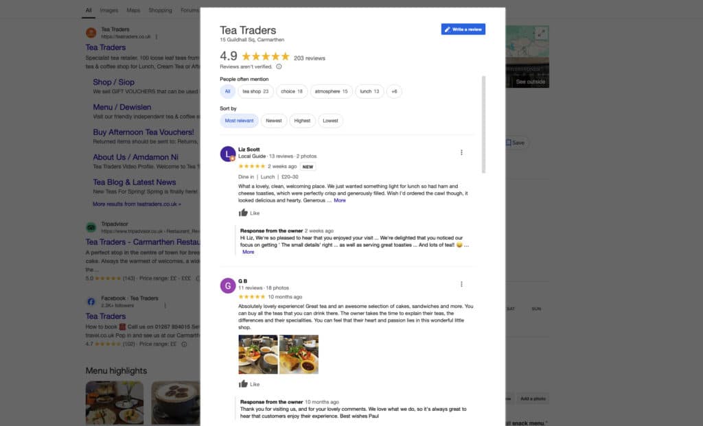
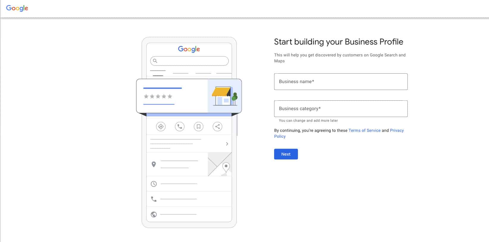
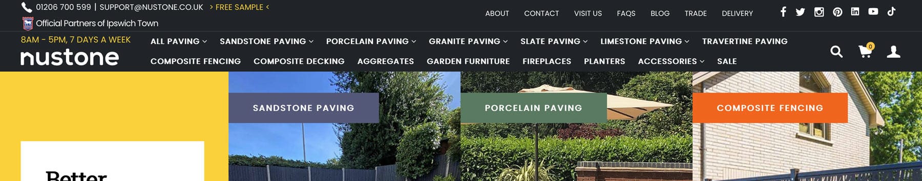
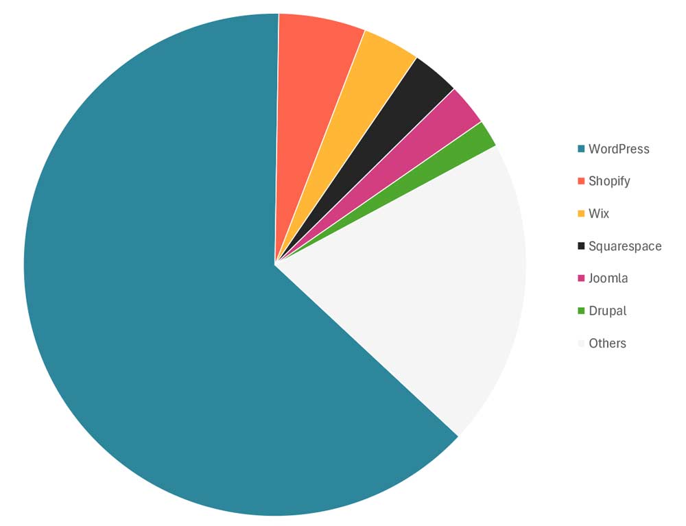
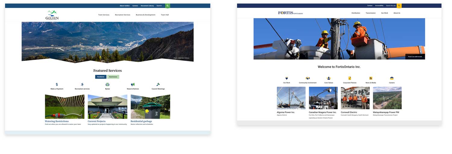
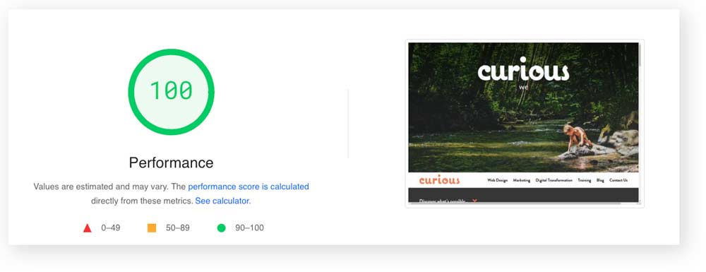
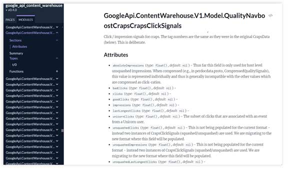


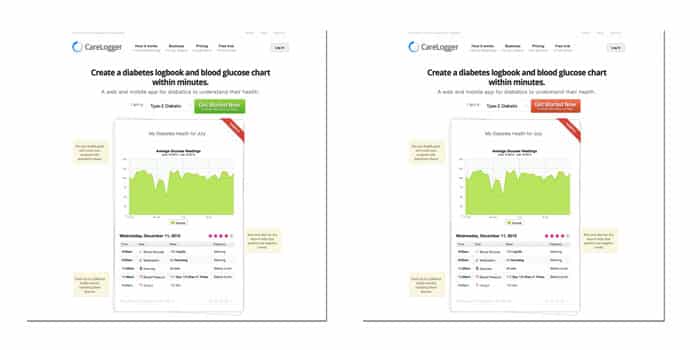

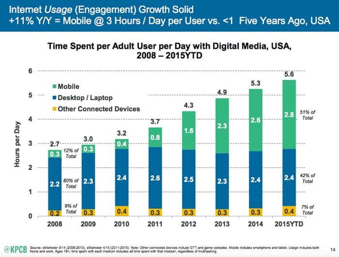
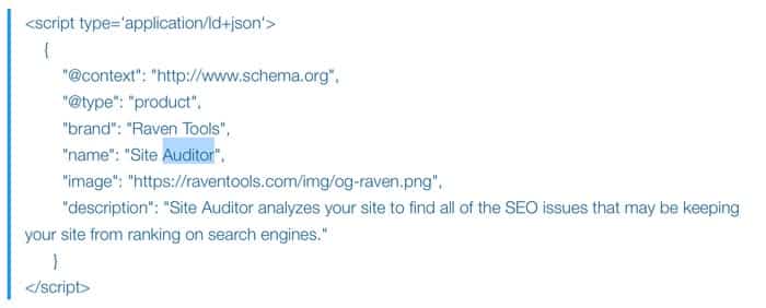

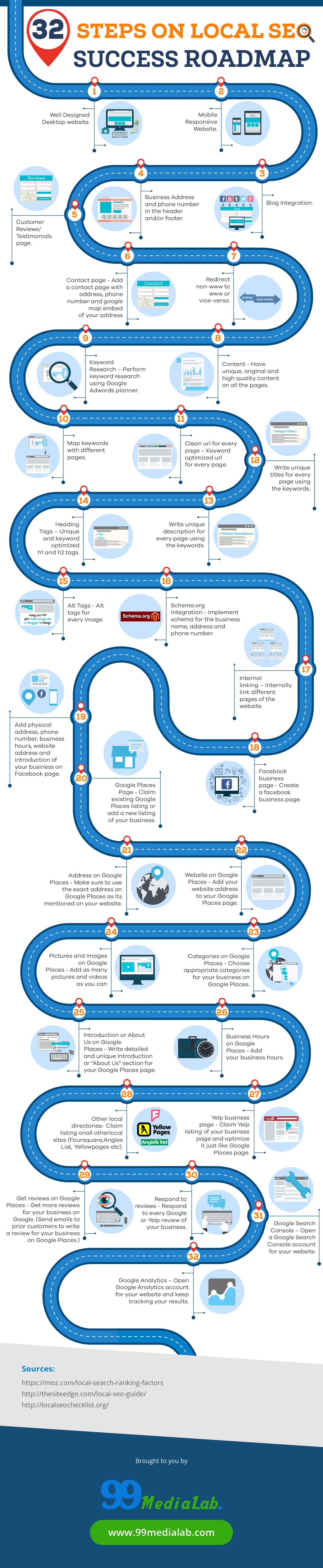
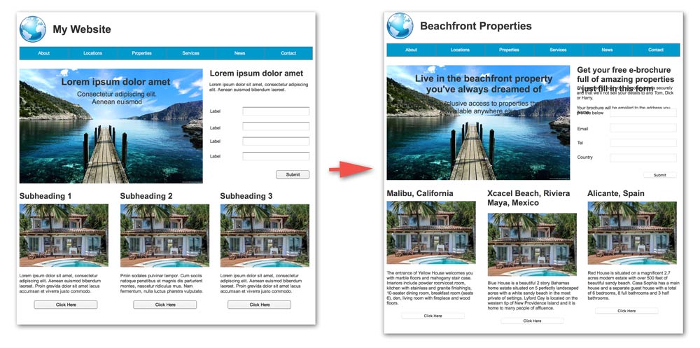
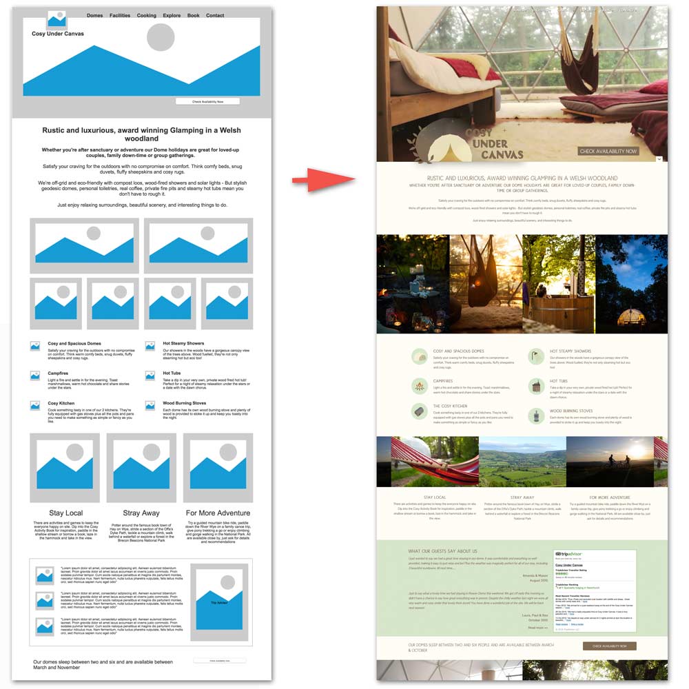
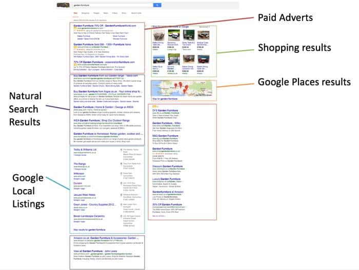
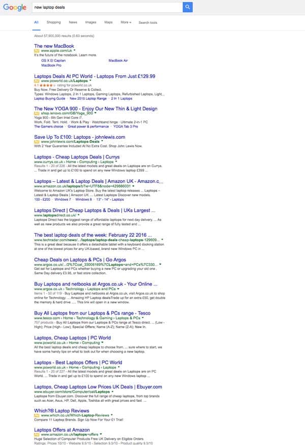
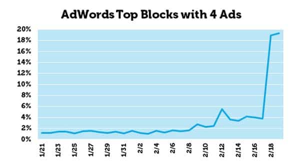
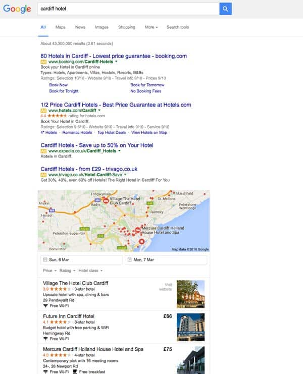

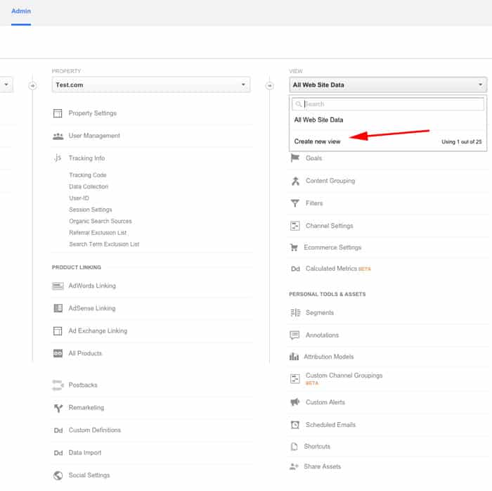
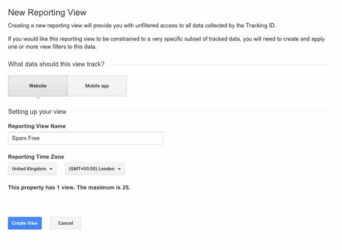
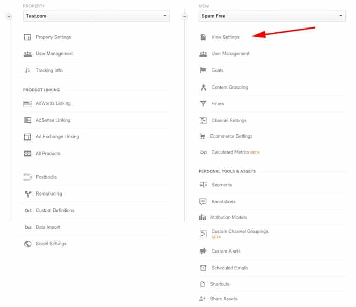
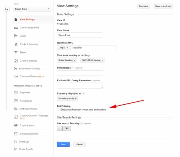
![9 Landing Page Goofs that Make You Lose Business [Infographic]](http://copyblogger.com/cdn-origin/images/650/copyblogger-landing-page-goofs-infographic.png "9 Landing Page Goofs that Make You Lose Business [Infographic]")