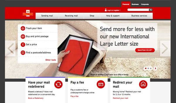
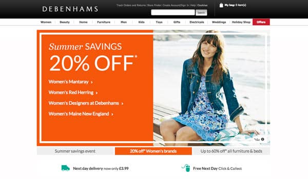
As you browse through the majority of websites on the Internet, they have quite a typical format: the name of the website at the top of the page; the navigation in a strip underneath; and then, below that, a full width block containing a series of images that take turns appearing on the screen:


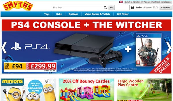
These ‘carousels’, ‘imagesliders’, or ‘rotating banners’ of images have become so popular that clients now expect them to appear on their new website, often specifically asking for them.They’re perceived to be what a website ‘should’ have.
But why? What is it about carousels that has made them so ubiquitous? More importantly, why do so many people use them when they’ve been shown not to work?
Why are carousels so popular?
Certainly it seems that many businesses think that they are the most appropriate thing they can put on their site. A large percentage of the clients we work with state in the early stages of the project “And I’d like one of those image sliders at the top of the home page”.
Why they want one is a tough question to answer. Most likely is that a few high-profile, cool websites built them and that, from there, the feature has then been copied and copied – principally because they’re an easy solution as to what to put at the top of your webpage, and if you’re the web designer, they’re pretty easy to knock out.
The reality is that agreeing what should go on your home page is tough.
Many businesses’ websites have to represent a diverse range of stakeholders interests and having a block of content at the top of the page that alternates a number of different message means everyone has their fair share of real estate. Can’t be bad right?
Well. there’s evidence that suggests that all these websites selecting a carousel aren’t making a smart choice at all.
Why should you bin the carousel?
As you’d hope for a feature that’s used so widely on the Internet, there has been a lot of testing carried out to see how users interact with them and whether they are a good use of what is prime real estate.
Tests show ‘image sliders’ don’t work
Jakob Neilson is probably the most famous usability expert on the planet. He carried out a test asking users whether Siemens had any special offers for washing machines on their website:
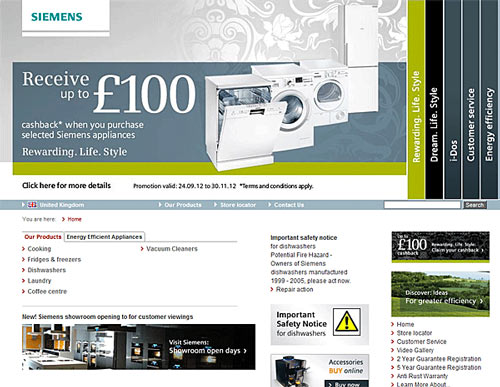
You’d have though it a simple question as, in 98-point font, there’s a clear message that customers can get cash back on a new appliance.
But, what you can’t see from the still screenshot above, is that every five seconds the main accordion-stye panel shifts to reveal a different message.
Users spent some time studying the page, but swiftly scrolled down past the moving banner without noticing the ad – and concluded there were no special offers.
We’re programmed to tune out
Neilson’s test highlights the concept of banner blindness: People are so used to webpages being plastered with moving ads, flashing and shouting for attention, that we tune them out – focussing instead on the meat of the page. This concept seems to apply to carousels as well.
A study by a developer at the University of Notre Dame tracked five different websites that included image sliders, monitoring how people interacted with the page and capturing the clicks made on each element.
On the ND.edu site, she found that only 1% of visitors to the page clicked on the one of the carousel images – and of those clicks, 84% were made on the first image shown.
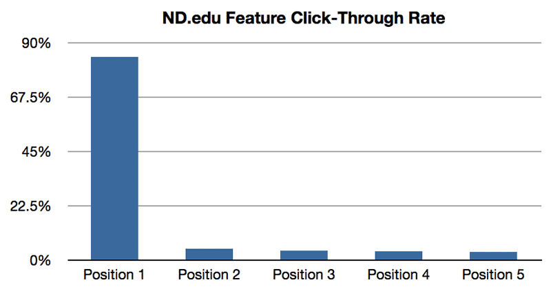
This pattern of behaviour was replicated on the other four sites she looked at, with even the highest percentage of clicks by visitors on the carousel being just 2.3%.
Conversion optimisation experts across the web have found the same results again and again: People don’t read the multiple messages contained in carousels and can’t recall them:
“We have tested rotating offers many times and have found it to be a poor way of presenting home page content”
Chris Goward – Author of You Should Test That
So, what’s the point of having a carousel taking up the most valuable real estate on your page, if only 1% of people are going to click on it – especially if 84% would click on the first image anyway?
Why not just pick the most relevant message and stick with it?
If this wasn’t enough, rotating banners cause headaches for users too…
Bad for accessibility
Where carousels automatically advance, having content automatically appearing and disappear can create problems for people using screen readers to read the page. The transitions can cause a loss of focus which forces the user back to the top of the page.
Also the controls for a carousel are generally either dots or arrows, which are hard to navigate for someone that can’t see the screen.
The cognitive load and distraction caused by moving carousels can also make reading sites that include them difficult for some users with cognitive and learning disabilities.
Still want to use a Carousel?
If you’re still not convinced, Tim Ash of Conversion Optimisation specialists SiteTuners, sets out six more very valid reasons why you should avoid carousels:
- A slower site: Moving banners generally include a number of images or animation that generally mean larger file sizes than other content. Website speed is critical (a page that takes longer than 2 seconds to load will have lost 40% of it’s traffic) so why use functionality that worsens user satisfaction
- Inconsistent messaging and look & feel: The mix of different messages in a carousel, and the large proportion of the screen size devoted to them can mean that it can seem the look and feel of your website changes every few seconds
- Laziness: You’re effectively saying “I don’t know what’s important, lets stick it all up there and hope”. The main content on your home page should seek to be relevant to the majority of your audience and engage them – encouraging them to look at the rest of your site. By showing a large number of sequential messages, you’re blindly throwing darts at a dartboard and hoping one will stick
- Users are impatient: Forcing them to consume a slideshow stops them actually finding what they’re looking for – wasting their time
- Motion-triggered reassessment: Carousel’s movement interrupts our attention, stopping us from giving other parts of the page the attention they deserve
- It takes up valuable space: We’ve already seen that few people interact with carousels. If that’s the case, the content that’s actually going to be noticed is just getting pushed down the page – out of easy sight
Tim’s conclusion?
“Rotating banners are absolutely evil and should be removed immediately”
So, what should you put on your homepage?
If you’re creating a new site, be careful don’t just blindly stick in a carousel just because everyone else is doing it.
Instead, think about what the important message on your homepage should be – and consider the most appropriate way of communicating that message to your users.
Sure, there’ll be other things you want to push, but if you’ve got your key content at the top of the page, there’ll be plenty of space underneath to talk about other things – and despite what some experts say, as long as you get the basics right, people do scroll.
“I, ahem, have a carousel”
If you’re reading this and have a carousel on your site, hopefully this has got you thinking that maybe it’s not doing you much in the way of a favour.
Well, you’ve got a great opportunity to find out for sure, so why not run a test: See how the way users’ behaviour changes when you switch out your image slider and replace it with one single important message.
All you need to do is install some AB testing software (it’s pretty straightforward and we’d be happy to help if you’re not sure where to start), and track your conversion rates for both types of content. We’d love to know your results, so please drop us a line, or reply in the comments below.
Finally, if after all this, you still decide to implement a carousel, that’s fine. Its your decision after all!
We do strongly suggest however, that you give users control of the image changes. If you use a slider that changes automatically, make sure you provide a pause button, and set it so that the changes pause if the user hovers their mouse over the slide.
It’s always great to hear what other people have found. Do carousels carry a particular appeal to you? Have they delivered for your website? Let us know below…
Update: 15/5/15
Found this recently, which I think rather sums things up beautifully… http://shouldiuseacarousel.com