Picture a new approach to search…
You type a question into Google (lets say, for instance, “best type of pram for a newborn”)
Instead of the usual list of links, you get a full, AI-generated response.
Not the usual AI snippet then links and summaries from other sites below. A complete answer, with pros and cons of different types, images and more.
Detailed, relevant, confident, helpful.
No need to click. You’ve got your answer immediately.
But hang fire a sec… where did that answer actually come from?
Welcome to the strange new world of Google AI Mode, where search engine optimisation is being turned upside down before your eyes.
What Is Google AI Mode — And Why Does It Matter?
In 2023, Google began rolling out a major change to how search works – something called “Search Generative Experience (SGE)”.
Instead of just showing a list of blue links, Google started using generative AI to summarise answers directly at the top of the search results. Ask a question, and you get a colourful, conversational response: a ChatGPT-lite experience built right into your browser.
It’s smart. It’s fast. And (although it’s not always correct) it’s incredibly helpful for users.
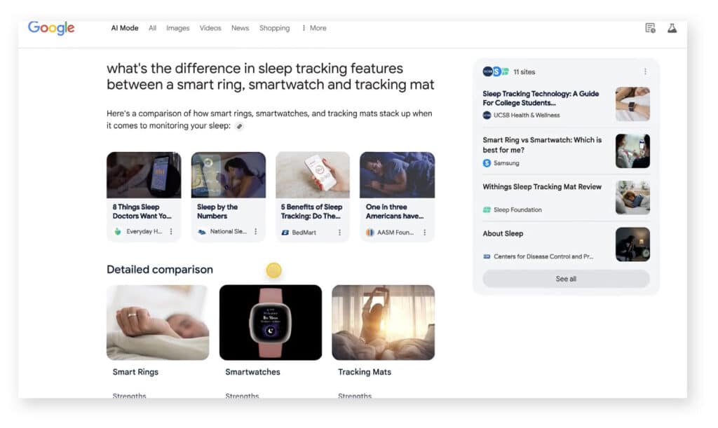
Google AI mode takes that a step further. Creating a new results page that’s AI created:

The page does includes links to websites (generally in the right hand side bar or, in some cases, citations for quoted text) – and it’s possible to use the links at the top to switch to a more standard set of search results for your query (in the same way you can switch to see Images or Shopping results related to your search).
It’s primary focus though, is much more about answering your question right there.
This isn’t live yet. It’s part of Google Labs – an experimental part of Google that them to trial the approach with limited group of users – but, based on Google’s announcements to date, it seems very likely this will get rolled out more widely.
Google Is Becoming the Destination
Let’s be clear: if/when this rolls out further, this won’t be a small tweak to the algorithm. It’s not a core update or a ‘Panda’.
This is a fundamental shift in how search works.
Google’s AI Mode is designed to answer your questions — not point you to someone who can.
Google is synthesising content from across the web, mashing it together into a summary, and serving it right up in answer to your question. Sometimes with citations. Often…without.
You don’t visit the blog. You don’t see the brand. You don’t convert. You just get what you came for and move on.
For users? Brilliant.
For content creators, publishers, brands, SEOs? Not so much.
Welcome to Zero-Click 2.0
We’ve been inching toward this for years – with featured snippets, ‘People Also Ask’ boxes, and knowledge panels chipping away at clicks. But Google AI Mode takes it to another level.
This is Zero-Click 2.0:
✅ User gets a solid, summarised answer instantly.
❌ The source site gets no traffic.
❌ The brand gets no visibility.
❌ The content creator gets no value from their work.
It’s like throwing a dinner party and realising that Google showed up early with the guests, ate the food, and left you the crumbs – with barely a word of thanks to the chef.

The Big SEO Questions We Can’t Ignore
So what does this mean for the future of SEO?
1. Who’s Incentivised to Create?
If high-quality content is hoovered up by Google’s AI and never clicked on, where is the incentive to produce it?
Will content become gated? Paywalled? Heavily branded just to be noticed?
Could this see a rise in “walled garden” content — less open web, more controlled ecosystems.
2. What Happens to Attribution?
Right now, citations in AI Mode are, well, let’s be kind and say vague. You might get a carousel of links. You might not. You often won’t know where a specific line came from (and therefore the degree it can be trusted).
This opens the door to accuracy issues, ethical murkiness, content scraping, and even legal challenges.
If Google’s AI is built on your content but gives you no credit, is that fair use? Or theft?
3. Is SEO Still Worth It?
Yes, but it’s changing fast.
Ranking and position one might soon mean that you’re a source for AI summaries, but may not automatically mean you’re a destination for traffic.
This could create an SEO arms race not – not so much for your content being included in search content, but figuring out how to be actually cited in Google’s answers.
(And we don’t really know yet how to optimise for that.)
The Journey Toward Zero Click
How Should We Respond?
So, rather than panic, how can we prepare for what’s ahead?
Focus on Content That AI Can’t Summarise Well
Deep research, opinion-led insights, original data, community-driven perspectives.
Things that can’t be neatly distilled into a two-sentence AI answer, without at least pointing towards the source.
Less “What is X?”
More “Here’s what happened when we tried X ourselves.”
Build Brand, Not Just Traffic
If people know you, they’ll seek you out directly. To that end, newsletters, communities, and branded experiences become critical.
Its less about trying to rank, more about trying to ensure your voice matters.
Add a Human Voice That AI Can’t Fake
The Internet’s about to get flooded with AI-generated content (some would argue it already is!).
As a result, REAL human writing with personality, tone, humour and emotion becomes a differentiator again.
Create that emotional connection with your reader.

Get this right and there are opportunities.
With the link blocks that appear on the left hand side of Google AI Mode, sites that were previously buried on Page 2 of Google can claw their way back into the answers – if they can optimise their content to appear as relevant topics, images and citations.
The Value Loop Is Breaking — Can We Rebuild It?
There is though a deeper question…
For the past 20 years, there’s been an implicit contract:
We create content → Google sends us traffic → Users find value → The web grows.
Google AI Mode has the potential to break that loop – taking value without returning it.
That’s not sustainable.
Unless Google finds a way to compensate creators – or at least drive meaningful visibility back to sources – it puts at risk the very ecosystem it depends on.
So while AI search is obviously alluring from Googles point of view, it also demands that they rethink how value flows online.
Until then, content creators are in limbo – serving an algorithm that increasingly is not serving them back.
Want help navigating this AI-driven shift in SEO?
Get in touch and we can talk strategies, future-proofing – and how to make your content matter.
What do you think?
Will Google change direction and not roll this out further? Is this a storm to be weathered, or is this a key shift in search? Are you changing SEO strategy to reflect the impact AI is having?
Let us know in the comments below…