These buttons are a topic that many in the world of websites seem to obsess over. What size should they be, what shape should they be and, most importantly, what colour should they be?
The best colour for a call to action button is a topic has been obsessed over by conversion optimisation specialists across the world in what probably amount to thousands of blog posts.
Red is a bold colour, it stands out on the page and is associated with value (think of all those “Sale” signs in shop windows). Green on the other hand is calmer, less scary and encourages us to “go” (think traffic lights). Unbounce (undoubtedly a company with some expertise in conversion rates) came out and declared the future was a Big Orange Button (BOB).
As you might expect, there’s been a whole host of user testing experiments carried out and published as case studies to support a particular view point. For example, CareLogger tested green vs red buttons on their site:
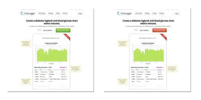
The result? 34% more people clicked on the red button than when it was green. A clear winner, right?
Well, maybe not. The trouble is that (like anything) it isn’t all that simple…Buttons on a website don’t exist in isolation, they are part of the wider page and need to therefore be sensitive to their context.
Sure red is a strong standout colour but, if the predominant colour scheme of the site is red, then it doesn’t stand out at all.
What’s more important is visual hierarchy: what elements stands out the most on the page?
If your button blends in with the rest of the site, then (whatever colour it is) it isn’t going to perform as well as a button that is more impactful.
Just to revisit that case study from earlier, take a look at the CareLogger page where those buttons were placed: The predominant colour scheme is green. In that instance, of course a red button performed more strongly – it differentiated the call to action from the rest of the page. It could be argued that another colour (perhaps orange, but even purple!) could perform even stronger.
So how to make sure your buttons perform best?
An effective button needs to be bold, stand out, catch your eye and encourage you to click. To that end you should:
- Make sure your buttons contrast with the rest of the page
- Use text that encourages users to click: communicate the value of what will happen. Not ‘Click Here’ but ‘Get your free report now’
- Ignore what works for other people: test the impact of different colours and text and see what works for you
Have you tested different button colours? Let us know what you found below.