Put aside the look & feel and first focus on the content
When most companies redesign their websites, they normally start with, well, the design.
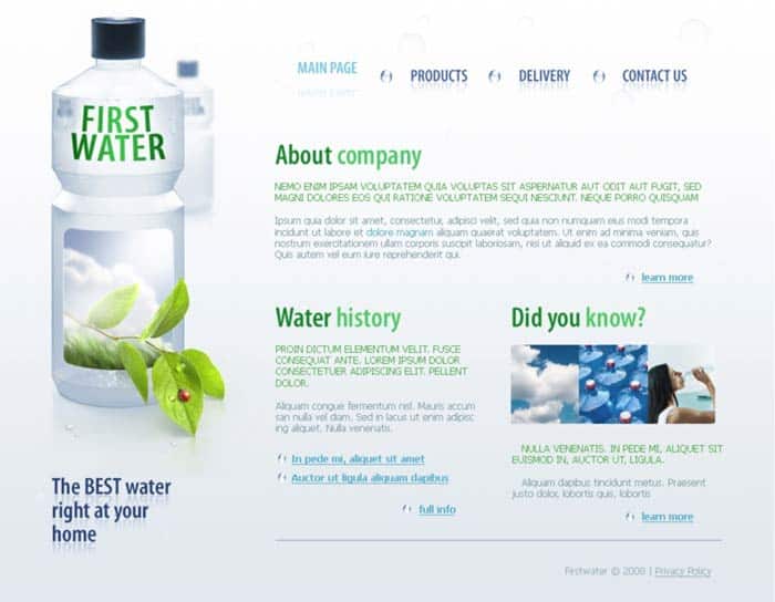
The process typically starts with a design brief, and the first output will usually be a beautifully rendered design concept filled with placeholder text – generally Lorem Ipsum. It might look something like this…

Lorem Impsum is pseudo-latin text that’s used by designers to fill spaces that are intended to have text in. The idea is that it gives a visual sense of the what the page will look like but, as it’s effectively nonsense, doesn’t inadvertently colour the viewer’s meaning of the page.
There’s an inherent problem with that though: the meaning a web page communicates is fundamental to how well it works.
In evaluating a design that’s filled with placeholder text, you have to make assumptions about the final content that will sit on the page – the information the page is going to communicate. With that in mind, you’ve no real idea if it is going to be effective in getting your message across to users or not.
Copy is important
When designing a website, copy is generally seen as the design’s poor cousin – the last thing that gets slotted in – and when you think about it, that’s crazy. You can have the slickest design imaginable but, when it comes down to it, the words are the most important thing on your website.
People might glance admiringly at your glossy design but, without compelling words, it’s unlikely that they will buy anything.
It’s frustrating then, that finding the right text to sit on the pages is so often a last minute affair – the final task before the site can go live.
‘Design first’ hobbles websites
There is a second problem that Loren Impsum creates: when you eventually come to replace it with copy, you’re left with the challenge of writing the right amount of copy to fit the space.
Now, chances are that the perfect message for a particular space isn’t going to match the pre-defined amount of space left by the placeholder text. This leaves you with three pretty unpalatable choices:
- Use the perfect copy for the circumstances, but break your design
- Make compromises with the copy to fit the available space
- Redesign the site to fit the final copy
Depending on which you pick, you’re either stuck with a sub-par website or a bill for additional work.
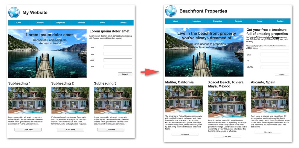
Take a look at this (rough) example:

What might look like a sensible design goes to pot when you add in finalised copy. Adding in real words, rather than convenient dummy text, overflows spaces, pushes alignments out, and breaks the intended design layout.
There must be a better approach.
Content first
Instead of immediately focussing on the design, try flipping the process on it’s head.
Start instead with setting out the content that should appear on each page:
- Define the objectives of each page: who should it be appealing to, what action(s) do you want them to do?
- What are the key brand messages you want to communicate to them
- What information do your users need to know before they’ll the action.
Once you’ve got the guidelines for the content, you can start writing – set out the headlines and titles and then flesh out the words underneath.
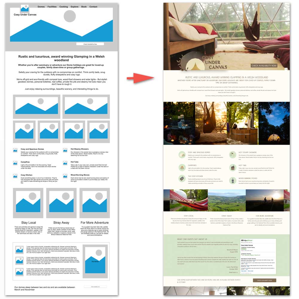
When you know exactly needs to appear on the page, you can then create a layout, including headlines, body copy and images, that communicates your messages effectively
Finally, you can apply a look and feel that’s relevant for the layout and creates a webpage that’s coherent and relevant to the audience.
Better all round
It’s not just a question of creating a more coherent site. We’ve found that this approach allows for a much smoother process all round.
Focussing on the objectives and audience creates a far more tightly focussed website – not something that’s driven by a graphic design concept.
It’s much easier to catch and correct issues. The process creates some really clear stages where the client gets to review and correct thinking: defining objectives; producing content; setting layouts; and final design.
And if something’s not right? Well, it only means redoing the last package of work – coming up with alternate designs is pretty simple if everyone’s agreed on the broad layout of content on the page. Equally experimenting with different layouts of what people agree to be the required content is pretty straightforward.
Paradigm Shift
We need make sure that content is the starting point, not an afterthought. After all, if a website doesn’t work, it doesn’t matter what it looks like:
“Design is not just what it looks like and feels like. Design is how it works”
Steve Jobs
Flipping the design process upside down creates a far better outcome: Web content that is focussed on guiding users down a path – meaning a website delivers on both the user’s and the business’ goals.
We’d love to know what design process works for you. Have you found issues with this approach? Has it come up trumps for you? Let us know.
